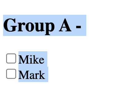
I have these Groups of people (Group A, Group B and Group C) and next to each group text there’s a toggle to hide/show the people for each group ("+" and "-" buttons).
My issue is that when I click on the "+" o "-" buttons to hide/show a section I end up having a blue focus color. Does anyone know how to get rid of the blue color? In order to see the blue color you must click on the toggle fast enough. Thanks a lot in advance!
Here’s a picture of my issue:
 return (
    <div>
      <h2>
        {post.label}{" "}
        <span onClick={() => setShowGroup(!showGroup)}>
          {showGroup ? "-" : "+"}
        </span>
      </h2>
      {showGroup && (
        <div>
          {post.fields?.map((field: any, idx: number) => {
            const key = `${post.label}__${field.name}`;
            const isChecked = checkboxStates[key] || false;
            return (
              <div key={idx}>
                <input
                  type="checkbox"
                  checked={isChecked}
                  onChange={(e) =>
                    handleCheckboxChange(field, e.target.checked)
                  }
                />
                <span>{field?.name}</span>
              </div>
            );
          })}
        </div>
      )}
    </div>
  );


2
Answers
Just make the
+/-"button" (currently aspan) into a realbuttonelement, and it’ll properly handle the button focus.You can easily use CSS styling to remove any unwanted button stylings
You are selecting text. When you click fast three times, a paragraph is selected.
You can use
user-selectCSS to disable select action at all.