


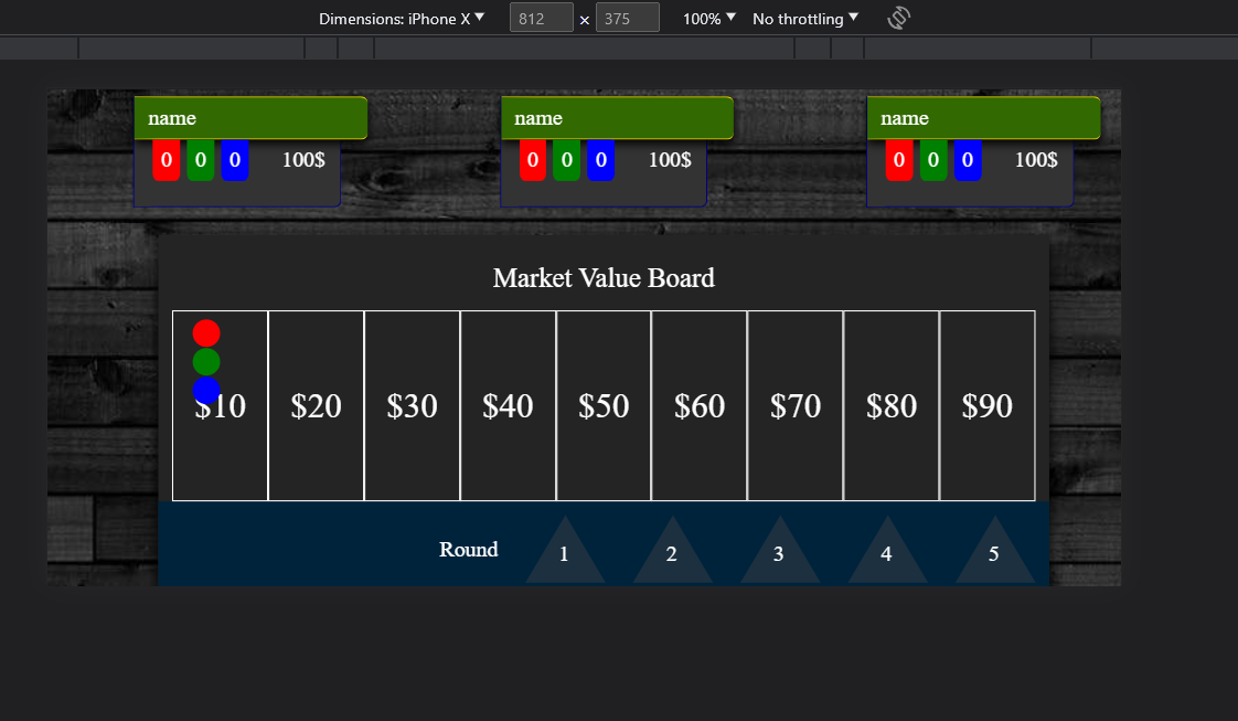
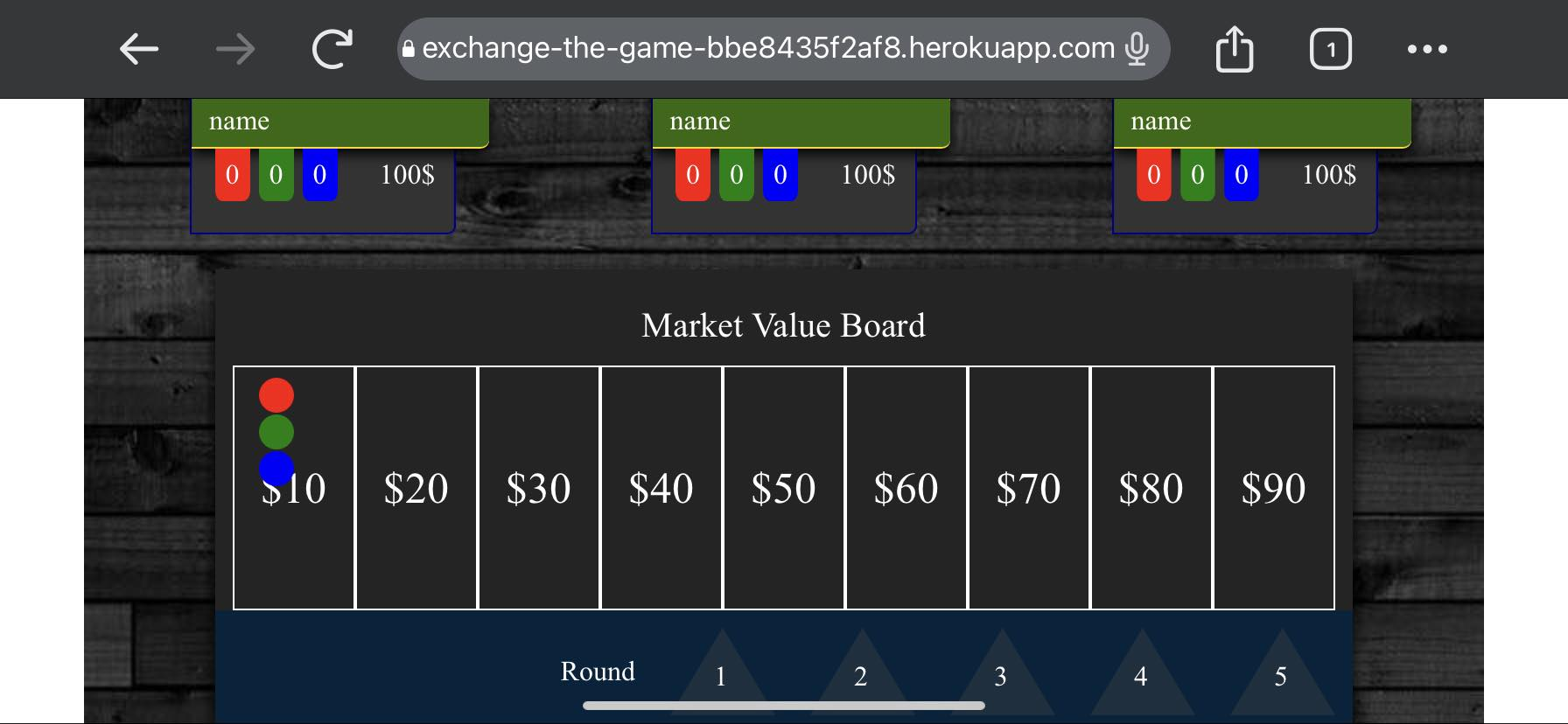
So I have created this board game using html css. It works fine on any size desktop and when I view it in the inspect mode with the device toolbar set for Iphone 12 or any other phone modes, there are no white spaces and everything seems to look fine. However, when I open the app on my actual phone there are white spaces around the body for some reason. Any suggestions on how to fix this ?
html {
  perspective: 20rem;
}

body {
  overflow: hidden;
  background-image: url(../images/background.jpg);
  background-position: center;
  transform: scale(1) rotateX(5deg);
}


/* WRAPPER */

.wrapper {
  padding: 5px;
}


/* TOP-PLAYERS */

.players {
  margin: 0px 0px 20px 0px;
  display: flex;
  justify-content: space-around;
}

.player-box {
  position: relative;
  border: 1px solid darkblue;
  border-top: none;
  border-bottom-right-radius: 5px;
  display: flex;
  flex-direction: column;
  width: 150px;
  height: 80px;
  background-color: rgb(51, 51, 51);
}

.player-active {
  border-color: aqua;
}

.name-bar {
  border-top: 1px solid gold;
  border-bottom: 1px solid gold;
  border-top-right-radius: 5px;
  border-bottom-right-radius: 5px;
  display: flex;
  align-items: center;
  width: 170px;
  height: 30px;
  background-color: rgb(50, 105, 0);
  box-shadow: 0px 3px 7px;
}

.name-bar span {
  margin-left: 10px;
  color: white;
}

.player-stats {
  display: flex;
  justify-content: space-around;
  align-items: center;
}

.player-stats ul {
  width: 50%;
  display: flex;
  justify-content: space-around;
}

.player-stats ul li {
  width: 20px;
  height: 30px;
  display: flex;
  justify-content: center;
  align-items: center;
  border-bottom-left-radius: 20%;
  border-bottom-right-radius: 20%;
  color: white;
}

.showPhases {
  visibility: hidden;
  display: flex;
  position: absolute;
  left: 5px;
  top: 100%;
  font-size: 15px;
  color: white;
}

.showPhase {
  padding: 1.5px;
  background-color: black;
  border: 1px solid white;
}

.player-stats ul li:nth-child(1) {
  background-color: red;
}

.player-stats ul li:nth-child(2) {
  background-color: green;
}

.player-stats ul li:nth-child(3) {
  background-color: blue;
}

.player-money {
  color: white;
}


/* GAME BOARD */

@keyframes moveRates {
  0% {
    transform: translateX(0);
  }
  100% {
    transform: translateX(100%);
  }
}

.move-rates {
  animation: moveRates 1s linear;
}

.game {
  display: flex;
  flex-direction: row-reverse;
  justify-content: center;
  align-items: flex-start;
}

.head-title {
  display: flex;
  align-items: center;
  justify-content: center;
  height: 60px;
  font-size: 25px;
  color: white;
}

.board {
  padding: 10px 10px 0px 10px;
  display: flex;
  flex-direction: column;
  align-items: center;
  justify-content: center;
  background-color: #242424;
  box-shadow: 0px 5px 10px;
}

.rates {
  position: relative;
  display: flex;
}

.rate {
  position: absolute;
  width: 20px;
  height: 20px;
  border-radius: 50%;
}

.red-rate {
  background-color: red;
  top: 10%;
  left: 15px;
}

.green-rate {
  background-color: green;
  top: 20%;
  left: 15px;
}

.blue-rate {
  background-color: blue;
  top: 30%;
  left: 15px;
}

.grid-rate {
  box-sizing: border-box;
  border: 1px solid white;
  display: flex;
  align-items: center;
  justify-content: center;
  width: 95px;
  height: 250px;
  font-size: 45px;
  color: #fff;
}

.round-counter {
  padding: 10px;
  display: flex;
  justify-content: flex-end;
  align-items: center;
  width: 100%;
  background-color: rgb(0, 35, 60);
  color: white;
}

.round {
  margin-left: 20px;
  position: relative;
  width: 0;
  height: 0;
  border-left: 30px solid transparent;
  border-right: 30px solid transparent;
  border-bottom: 50px solid rgba(65, 65, 65, 0.425);
  color: white;
}

.round span {
  position: absolute;
  top: 20px;
  right: -3px;
}

.pop-up {
  display: none;
}

.pop-up ul {
  display: flex;
  flex-direction: column;
}

.pop-up li {
  color: white;
  margin: 15px;
}

#confirm {
  width: 100px;
  height: 30px;
  background-color: white;
  border: none;
  border-radius: 5px;
}

@media screen and (max-width: 1115px) and (min-width: 350px) {
  html,
  body {
    perspective: none;
    overflow-x: hidden;
  }
  body {
    margin: 0;
    padding: 0;
    transform: scale(1) rotateX(0deg);
  }
  .head-title {
    height: 45px;
    font-size: 20px;
  }
  .grid-rate {
    width: 70px;
    height: 140px;
    font-size: 25px;
  }
  .red-rate {
    top: 5%;
  }
  .green-rate {
    top: 20%;
  }
  .blue-rate {
    top: 35%;
  }
}
<!DOCTYPE html>
<html lang="en">
<head>
<meta charset="UTF-8" />
<meta name="viewport" content="width=device-width, initial-scale=1.0">
<link rel="stylesheet" href="style/reset.css" />
<link rel="stylesheet" href="style/board.css" />
<title>Exchange The Game</title>
</head>
<body>
<div class="wrapper">
<div class="top">
<div class="players">
<div class="player-box">
<div class="name-bar">
<span>name</span>
</div>
<div class="player-stats">
<ul>
<li>
<span>0</span>
<div class="red"></div>
</li>
<li>
<span>0</span>
<div class="red"></div>
</li>
<li>
<span>0</span>
<div class="red"></div>
</li>
</ul>
<span class="player-money">100$</span>
</div>
<div class="showPhases">
<div class="showPhase">
<span></span>
</div>
<div class="showPhase">
<span></span>
</div>
</div>
</div>
</div>
</div>
<div class="game">
<div class="board">
<div class="head-title">
<span>Market Value Board</span>
</div>
<div class="rates">
<div class="red-rate rate"></div>
<div class="green-rate rate"></div>
<div class="blue-rate rate"></div>
<div class="grid-rate">
<span>$10</span>
</div>
<div class="grid-rate">
<span>$20</span>
</div>
<div class="grid-rate">
<span>$30</span>
</div>
<div class="grid-rate">
<span>$40</span>
</div>
<div class="grid-rate">
<span>$50</span>
</div>
<div class="grid-rate">
<span>$60</span>
</div>
<div class="grid-rate">
<span>$70</span>
</div>
<div class="grid-rate">
<span>$80</span>
</div>
<div class="grid-rate">
<span>$90</span>
</div>
</div>
<div class="round-counter">
<span>Round</span>
<div class="round">
<span>1</span>
</div>
<div class="round">
<span>2</span>
</div>
<div class="round">
<span>3</span>
</div>
<div class="round">
<span>4</span>
</div>
<div class="round">
<span>5</span>
</div>
</div>
</div>
<div class="pop-up">
<ul>
<li>
<label for="phase-1">Phase 1</label>
<select name="phase-1" id="phase-1" class="phase">
<option value="red">red</option>
<option value="green">green</option>
<option value="blue">blue</option>
</select>
</li>
<li>
<label for="phase-2">Phase 2</label>
<select name="phase-2" id="phase-2" class="phase">
<option value="buy">buy</option>
<option value="sell">sell</option>
</select>
<select name="phase-2-count" id="phase-2-count" class="phase">
<option value="1">1</option>
<option value="2">2</option>
<option value="3">3</option>
<option value="4">4</option>
<option value="5">5</option>
<option value="6">6</option>
<option value="7">7</option>
<option value="8">8</option>
<option value="9">9</option>
</select>
</li>
<li>
<label for="phase-3">Phase 3</label>
<select name="phase-3" id="phase-3" class="phase">
<option value="red +1">red +1</option>
<option value="green +1">green +1</option>
<option value="blue +1">blue +1</option>
<option value="red -1">red -1</option>
<option value="green -1">green -1</option>
<option value="blue -1">blue -1</option>
</select>
</li>
</ul>
<button id="confirm">Confirm</button>
</div>
</div>
</div>
<script src="https://cdnjs.cloudflare.com/ajax/libs/qs/6.11.2/qs.min.js" integrity="sha512-vCegEXqPUYpZsTGz2lk0jaQ1psxtFeniVJACAXhMVxuoYa/N4nZkjoVFOxLwP7uGeQOoemiz7DQrIpRTj4IBPw==" crossorigin="anonymous" referrerpolicy="no-referrer"></script>
<script src="https://cdn.socket.io/4.6.1/socket.io.min.js"></script>
<script type="module" src="scripts/game.js"></script>
</body>
</html>
2
Answers
Update*** The image is the problem. It does not size accordingly to mobile. Thus resulting in white spaces. –
Remove overflow: hidden; from the body CSS rule. This property hides any content that overflows the body, which might be causing the white spaces.
Add margin: 0; to the body CSS rule to reset the default margin on the body element to the rest of the body code