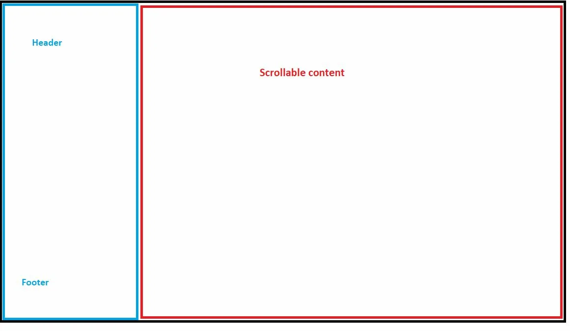
I tried to achieved the following layout for larger screen.
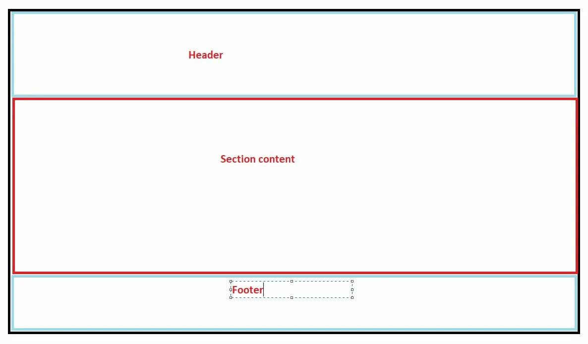
Applied multiple options but can’t get the result. I am using the flex property for alignment purpose. header and footer position is fixed and left aligned(width 35%) .The screen should be responsive means when we resize or shrink the screen the layout will be
Note for this layout (shrink screen) footer will be appear on end of the page (content section is scrollable) means here header and footer is not fixed
how can i achieve above mentioned scenario?
the html structure is below
<!DOCTYPE html>
<html lang="en">
<head>
    <meta charset="UTF-8">
    <meta name="viewport" content="width=device-width, initial-scale=1.0">
    <title>Your Page Title</title>

</head>
<body>
    <div class="wrapper">
        <header>
            <!-- Your header content -->
        </header>
        <section>
            <!-- Your section content -->
        </section>
        <footer>
            <!-- Your footer content -->
        </footer>
    </div>
    <script src="{{ "/assets/js/scale.fix.js" | relative_url }}"></script>
</body>
</html>
I want to work with Flex Property


3
Answers
This is maybe a bit crude but it’s probably the direction I’d go in.
I believe a better approach would be using grid, but as you used flex am explaining with flex approach.
I would approach like this: create a parent flex layout which will have three divs:
And div1 will also be a flex layout
This way gives you very good flexibility even if you want to create a collapsible sidebar.