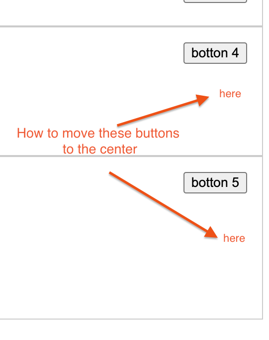
I have this list of texts with a button for each row on the right side. How can I make the buttons stay on the right side but vertically centered? if I have a lot of text in a row the buttons aren’t vertically centered. Thanks a lot in advanced! Here’s my code:
ol > li.row {
   position: relative;
   list-style: none;
   border: 1px solid #ccc;
   border-bottom-color: #ccc;
}

.right-side {
   position: absolute;
   top: 0;
   right: 0;
   padding: 15px;
 }
<ol>
<li class="row">
<h3>Text 1</h3>
<div class="right-side">
<button>botton 1</button>
</div>
</li>
<li class="row">
<h3>Text 2</h3>
<div class="right-side">
<button>botton 2</button>
</div>
<p>This is some random text</p>
</li>
<li class="row">
<h3>Text 3</h3>
<div class="right-side">
<button>botton 3</button>
</div>
</li>
<li class="row">
<h3>Text 4</h3>
<div class="right-side">
<button>botton 4</button>
</div>
<p>This is another random text</p>
<p>abc</p>
</li>
<li class="row">
<h3>Text 5</h3>
<div class="right-side">
<button>botton 5</button>
</div>
<p>efg</p>
<p>random text</p>
<p>This is another paragraph</p>
</li>
</ol>NOTE: I prefer not to use Flex
This is what I’m trying to accomplish:


3
Answers
One option is to use flex and restructure your html markup. Typically you want the html structure to be grouped the same way you are viewing it on the screen. So I would vote for this option since the div for left-side are grouping these together as opposed to using position absolute / relative.
If you have to this html structure you can still use flex, but the parent li will need the height set so it knows where center is. You can use -webkit-fill-available for this.
change the top to top: 50%;, and add: transform: translate(0, -50%); to your .right-side class