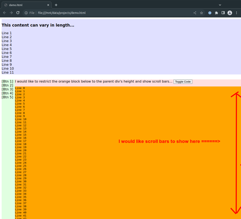
I am writing an electron app and the basic screen layout is a two-column flex with forms on the top and a code editor in the bottom underneath. These panes are resizing as expected using CSS flex. I am having a problem though with content within the bottom pane.
When content is loaded, I would like the content block (in orange) below to remain within the bounds of its bottom parent and have scroll bars appear in that block. What ends up happening is that the orange code element grows to accommodate the code, without the parent showing scroll bars.
I can get the entire bottom panel to scroll (green and red/orange), but I’d rather not do that unless I have to.
The HTML below demonstrates this (click on the "Toggle Code" button to load).
<html>
<head>
    <style>
        body { overflow: hidden; }
        #container { display:flex; flex-direction: column; height:100vh; width:100vw; overflow: hidden; }
        #top { width:100%; flex-grow: 1; background-color: #E0E0FF }
        #bottom { display:flex; flex-direction:row; flex-grow:2; margin-top: 24px; }
        #bottom-left { width:64px; background-color:#E0FFE0 }
        #bottom-right { display:flex; flex-direction: column; flex-grow: 1; background-color: #FFE0E0; }
        #bottom-right-header { flex-grow: 0; }
        #bottom-right-content { flex-grow: 1; overflow:auto; background-color: orange;" }
    </style>
    <script type="text/javascript">
        let showing = false;
        function toggleCode() {
            let text = '';
            showing = !showing
            if(showing) {
                for(let i = 0; i < 1000; i++) text += `Line ${i}n`;
            }
            document.getElementById('bottom-right-content').innerText = text;
        }
    </script>
</head>
<body>
    <div id="container">
        <div id="top">
            <h3>This content can vary in length...</h3>
            <div>Line 1</div>
            <div>Line 2</div>
            <div>Line 3</div>
            <div>Line 4</div>
            <div>Line 5</div>
            <div>Line 6</div>
            <div>Line 7</div>
            <div>Line 8</div>
            <div>Line 9</div>
            <div>Line 10</div>
            <div>Line 11</div>
        </div>
        <div id="bottom">
            <div id="bottom-left">
                <div>[Btn 1]</div>
                <div>[Btn 2]</div>
                <div>[Btn 3]</div>
                <div>[Btn 4]</div>
                <div>[Btn 5]</div>
            </div>
            <div id="bottom-right">
                <div id="bottom-right-header">
                    I would like to restrict the orange block below to the parent div's height and show scroll bars...
                    <button onClick="toggleCode()">Toggle Code</button>
                </div>
                <pre id="bottom-right-content">
                </pre>
            </div>
        </div>
    </div>
</body>
</html>


2
Answers
If you utilize both
overflow-y: scroll;andmax-height:250px;, you’ll be able to have the desired scroll effect. Change the height of themax-heightto fit whatever maximum height you’d like (adding in media queries for your specific app would be wise).I created the below snippet based on your question code to display the solution I’m describing:
Although the question can be flagged as a duplicate (see Why don’t flex items shrink past-content-size? ), I’ll give the answer anyway, because it might not be obvious:
#bottom { min-height: 0; }