skip to Main Content

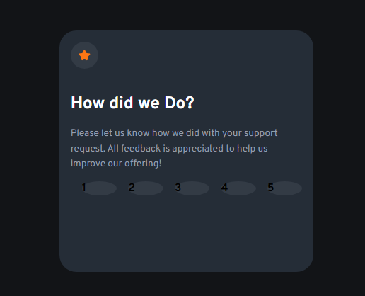
Actually I have three divs (.box, .rating-options, .rating). I wanted to create a layout like this:

I wanted to create a layout like this

However I’m not getting a complete circle, they’re ovals. The width of the parent element is fixed (i.e. 25%), so in order to get a complete circle, I have to adjust the height of .rating-options, but that too gets distorted when it is responsive.

enter image description here

:root{
    --dark-blue: hsl(213, 19%, 18%);
}
.box{
    background-color: var(--dark-blue);
    width: 25%;
    height: 50%;
    margin: auto;
    border-radius: 1.5rem;
    font-weight: 700;
    padding: 1rem;
}
.rating-options{
    display: grid;
    flex-wrap: wrap;
    grid-template-columns: repeat(5, 1fr);
}
.rating{
    background-color:hsla(217, 12%, 63%, 0.123);
    margin-left: 1rem;
    border-radius: 50%;
}
<div class="box">
    <div class="rating-options">
      <div id="1" class="rating">1</div>
      <div id="2" class="rating">2</div>
      <div id="3" class="rating">3</div>
      <div id="4" class="rating">4</div>
      <div id="5" class="rating">5</div>
    </div>
  </div>

Please help me with this.

2

Answers


  1. :root{
        --dark-blue: hsl(213, 19%, 18%);
    }
    .box{
        background-color: var(--dark-blue);
        width: 25%;
        height: 50%;
        margin: auto;
        border-radius: 1.5rem;
        font-weight: 700;
        padding: 1rem;
    }
    .rating-options{
        display: grid;
        flex-wrap: wrap;
        grid-template-columns: repeat(5, 1fr);
    }
    .rating{
        text-align:center;
        background-color:hsla(217, 12%, 63%, 0.123);
        margin: auto;
        border-radius: 50%;
        width:20px;
        height:20px;
    
    
    }
    <div class="box">
        <div class="rating-options">
          <div id="1" class="rating">1</div>
          <div id="2" class="rating">2</div>
          <div id="3" class="rating">3</div>
          <div id="4" class="rating">4</div>
          <div id="5" class="rating">5</div>
        </div>
      </div>
    Login or Signup to reply.
  2. This will get you closer to what you want, but I’ve set a min-width on the container, as it’s eventually going to get distorted no matter what you do, so I’d rethink the width: 25% — at least via media queries for smaller screens.

    :root{
        --dark-blue: hsl(213, 19%, 18%);
    }
    .box{
        background-color: var(--dark-blue);
        width: 25%;
        height: 50%;
        margin: auto;
        border-radius: 1.5rem;
        font-weight: 700;
        padding: 1rem;
        min-width: 300px;
    }
    .rating-options {
        display: grid;
        grid-template-columns: repeat(5, 1fr);
        gap: 1rem;
    }
    .rating-options div {
        background-color:hsla(217, 12%, 63%, 0.123);
        border-radius: 50%;
        aspect-ratio: 1;
        display: grid;
        place-content: center;
        color: white;
    }
    <div class="box">
      <div class="rating-options">
        <div id="1">1</div>
        <div id="2">2</div>
        <div id="3">3</div>
        <div id="4">4</div>
        <div id="5">5</div>
      </div>
    </div>
    Login or Signup to reply.
Please signup or login to give your own answer.
Back To Top
Search