skip to Main Content

I’m trying to make custom checkboxes for different colors (red, blue, etc…)

enter image description here

but I’m having issues figuring out how to get the desired result

I’m using Bootstrap 5.3:
trying to learn how to do it by deconstructing a bootstrap template that has the desired result. here’s the example (shop leftsidebar => filter-options):
https://themes.getbootstrap.com/preview/?theme_id=35287
First I made the standard checkbox invisible by adding the code below into my scss (connected to the Bootstrap class).

.form-check-input{
  border: 0;
  background: none;
}

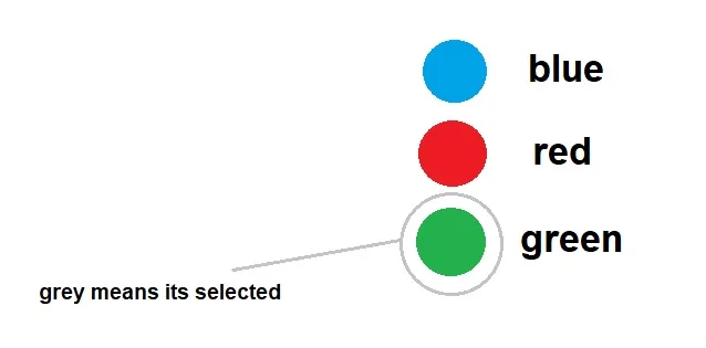
as for the color balls this is the code I have that’s sort of based on the site I mentioned

<div class="form-check">
                    <input class="form-check-input" type="checkbox" value="" id="flexCheckDefault">
                    <label class="checkbox-ring-size rounded-circle border border-1 border-danger">
                        <span class="checkbox-color-size rounded-circle bg-danger">

                        </span>
                    </label>
                    <label class="form-check-label font-philos-ita" for="flexCheckDefault">
                        RED
                    </label>
                </div>

these 2 are custom classes in here
checkbox-ring-size and checkbox-color-size
the idea is one is the outer line, meaning selected

.checkbox-ring-size{
  width:14px;
  height:14px;
}

and the other is just the color bal.

.checkbox-color-size{
  width:10px;
  height:10px;
}

I’m currently at a loss at this point. I have no idea how to make this custom checkbox clickable, indicating that its being selected.
maybe something that I should mention is that even though the standard bootstrap checkbox is invisible, if you click on the area it is in, it will still be checkable. so I also need to find a way to solve that issue
though the bootstrap template also suffers from this, but its custom buttons work.

I would appreciate the help, preferably keep using Bootstrap as much as possible.

2

Answers


  1. You can do that completely without labels, by directly styling the checkbox itself. By setting appearance to none, and using the :checked, ::before and ::after pseudo selectors.

    :root {
      --checkbox-radius: 20px;
      --checkbox-ring-distance: 2px;
    }
    
    [type="checkbox"] {
      position: relative;
      appearance: none;
      background-color: red;
      width: var(--checkbox-radius);
      height: var(--checkbox-radius);
      border-radius: var(--checkbox-radius);
      cursor: pointer;
      z-index: 0;
    }
    
    [type="checkbox"]:checked::after {
      position: absolute;
      outline: 1px solid red;
      content: '';
      width: calc(var(--checkbox-radius) + var(--checkbox-ring-distance)*2 );
      height: calc(var(--checkbox-radius) + var(--checkbox-ring-distance)*2 );
      border-radius:  calc(var(--checkbox-radius) + var(--checkbox-ring-distance)*2 );
      left: calc(var(--checkbox-ring-distance)*-1);
      top:  calc(var(--checkbox-ring-distance)*-1);
      z-index: -1;
    }
    <input type="checkbox" id="thecheckbox">
    <label for="thecheckbox">checkbox</label>

    If you really want to do it with a label you would use the next-sibling combinator:

    :root {
      --checkbox-radius: 20px;
      --checkbox-ring-distance: 2px;
    }
    
    [type="checkbox"] {
      display: none;
    }
    
    label span {
      position: relative;
      background-color: red;
      width: var(--checkbox-radius);
      height: var(--checkbox-radius);
      border-radius: var(--checkbox-radius);
      cursor: pointer;
      z-index: 0;
      display: inline-block;
    }
    
    [type="checkbox"]:checked + label span::after {
      position: absolute;
      outline: 1px solid red;
      content: '';
      width: calc(var(--checkbox-radius) + var(--checkbox-ring-distance)*2 );
      height: calc(var(--checkbox-radius) + var(--checkbox-ring-distance)*2 );
      border-radius:  calc(var(--checkbox-radius) + var(--checkbox-ring-distance)*2 );
      left: calc(var(--checkbox-ring-distance)*-1);
      top:  calc(var(--checkbox-ring-distance)*-1);
      z-index: -1;
    }
    <input type="checkbox" id="thecheckbox">
    <label for="thecheckbox"><span></span></label>
    <label for="thecheckbox">checkbox</label>
    Login or Signup to reply.
  2. Try using a second element, within a parent element, that uses ::after with the checkbox’s :checked property. Here’s some modified code from one of my own projects that I edited a bit to work for your question:

    .checkarea input {
      position: absolute;
      cursor: pointer;
      height: 0;
      width: 0;
    }
    .customcheck {
      position: absolute;
      top: 0;
      left: 0;
      height: 20px;
      width: 20px;
      background-color: white;
      border: 2px solid rgba(179, 179, 179, 0.7);
      border-radius: 30%;
    }
    .checkarea input:checked ~ .customcheck {
      background-color: hotpink;
    }
    .customcheck:after {
      content: "";
      position: absolute;
      display: none;
    }
    .checkarea input:checked ~ .customcheck:after {
      display: block;
    }
    .checkarea .customcheck:after {
      left: 7px;
      top: 3px;
      width: 4px;
      height: 9px;
      border: solid white;
      border-width: 0 3px 3px 0;
      -webkit-transform: rotate(45deg);
      -ms-transform: rotate(45deg);
      transform: rotate(45deg);
    }
    <label class="checkarea">
      <input type="checkbox" style="opacity: 0;">
      <span class="customcheck"></span>
    </label>

    NOTE: Using ::before or ::after on the checkbox itself won’t work well, since it is self closing.

    Login or Signup to reply.
Please signup or login to give your own answer.
Back To Top
Search