


Unsure if the title is descriptive enough, but what I currently have is this:
with HTML and CSS:
.test-outer {
  display: grid;
  grid-template-columns: 1fr 1fr;
  column-gap: 1rem;
}

.test-left {
  background-color: aquamarine;
  border-radius: 8px;
  border: 2px solid black;
  text-align: center;
  height: 6.28rem;
}

.test-right {
  display: grid;
  grid-template-columns: 1fr 1fr;
  row-gap: 1rem;
  column-gap: 1rem;
}

.test-right-item {
  background-color: #999;
  border-radius: 8px;
  border: 2px solid black;
  text-align: center;
}
<div class="test-outer">
<div class="test-left">
0
</div>
<div class="test-right">
<div class="test-right-item">
1<br>2
</div>
<div class="test-right-item">
3<br>4
</div>
<div class="test-right-item">
5<br>6
</div>
<div class="test-right-item">
7<br>8
</div>
<div class="test-right-item">
9<br>10
</div>
<div class="test-right-item">
11<br>12
</div>
<div class="test-right-item">
13<br>14
</div>
<div class="test-right-item">
15<br>16
</div>
</div>
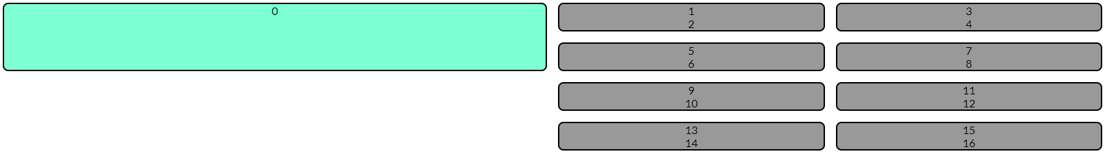
</div>As you can see, I have fixed the height of the .test-left class, and would like all items in the right column that are below the fixed height of the left column to overflow into the left column. The height doesn’t have to be fixed via the height property but is just how I’ve currently gotten it to the height I want. Eventually I want it to look like this:
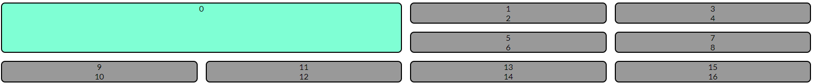
Unfortunately I have hard coded a bunch of divs to be in those exact positions and would like it to do this dynamically so I can loop over an object of data via Jinja and place all the divs in that way. All the divs below the top left box will continue to grow left to right downwards.
I can imagine a solution where I loop over the first four elements in that data (if four exist, otherwise however many there are) and place them to the right of the big box, and then any elements after the first four I can loop over and are placed in a different grid below the big box, but perhaps there is a cleaner solution.
I’m okay with a solution including some JS.
2
Answers
one way to do it using
grid-rowpropertyUse
grid-row: span 2;andgrid-column: span 2;to firstdiv: