


I’m new to HTML, CSS, and trying make the fill the remaining space of it’s container.
The problem is when the content of is too long, it will exceed out of the container, which make the break-word not work (I think so)
This is my codes:
.a {
  width: 50%;
  height: 200px;
  background-color: black;
  display: flex;
}
.b {
  height: 100px;
  background-color: yellow;
  display: flex;
}
.c {
  background-color: gray;
  margin-left: 20px;
  color: blue;
  height: 20px;
  display: flex;
  flex-grow: 1;
  word-wrap: break-word;
}
<div class="a">
<div class="b">vcvxzc</div>
<div class="c">
<span> ccccccccccccccccccccccccccccccccccccccccccccccccccccccccccccccccccccccccccccccccccccccccccccccccccccccccccccccccccccccccccccccccccccccccccccccccccccccccccccccccccccccccccccccccccccccccccccccccccccccccccccccccccccccccccccccccc
</span>
</div>
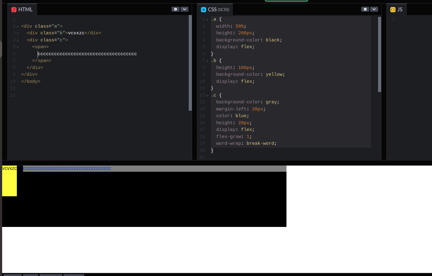
</div>When the span is not too long:
enter image description here
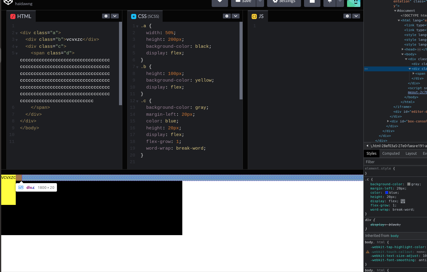
When it’s too long:
enter image description here
how can I make it always contain inside the flex container.
thank you so much
5
Answers
if you need to keep height on 20px you can use the style bellow to hide rest of text
but if height is not important for you and you just want to break the text in that width you can use this style:
Your question is not clear enough.
In the title you asked for how to fill the entire container of a flex parent. You can do so by using
Flex-GrowIn the description you asked for how can you prevent overflow in a flex container, you can do so by
Flex-wrap.Use
word-breakproperty and set it tobreak-allto contain it inside the parent container.Refer this
I think this is what you need..
All you need to do is, change
word-wrap: break-wordtoword-break: break-wordand adjust height appropriatelytry this css: