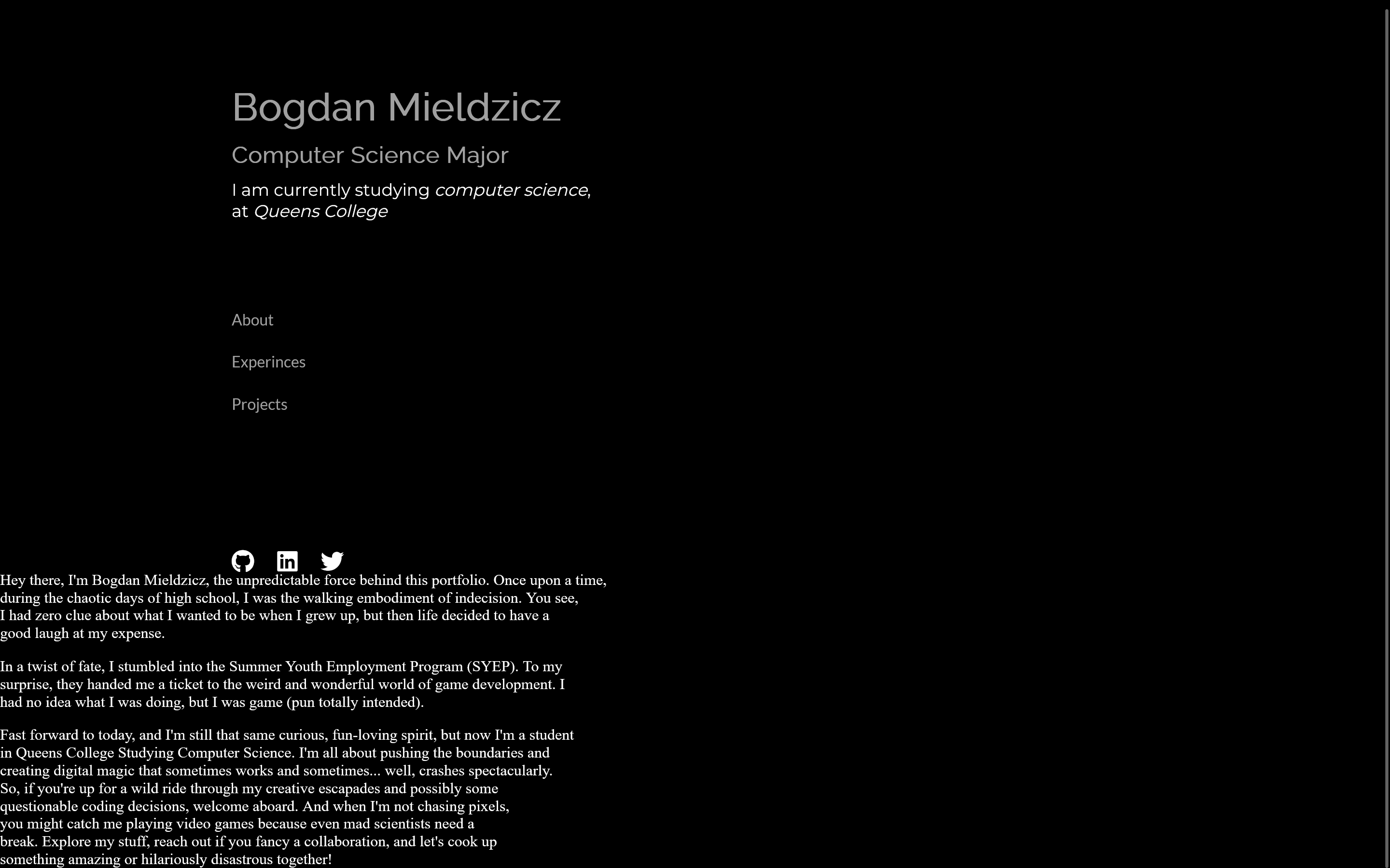
Im trying to keep the the github, linkedin and twitter icons in the spot where they are and im just trying to move the 3 paragraphs to the right side of the screen.
my html looks like this
div.social {
  margin-top: 9rem;
  margin-left: 15rem;
}

div.social ul {
  display: flex;
  grid-gap: 1.5rem;
}

div.aboutme {
  display: flex;
  flex-direction: column;
  color: #FFFFFF;
  grid-gap: 1rem;
  justify-content: flex-end;
}

div.aboutme p.about {
  display: inline-block;
}
<body>
<div class="container">
<div class="Intro">
<h1 class="Name"><strong>Bogdan Mieldzicz</strong></h1>
<h3 class="Title"><strong>Computer Science Major</strong></h3>
<p class="Bio">I am currently studying <em>computer science</em>,<br>at <em>Queens College</em></p>
<nav class="navbar">
<ul>
<li><a href="./index.html">About</a></li>
<li><a href="#">Experinces</a></li>
<li><a href="#">Projects</a></li>
</ul>
</nav>
</div>
<div class="social">
<ul>
<li><a href="https://github.com/Bodzik1"><i class="fa-brands fa-github fa-xl" style="color: #ffffff;"></i></a></li>
<li><a href="https://www.linkedin.com/in/bogdan-mieldzicz/"><i class="fa-brands fa-linkedin fa-xl" style="color: #ffffff;"></i></a></li>
<li><a href=""><i class="fa-brands fa-twitter fa-xl" style="color: #ffffff;"></i></a></li>
</ul>
</div>
<div class="aboutme">
<p></p>
<p></p>
<p></p>
</div>


2
Answers
For the sake of understanding, I’ve ignored class social as I’m not sure about where you want to place it.
provide a common outer element and place both the div inside and display property of the outer element should be flex.
And the margin-left and margin-right of the inner elements should be auto. Inner elements’ width should be less than 50%.
See my example where I’ve provided an outer element section. Please see the html and css. Understand the concept and modify accordingly.
I scraped this down to the bare minimum.
style="from all the HTML, put it in CSS if you need it.ul lias lists so why not just use divs and spansdiv) and apply the style to that.nnn-containerto better illustrate the intent.container { display: grid; place-items: center; }just "super centers" the containers inside that container then I added a margin cssmargin-left: auto;to the last one to move it to the right.Your image had some additional style like background but that was not supplied so I just used what was.