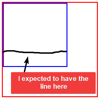
I would like to use a <hr> as an indicator of progress within a <div>. To this I expected that a combination of position: absolute and top: ...px would do the job:
.container {
  border-style: solid;
  border-color: red;
  width: 300px;
  height: 300px;
}

.box {
  border-style: solid;
  border-color: blue;
  width: 200px;
  height: 200px;
}

hr {
  margin: 0;
  position: absolute;
  top: 150px;
}
<div class="container">
<div class="box">
<hr class="line">
</div>
</div>I was expecting the line to be 3/4 down from the top of the blue box:
Why is my positioning wrong?
EDIT: Through trial-and-error, I discovered that by adding a width: 200px; to the hr definition I can see the line, but I do not understand why so I am not making an answer of it. Specifically: what happens that the HR does not fill the width of the container on its own anymore
.container {
  border-style: solid;
  border-color: red;
  width: 300px;
  height: 300px;
}

.box {
  border-style: solid;
  border-color: blue;
  width: 200px;
  height: 200px;
}

hr {
  margin: 0;
  position: absolute;
  top: 150px;
  width: 200px;
}
<div class="container">
<div class="box">
<hr class="line">
</div>
</div>


2
Answers
The
widthproperty makes an element behave as if it wasdisplay: blockin terms of space and position. Even if it wasdisplay: inlineto begin with (like<a>or<span>). As for thehrelement – it seems to have 0widthwhen it hasabsolutepositioning. Reason: any absolute element is shrink-to-fit and hr has no content – thanks to Temani Afif’s comment.Another issue you will have, the container needs to be
position: relativefor the absolute positioning within it to be correct. That has a nice side effect that a percent ofwidthwill be of the width of the containing div. Perfect for progress bars.In your code, the positioning of the
element is not behaving as expected. You wanted the line to be positioned 3/4 down from the top of the blue box. However, it appears that the line is not being positioned correctly.
The issue lies in the fact that the
element is an inline element by default, and its width is determined by the content it contains. In your initial code, the
element has no content, so its width collapses to zero.
To make the line appear as expected, you added width: 200px; to the
element. By specifying a width, you force the element to have a visible presence, even without content.
The reason why the line does not fill the width of the container on its own is because it behaves as an inline element, which by default only takes up the necessary width for its content. By specifying the width explicitly, you ensure that the line extends to the desired width.
In summary, by adding width: 200px; to the
element, you are explicitly defining its width, which overrides the default behavior of an inline element and allows the line to appear as expected within the blue box.