 Question posted in


I have a bunch of flex-items in a container. The flex-direction is set to column. One of the elements has a little bit more text, so that its contents wraps into a new line. Now the element’s width automatically becomes 100% of the width of the parent. How can I prevent this from happening?
To make it a bit clearer: The "green" should "stop" after the second "Twentyone".
.parent {
  border: 1px solid black;
  display: flex;
  flex-direction: column;
  width: 200px;
  align-items: flex-start;
}

.child:nth-child(odd) {
  background-color: chartreuse;
}

.child:nth-child(even) {
  background-color: chocolate;
}

.long {
  /* ??? */
}
<div class="parent">
<div class="child">One</div>
<div class="child">Two</div>
<div class="child long">Twentyone Twentyone Twentyone</div>
<div class="child">Four</div>
<div class="child">Five</div>
</div>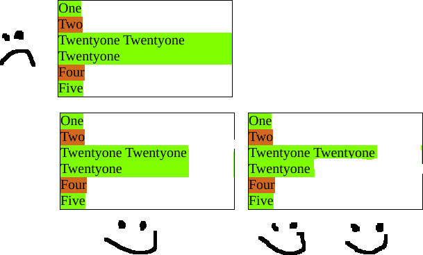
2
Answers
simply you can use width to solve this problem
You can use the
<span>element.