skip to Main Content

I am have difficulty with some CSS. I’m trying to put an element above two elements. I’ve tried several solutions but nothing is helping.

.grey_font {
  background-color: #FAF6EE;
  height: 280px;
  z-index: 1;
}

.ads {
  background-color: #007181;
  height: 160px;
  z-index: 2;
  margin-left: 7%;
  margin-right: 7%;
  border-radius: 30px;
  position: relative;
  display: flex;
}

footer {
  background-color: #00525D;
  height: 369px;
  z-index: 1;
}
<header>
  <nav id="nav">
    <img src="Logo-horizontal.png" id="img_snark" />
    <ul id="tabs">
      <li>Qui Sommes-nous</li>
      <li>Blog</li>
      <li>FAQ</li>
      <li>Contact</li>
      <li id="compte">Mon compte</li>
    </ul>
    <img src="united-kingdom.png" id="uk_images">
  </nav>
</header>
<img src="Union.png" id="union_images">
<div class="images_first-plan">
  <div id="sentences">
    <img src="entree.png" id="entree_images">
    <img src="cake.png" id="cake_images">
    <img src="par Nicolas Cooking.png" id="nicook_images">
  </div>
  <div class="images-play">
    <img src="image 3.png" id="video_images">
    <img src="PLAY 1.png" id="play">
  </div>
</div>
<div class="grey_font">
</div>
<div class="ads">
</div>
<footer>
</footer>

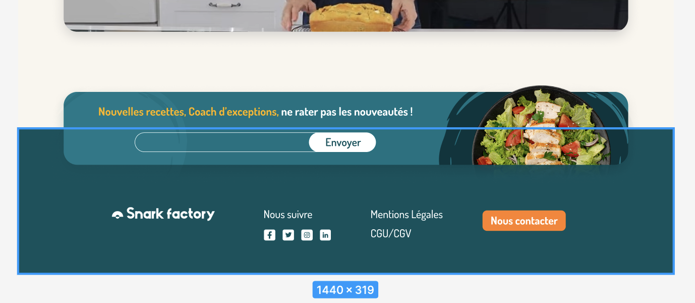
This is the case in picture :

enter image description here

When I put two elements in position ‘fixed’ or ‘absolute’. They disappear.

This what I want:

enter image description here

6

Answers


  1. Add position ‘absolute’ to the element you need to flow, and also add ‘top’ and ‘left’ to control its position

    position: absolute;
    top: 50px;
    left: 0;
    

    Then add position ‘relative’ for the upper main element you want to connect with

    Login or Signup to reply.
  2. When you change the position to absolute then the width collapses. You need to set a width to make it visible and I also did the other positioning like below to meet your requirement:

    .ads {
        position: absolute;
        width: 86%;
        left: 7%;
    }
    
    footer {             
        margin-top: 80px;
    }
    
    .grey_font {
        background-color: #FAF6EE;
        height: 280px;
        z-index: 1;
    }
    
    .ads {
        background-color: #007181;
        height: 160px;
        z-index: 2;              
        border-radius: 30px;
        position: absolute;
        width: 86%;
        left: 7%;
        display: flex;
    }
    
    footer {
        background-color: #00525D;
        height: 369px;
        z-index: 1;
        margin-top: 80px;
    }
    <link href="https://fonts.googleapis.com/css2?family=Dosis:wght@500;700&display=swap" rel="stylesheet">
    
    <header>
        <nav id="nav">
            <img src="Logo-horizontal.png" id="img_snark"/>
            <ul id="tabs">
                <li>Qui Sommes-nous</li>
                <li>Blog</li>
                <li>FAQ</li>
                <li>Contact</li>
                <li id="compte">Mon compte</li>
            </ul>
            <img src="united-kingdom.png" id="uk_images">
        </nav>
    </header>
    <img src="Union.png" id="union_images">
    <div class="images_first-plan">
        <div id="sentences">
            <img src="entree.png" id="entree_images">
            <img src="cake.png" id="cake_images">
            <img src="par Nicolas Cooking.png" id="nicook_images">
        </div>
        <div class="images-play">
            <img src="image 3.png" id="video_images">
            <img src="PLAY 1.png" id="play">
        </div>
    </div>
    <div class="grey_font">
    </div>
    <div class="ads">
    </div>
    <footer>
    </footer>
    Login or Signup to reply.
  3. as far as your html code is not complete and I couldn’t figure it out which element is which, I name the div with search bar searchBox and the other one without search box, noSearchBox.

    css:

    .noSearchBox{
    position:relative;
    z-index:2;}
    
    .searchBox{
    position:absolute;
    top:-8%
    
    /*you should give a negative number to cross the parent top border which is 
    noSearchBox and your number unit should be based on percent due to responsive 
    reasons and if -8% was too much or not enough just give another number)
    right: optional number, based on distance you want from right side and this one 
    applies for left too.*/
    
    z-index:3;
    }
    
    Login or Signup to reply.
  4. HTML code –

    <!DOCTYPE html>
    <html lang="en">
    <head>
        <meta charset="UTF-8">
        <meta name="viewport" content="width=device-width, initial-scale=1.0">
        <title>Test Snark Factory</title>
        <link rel="stylesheet" href="test.css">
        <link href="https://fonts.googleapis.com/css2?family=Dosis:wght@500;700&display=swap" rel="stylesheet">
    </head>
    <body>
        <header>
            <!-- Your header content here -->
        </header>
        <img src="Union.png" id="union_images">
        <div class="images_first-plan">
            <!-- Your content here -->
        </div>
        <div class="grey_font">
            <!-- Your content here -->
        </div>
        <div class="ads">
            <!-- Your content here -->
        </div>
        <footer>
            <!-- Your footer content here -->
        </footer>
    </body>
    </html>
    

    CSS code –

    /* Your other CSS styles here */
    
    .images_first-plan {
        /* Other styles */
        position: relative; /* Add this to enable z-index */
    }
    
    .images-play {
        /* Other styles */
        position: relative; /* Add this to enable z-index */
    }
    
    .grey_font {
        background-color: #FAF6EE;
        height: 280px;
        position: relative; /* Add this to enable z-index */
        z-index: 1; /* Increase the z-index to bring it above other elements with lower z-index */
    }
    
    .ads {
        background-color: #007181;
        height: 160px;
        position: relative; /* Add this to enable z-index */
        z-index: 2; /* Increase the z-index to bring it above other elements with lower z-index */
        margin-left: 7%;
        margin-right: 7%;
        border-radius: 30px;
        display: flex;
    }
    
    footer {
        background-color: #00525D;
        height: 369px;
        position: relative; /* Add this to enable z-index */
        z-index: 1; /* Increase the z-index to bring it above other elements with lower z-index */
    }
    

    With these changes, the .grey_font element will appear above the other
    elements because its z-index is higher. Similarly, the .ads element
    will appear above the .grey_font element because its z-index is even
    higher.

    Login or Signup to reply.
  5. Based on the images and the provided code, it looks like you want the elements with class grey_font and ads to appear above the images in the foreground. To achieve this, you’ll need to adjust the positioning and stacking context of the elements.

    Here’s how you can modify your CSS to achieve the desired result:

    css
    Copy code
    /* Rest of your existing CSS */

    .images_first-plan {
        position: relative;
    }
    
    .grey_font {
        background-color: #FAF6EE;
        height: 280px;
        position: absolute;
        top: 0;
        left: 0;
        right: 0;
        z-index: 1;
    }
    
    .ads {
        background-color: #007181;
        height: 160px;
        position: absolute;
        bottom: 0;
        left: 7%;
        right: 7%;
        border-radius: 30px;
        z-index: 2;
        display: flex;
    }
    
    footer {
        background-color: #00525D;
        height: 369px;
        z-index: 1;
    }
    

    Set the parent container with class images_first-plan to have position: relative;. This establishes the stacking context for its child elements with absolute positioning.
    For the element with class grey_font, use position: absolute; and set top: 0; left: 0; right: 0; to make it cover the entire width of its parent container. Adjust the height as needed.
    For the element with class ads, also use position: absolute; and set bottom: 0; left: 7%; right: 7%; to position it at the bottom with a margin on the sides. Adjust the height and other properties as needed.
    The z-index property is used to control the stacking order. Elements with higher z-index values appear above elements with lower z-index values.
    By using position: absolute; and adjusting the positioning and z-index, you can layer the elements above the images in the foreground as shown in your desired result.

    Login or Signup to reply.
  6. If you can update your HTML, you can "fake" the overlay by wrapping the .ads element in a parent and setting the parent background to a linear-gradient with the same colors as the section before and the footer section.

    I removed the unnecessary HTML elements.

    .grey_font {
      background-color: #FAF6EE;
      height: 280px;
      z-index: 1;
    }
    
    /* This creates a hard gradient with the stop in the middle to fake an overlay */
    .ads-wrapper {
      background-image: linear-gradient( #FAF6EE 50%,  #00525D 50% );
    }
    
    .ads {
      background-color: #007181;
      height: 160px;
      z-index: 2;
      margin-left: 7%;
      margin-right: 7%;
      border-radius: 30px;
      position: relative;
      display: flex;
    }
    
    footer {
      background-color: #00525D;
      height: 369px;
      z-index: 1;
    }
    <div class="grey_font">
    </div>
    <div class="ads-wrapper">
      <div class="ads">
      </div>
    </div>
    <footer>
    </footer>
    Login or Signup to reply.
Please signup or login to give your own answer.
Back To Top
Search