skip to Main Content

I have a blogger website, and there is an HTML table on it (Homepage).
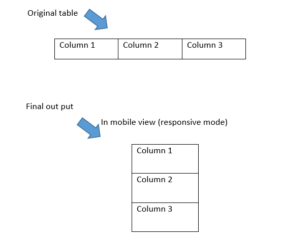
In mobile view, I want to see that table like the image attached below. Please tell me how to do it (final output). I’m not fluent in CSS.

attached image

HTML:

<table border="1" cellspacing="1" style="width: 100%px;">
  <tbody>
    <tr>
      <td>
        <a href="" target="_blank">
          <img alt="" border="0" src="https://hiru.lk/8Ds0Tf" title="" /></a>
      </td>
      <td>
        <a href="" target="_blank">
          <img alt="" border="0" src="https://hiru.lk/8Ds0Tf" title="" /></a>
      </td>
      <td>
        <a href="" target="_blank">
          <img alt="" border="0" src="https://hiru.lk/8Ds0Tf" title="" /></a>
      </td>
    </tr>
  </tbody>
</table>

2

Answers


  1. Here, using CSS-grids would be a great idea.

    Check this example:

    .grid-container {
      display: grid;
      gap: 1px;
      width: 100%;
    }
    
    .grid-container>a {
      border: 1px solid black;
      box-sizing: border-box;
    }
    
    .grid-container>a>img {
      display: block;
      width: 100%;
      height: auto;
    }
    
    
    /* For large screens */
    
    @media only screen and (min-width: 768px) {
      .grid-container {
        grid-template-columns: repeat(3, 1fr);
      }
    }
    <div class="grid-container">
      <a href="" target="_blank">
        <img alt="" border="0" src="https://hiru.lk/8Ds0Tf" title="" />
      </a>
      <a href="" target="_blank">
        <img alt="" border="0" src="https://hiru.lk/8Ds0Tf" title="" />
      </a>
      <a href="" target="_blank">
        <img alt="" border="0" src="https://hiru.lk/8Ds0Tf" title="" />
      </a>
    </div>
    Login or Signup to reply.
  2.  table {
            width: 100%;
            border-collapse: collapse;
        }
    
        td {
            padding: 5px;
            text-align: center;
          border: 1px solid #000;
        }
    
        /* Small screens */
        @media (max-width: 600px) {
            table {
                display: flex;
                flex-direction: column;
            }
    
            tr {
                display: flex;
                flex-direction: column;
            }
    
            td {
                width: 100%;
            }
        }
    <table>
        <tbody>
            <tr>
                <td>
                    <a href="" target="_blank">
                        <img alt="" border="0" src="https://hiru.lk/8Ds0Tf" title="" />
                    </a>
                </td>
                <td>
                    <a href="" target="_blank">
                        <img alt="" border="0" src="https://hiru.lk/8Ds0Tf" title="" />
                    </a>
                </td>
                <td>
                    <a href="" target="_blank">
                        <img alt="" border="0" src="https://hiru.lk/8Ds0Tf" title="" />
                    </a>
                </td>
            </tr>
        </tbody>
    </table>

    on smaller screens (max-width: 600px), the table is displayed as a flex container with the direction set to column, which makes the table rows stack vertically. Each table row () is also displayed as a flex container with the direction set to column, which makes the table cells () stack vertically within each row.

    Login or Signup to reply.
Please signup or login to give your own answer.
Back To Top
Search