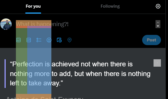
the problem
I am trying to add some options on top of Twitter UI for text editing, but when I do that, I get an issue, and I cannot show the element on top of other elements. It’s always being shown behind the siblings.
The code
Here is the code I am trying and running it on https://twitter.com/home
let tweetArea = document.querySelector(".public-DraftStyleDefault-block");

const unlistedItems = document.createElement('ul');
unlistedItems.innerHTML += `
  <li> Option 0</li>
  <li> Option 1</li>
  <li> Option 2</li>
  <li> Option 3</li>`;
unlistedItems.style.position = 'absolute';
unlistedItems.style.top = '0';
unlistedItems.style.backgroundColor = "red";
unlistedItems.style.zIndex = '100';

tweetArea.parentNode.insertBefore(unlistedItems, tweetArea);
The current vs desired behavior:
I am getting this result which adds the element but it does not show it on top of the siblings and parents. I want my element to be visible and shown even on top of the Gif icon and toolbar. How can I achieve that?
What did I try?
As for this I tried to use Z-index but it did not work and could not figure out what is the reason even though I used a really high one.
Questions that I checked:


2
Answers
The solution
The main issue I faced here was the stackedContext as what nkemdi and chris explained. To get over this issue, I have appended the element to the body directly. Then, I calculated the position of the element I want to position on top of it and added my element on top of that. Here is the solution:
code
Result:
Here is the result of this code:
Limitation:
The code above checks the position based on the view that's available when executed. If you want to keep the position constant, you need to do further coding for that to check the edge cases. Since it's out of the scope of this question, we will not dive into that.
Further reading:
The issue is related to stacking contexts and how parents with
z-indexaffect their children. You could try moving your list of items further up the tree so that it is not nested so deeply, moving it to a spot where its z-index is not being scoped. Of course, you would need to figure out how to get it into the right spot on the screen.Explanation
Suppose you have the following:
Notice how even though
.childhasz-index: 1000, it still goes underneath.extra? That’s because the z-index on.parentis explicitly less than or equal to the z-index on.extra. The result is that.child‘s z-index is essentially "scoped" to.parent, and since.parentand.extrahave the same z-index in this example,.extrashows up in front because it is lower in the HTML code.Meanwhile, in the snippet below, z-index is unset on
.parentand.extra. Now all of a sudden,.childis brought in front of.extrabecause its z-index is not being "scoped", if that makes sense. In your Twitter example, if you find your<ul>and start going up through its parents and removing theirpositionstyles (because z-index only affects positioned elements), you’ll notice that the list will eventually start to show through. That’s because of the exact same reason above.