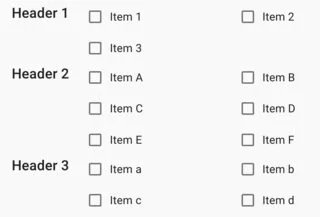
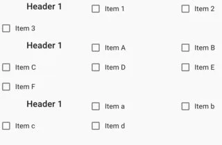
I am trying to recreate the above layout. Each header will be associated with a number of checkbox items. The checkboxes are generated dynamically, and I want the number of columns to grow if the user expands the window. I am trying to use a single CSS grid; however, when I do so, the checkboxes keep bleeding into the header column. See below.
import React from 'react';
import {FormControlLabel, Typography, Box, Checkbox} from '@material-ui/core';

const ITEMS_1 = ["Item 1", "Item 2", "Item 3",]
const ITEMS_2 = ["Item A", "Item B", "Item C", "Item D", "Item E", "Item F"]
const ITEMS_3 = ["Item a", "Item b", "Item c", "Item d",]

export const Grid = () => {
  return (
    <Box
        display="grid"
        gridTemplateColumns="repeat(auto-fit, minmax(14em, auto))"
        gridRowGap=".2em"
        justifyContent="space-evenly"
        width="100%"
    >
    {
        [ITEMS_1, ITEMS_2, ITEMS_3].map(
            (items) => <>
                <Box gridColumn="1/1">
                    <Typography align="center" variant="h6" >
                        Header 1
                    </Typography>
                </Box>
                {
                    items.map(
                        (value) => <FormControlLabel
                            label={value}
                            control={<Checkbox /> }
                        />

                    )
                }
            </>
        )
    }
    </Box>
  );
};
Is there a way I can place the Item elements such that they will still be automatically placed into the repeat columns, but they will never be inserted in the first column?

 Question posted in


2
Answers
You might want to consider taking the header out of the grid and unto a different box so the grid doesnt interfere with the header.
You might have to put the whole thing in a sort of container to separate it from other items.
I’d pull the header out into it’s own column. Semantically it would also be better because technically the headers are outside of the flow of the grid you are trying to create. Any reason why you are trying to use a single css grid?