skip to Main Content

NOTE: I’m using this URL https://svgur.com/i/126b.svg for illustration purposes, the actual SVG is in my computer among my other files so CORS isn’t an issue.

OBJECTIVE

To use this SVG as a mask with the black parts being made transparent. This mask should be applied on the before pseudo-element and should cover the very bottommost part.

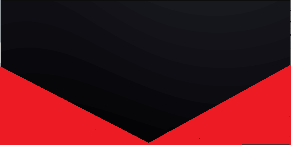
Below is my code and, underneath it, an image illustrating what I need. I’m using red to illustrate the area that should be revealed after applying the mask.

body {
  margin: 0;
  background: red;
}

#bg {
  background: black;
  width: 100vw;
  height: 100vh;
}

#bg::before {

  background-color: ;
  background-image: url("data:image/svg+xml,%3Csvg xmlns='http://www.w3.org/2000/svg' width='100%25' height='100%25' viewBox='0 0 1600 800'%3E%3Cg %3E%3Cpath fill='%23191a37' d='M486 705.8c-109.3-21.8-223.4-32.2-335.3-19.4C99.5 692.1 49 703 0 719.8V800h843.8c-115.9-33.2-230.8-68.1-347.6-92.2C492.8 707.1 489.4 706.5 486 705.8z'/%3E%3Cpath fill='%231e2044' d='M1600 0H0v719.8c49-16.8 99.5-27.8 150.7-33.5c111.9-12.7 226-2.4 335.3 19.4c3.4 0.7 6.8 1.4 10.2 2c116.8 24 231.7 59 347.6 92.2H1600V0z'/%3E%3Cpath fill='%23242550' d='M478.4 581c3.2 0.8 6.4 1.7 9.5 2.5c196.2 52.5 388.7 133.5 593.5 176.6c174.2 36.6 349.5 29.2 518.6-10.2V0H0v574.9c52.3-17.6 106.5-27.7 161.1-30.9C268.4 537.4 375.7 554.2 478.4 581z'/%3E%3Cpath fill='%23292b5d' d='M0 0v429.4c55.6-18.4 113.5-27.3 171.4-27.7c102.8-0.8 203.2 22.7 299.3 54.5c3 1 5.9 2 8.9 3c183.6 62 365.7 146.1 562.4 192.1c186.7 43.7 376.3 34.4 557.9-12.6V0H0z'/%3E%3Cpath fill='%232F3169' d='M181.8 259.4c98.2 6 191.9 35.2 281.3 72.1c2.8 1.1 5.5 2.3 8.3 3.4c171 71.6 342.7 158.5 531.3 207.7c198.8 51.8 403.4 40.8 597.3-14.8V0H0v283.2C59 263.6 120.6 255.7 181.8 259.4z'/%3E%3Cpath fill='%23343775' d='M1600 0H0v136.3c62.3-20.9 127.7-27.5 192.2-19.2c93.6 12.1 180.5 47.7 263.3 89.6c2.6 1.3 5.1 2.6 7.7 3.9c158.4 81.1 319.7 170.9 500.3 223.2c210.5 61 430.8 49 636.6-16.6V0z'/%3E%3Cpath fill='%233a3c81' d='M454.9 86.3C600.7 177 751.6 269.3 924.1 325c208.6 67.4 431.3 60.8 637.9-5.3c12.8-4.1 25.4-8.4 38.1-12.9V0H288.1c56 21.3 108.7 50.6 159.7 82C450.2 83.4 452.5 84.9 454.9 86.3z'/%3E%3Cpath fill='%233f428c' d='M1600 0H498c118.1 85.8 243.5 164.5 386.8 216.2c191.8 69.2 400 74.7 595 21.1c40.8-11.2 81.1-25.2 120.3-41.7V0z'/%3E%3Cpath fill='%23454798' d='M1397.5 154.8c47.2-10.6 93.6-25.3 138.6-43.8c21.7-8.9 43-18.8 63.9-29.5V0H643.4c62.9 41.7 129.7 78.2 202.1 107.4C1020.4 178.1 1214.2 196.1 1397.5 154.8z'/%3E%3Cpath fill='%234A4DA4' d='M1315.3 72.4c75.3-12.6 148.9-37.1 216.8-72.4h-723C966.8 71 1144.7 101 1315.3 72.4z'/%3E%3C/g%3E%3C/svg%3E");
  background-attachment: fixed;
  background-size: cover;
  content: '';
  width: 100%;
  height: 100%;
  position: absolute;
  opacity: 0.3;
  filter: saturate(0.2) brightness(1.1) contrast(1.25);

  /*mask-image: url('https://svgur.com/i/126b.svg');*/
  /*-webkit-mask-image: url('https://svgur.com/i/126b.svg');*/
  }
<div id="bg">


</div>

It should look like this.

enter image description here

WHAT I’VE TRIED

Adding:

mask-image: url('https://svgur.com/i/126b.svg');
-webkit-mask-image: url('https://svgur.com/i/126b.svg');

and a few other things. I also tried troubleshooting with ChatGPT, to no avail.

NOTE

I already achieved what I wanted using clip-path as shown below. However, I’d still love to know why the previous approach wasn’t working, if somebody knows!

clip-path: polygon(
                  0 0, /* top left corner of the rectangle */
                  100% 0, /* top right corner of the rectangle */
                  100% 100vh, /* bottom right corner of the rectangle */
                  50% calc(100vh + 280px), /* tip of the triangle */
                  0 100vh /* bottom left corner of the rectangle */
  );

2

Answers


  1. put yout SVG inside the element, set the position: absolute and left: 0; bottom: 0; to align it on bottom.

    body {
      margin: 0;
      background: red;
    }
    
    #bg {
      background: black;
      width: 100vw;
      height: 100vh;
    }
    
    #bg::before {
    
      background-color: ;
      background-image: url("data:image/svg+xml,%3Csvg xmlns='http://www.w3.org/2000/svg' width='100%25' height='100%25' viewBox='0 0 1600 800'%3E%3Cg %3E%3Cpath fill='%23191a37' d='M486 705.8c-109.3-21.8-223.4-32.2-335.3-19.4C99.5 692.1 49 703 0 719.8V800h843.8c-115.9-33.2-230.8-68.1-347.6-92.2C492.8 707.1 489.4 706.5 486 705.8z'/%3E%3Cpath fill='%231e2044' d='M1600 0H0v719.8c49-16.8 99.5-27.8 150.7-33.5c111.9-12.7 226-2.4 335.3 19.4c3.4 0.7 6.8 1.4 10.2 2c116.8 24 231.7 59 347.6 92.2H1600V0z'/%3E%3Cpath fill='%23242550' d='M478.4 581c3.2 0.8 6.4 1.7 9.5 2.5c196.2 52.5 388.7 133.5 593.5 176.6c174.2 36.6 349.5 29.2 518.6-10.2V0H0v574.9c52.3-17.6 106.5-27.7 161.1-30.9C268.4 537.4 375.7 554.2 478.4 581z'/%3E%3Cpath fill='%23292b5d' d='M0 0v429.4c55.6-18.4 113.5-27.3 171.4-27.7c102.8-0.8 203.2 22.7 299.3 54.5c3 1 5.9 2 8.9 3c183.6 62 365.7 146.1 562.4 192.1c186.7 43.7 376.3 34.4 557.9-12.6V0H0z'/%3E%3Cpath fill='%232F3169' d='M181.8 259.4c98.2 6 191.9 35.2 281.3 72.1c2.8 1.1 5.5 2.3 8.3 3.4c171 71.6 342.7 158.5 531.3 207.7c198.8 51.8 403.4 40.8 597.3-14.8V0H0v283.2C59 263.6 120.6 255.7 181.8 259.4z'/%3E%3Cpath fill='%23343775' d='M1600 0H0v136.3c62.3-20.9 127.7-27.5 192.2-19.2c93.6 12.1 180.5 47.7 263.3 89.6c2.6 1.3 5.1 2.6 7.7 3.9c158.4 81.1 319.7 170.9 500.3 223.2c210.5 61 430.8 49 636.6-16.6V0z'/%3E%3Cpath fill='%233a3c81' d='M454.9 86.3C600.7 177 751.6 269.3 924.1 325c208.6 67.4 431.3 60.8 637.9-5.3c12.8-4.1 25.4-8.4 38.1-12.9V0H288.1c56 21.3 108.7 50.6 159.7 82C450.2 83.4 452.5 84.9 454.9 86.3z'/%3E%3Cpath fill='%233f428c' d='M1600 0H498c118.1 85.8 243.5 164.5 386.8 216.2c191.8 69.2 400 74.7 595 21.1c40.8-11.2 81.1-25.2 120.3-41.7V0z'/%3E%3Cpath fill='%23454798' d='M1397.5 154.8c47.2-10.6 93.6-25.3 138.6-43.8c21.7-8.9 43-18.8 63.9-29.5V0H643.4c62.9 41.7 129.7 78.2 202.1 107.4C1020.4 178.1 1214.2 196.1 1397.5 154.8z'/%3E%3Cpath fill='%234A4DA4' d='M1315.3 72.4c75.3-12.6 148.9-37.1 216.8-72.4h-723C966.8 71 1144.7 101 1315.3 72.4z'/%3E%3C/g%3E%3C/svg%3E");
      background-attachment: fixed;
      background-size: cover;
      content: '';
      width: 100%;
      height: 100%;
      position: absolute;
      opacity: 0.3;
      filter: saturate(0.2) brightness(1.1) contrast(1.25);
    
      /*mask-image: url('https://svgur.com/i/126b.svg');*/
      /*-webkit-mask-image: url('https://svgur.com/i/126b.svg');*/
      }
      
      svg {
        position: absolute;
        left: 0;
        bottom: 0;
      }
    <div id="bg">
    <svg xmlns="http://www.w3.org/2000/svg" width="100vw" height="280px" viewBox="0 0 100 280" preserveAspectRatio="none" opacity="0.3">
        <!-- Left Triangle -->
        <polygon points="0,280 50,280 0,0"/>
        <!-- Right Triangle -->
        <polygon points="50,280 100,280 100,0"/>
    </svg>
    
    </div>
    Login or Signup to reply.
  2. If you need your mask svg to fit the parent elements width and height you can’t use vw or vh units.

    Instead you scale and "squeeze" the mask-image via CSS-masksize:100% 100

    :root{
    --mask:url("data:image/svg+xml,<svg width='100' height='280'  preserveAspectRatio='none' xmlns='http://www.w3.org/2000/svg'><polygon points='0 280 50 280 0 0' fill='black'/><polygon points='50 280 100 280 100 0'/></svg>");
    }
    
    body {
      margin: 0;
      background: red;
    }
    
    #bg {
      background: black;
      width: 100vw;
      height: 100vh;
    }
    
    #bg::before {
      background-image: url("data:image/svg+xml,%3Csvg xmlns='http://www.w3.org/2000/svg' width='100%25' height='100%25' viewBox='0 0 1600 800'%3E%3Cg %3E%3Cpath fill='%23191a37' d='M486 705.8c-109.3-21.8-223.4-32.2-335.3-19.4C99.5 692.1 49 703 0 719.8V800h843.8c-115.9-33.2-230.8-68.1-347.6-92.2C492.8 707.1 489.4 706.5 486 705.8z'/%3E%3Cpath fill='%231e2044' d='M1600 0H0v719.8c49-16.8 99.5-27.8 150.7-33.5c111.9-12.7 226-2.4 335.3 19.4c3.4 0.7 6.8 1.4 10.2 2c116.8 24 231.7 59 347.6 92.2H1600V0z'/%3E%3Cpath fill='%23242550' d='M478.4 581c3.2 0.8 6.4 1.7 9.5 2.5c196.2 52.5 388.7 133.5 593.5 176.6c174.2 36.6 349.5 29.2 518.6-10.2V0H0v574.9c52.3-17.6 106.5-27.7 161.1-30.9C268.4 537.4 375.7 554.2 478.4 581z'/%3E%3Cpath fill='%23292b5d' d='M0 0v429.4c55.6-18.4 113.5-27.3 171.4-27.7c102.8-0.8 203.2 22.7 299.3 54.5c3 1 5.9 2 8.9 3c183.6 62 365.7 146.1 562.4 192.1c186.7 43.7 376.3 34.4 557.9-12.6V0H0z'/%3E%3Cpath fill='%232F3169' d='M181.8 259.4c98.2 6 191.9 35.2 281.3 72.1c2.8 1.1 5.5 2.3 8.3 3.4c171 71.6 342.7 158.5 531.3 207.7c198.8 51.8 403.4 40.8 597.3-14.8V0H0v283.2C59 263.6 120.6 255.7 181.8 259.4z'/%3E%3Cpath fill='%23343775' d='M1600 0H0v136.3c62.3-20.9 127.7-27.5 192.2-19.2c93.6 12.1 180.5 47.7 263.3 89.6c2.6 1.3 5.1 2.6 7.7 3.9c158.4 81.1 319.7 170.9 500.3 223.2c210.5 61 430.8 49 636.6-16.6V0z'/%3E%3Cpath fill='%233a3c81' d='M454.9 86.3C600.7 177 751.6 269.3 924.1 325c208.6 67.4 431.3 60.8 637.9-5.3c12.8-4.1 25.4-8.4 38.1-12.9V0H288.1c56 21.3 108.7 50.6 159.7 82C450.2 83.4 452.5 84.9 454.9 86.3z'/%3E%3Cpath fill='%233f428c' d='M1600 0H498c118.1 85.8 243.5 164.5 386.8 216.2c191.8 69.2 400 74.7 595 21.1c40.8-11.2 81.1-25.2 120.3-41.7V0z'/%3E%3Cpath fill='%23454798' d='M1397.5 154.8c47.2-10.6 93.6-25.3 138.6-43.8c21.7-8.9 43-18.8 63.9-29.5V0H643.4c62.9 41.7 129.7 78.2 202.1 107.4C1020.4 178.1 1214.2 196.1 1397.5 154.8z'/%3E%3Cpath fill='%234A4DA4' d='M1315.3 72.4c75.3-12.6 148.9-37.1 216.8-72.4h-723C966.8 71 1144.7 101 1315.3 72.4z'/%3E%3C/g%3E%3C/svg%3E");
      //background-attachment: fixed;
      background-size: cover;
      content: '';
      width: 100%;
      height: 100%;
      position: absolute;
      opacity: 1;
      filter: saturate(0.2) brightness(1.1) contrast(1.25);
      mask-image: var(--mask);
      -webkit-mask-image: var(--mask);
      mask-size: 100% 100%;
    }
    <div id="bg">
    </div>

    Frankly, in your case css polygon based clip-paths are certainly the better option as they permit relative units by default.

    Login or Signup to reply.
Please signup or login to give your own answer.
Back To Top
Search