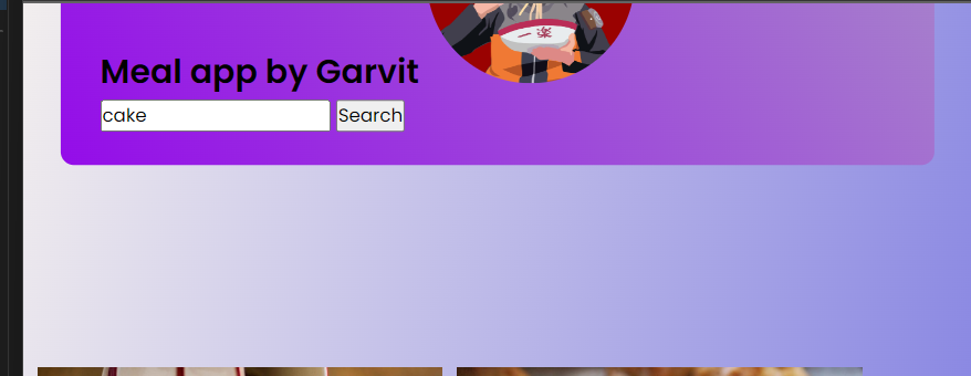
I am trying to put image at right of the text but it always get cropped out of the container
html/css is:
body {
  background-color: #1e4bdd;
  background: linear-gradient(105deg, #f2eeee, #0808d4);
}

.container {
  text-align: justify;
  background-color: #ffffff;
  font-size: 16px;
  padding: 01.5em 1.8em;
  width: 90vw;
  max-width: 100em;
  position: relative;
  transform: translate(-50%, -50%);
  left: 50%;
  top: 50%;
  border-radius: 0.6em;
  background: linear-gradient(55deg, #940ce9, #a88bc9);
}

.image {
  border-radius: 50%;
  border: #1e4bdd;
  float: center;
}
<div class="seacrh">
<h2> Meal app by Garvit <img class="image" src="heading.jpg" width="150" height="150"></h2>
<input type="text" placeholder="Type A NOM NOM Dish.." class="inputBox" />
<button class="inputBtn">Search</button>
</div>So basically, it gets cropped out of the container. i don’t understand why. I tried floating too, but it did not work.


2
Answers
You can replace your code with this. And it should work. I have included two css classes
header-titles&header-imageAnd here are those two css classes.
The HTML and CSS that you provided don’t match. You have
<div class="seacrh">and.container {}. I am going to assume that this should be the same class name and I’ll use the correct spelling of "search".As already commented, the cropping is due to the positioning declarations. This is how it looks without that:
This example suggests using flexbox to position the image next to the heading and search box. By nesting the header and search box in a
div, thatdivand the image can be positioned side-by-side.