


I want to keep my child left align and also to take the full width of the container just like when we do justify-content: space-between
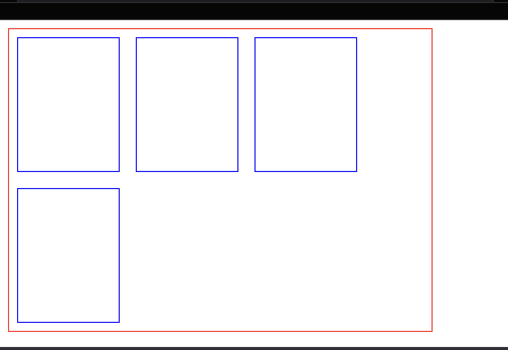
<div class='parent'>
  <div class='child'></div>
  <div class='child'></div>
  <div class='child'></div>
  <div class='child'></div>
</div>
.parent {
  border: 1px solid red;
  width: 420px;
  height: 300px;
  display: flex;
  flex-wrap: wrap;
  justify-content: left;
}

.child {
  border: 1px solid blue;
  width: 100px;
  margin: 8px;
}
2
Answers
to get your desired layout where the first row stretches to fill the full width and the children are left-aligned, you can use a combination of CSS Grid and Flexbox. Here’s how you can modify your HTML and CSS:
JSFiddle
HTML
CSS
I don’t get the question completely but if you just want your first child to take full width you can just