


I need help filling up 100 percent of my computer screen’s height using Flexbox, while maintaining responsiveness:
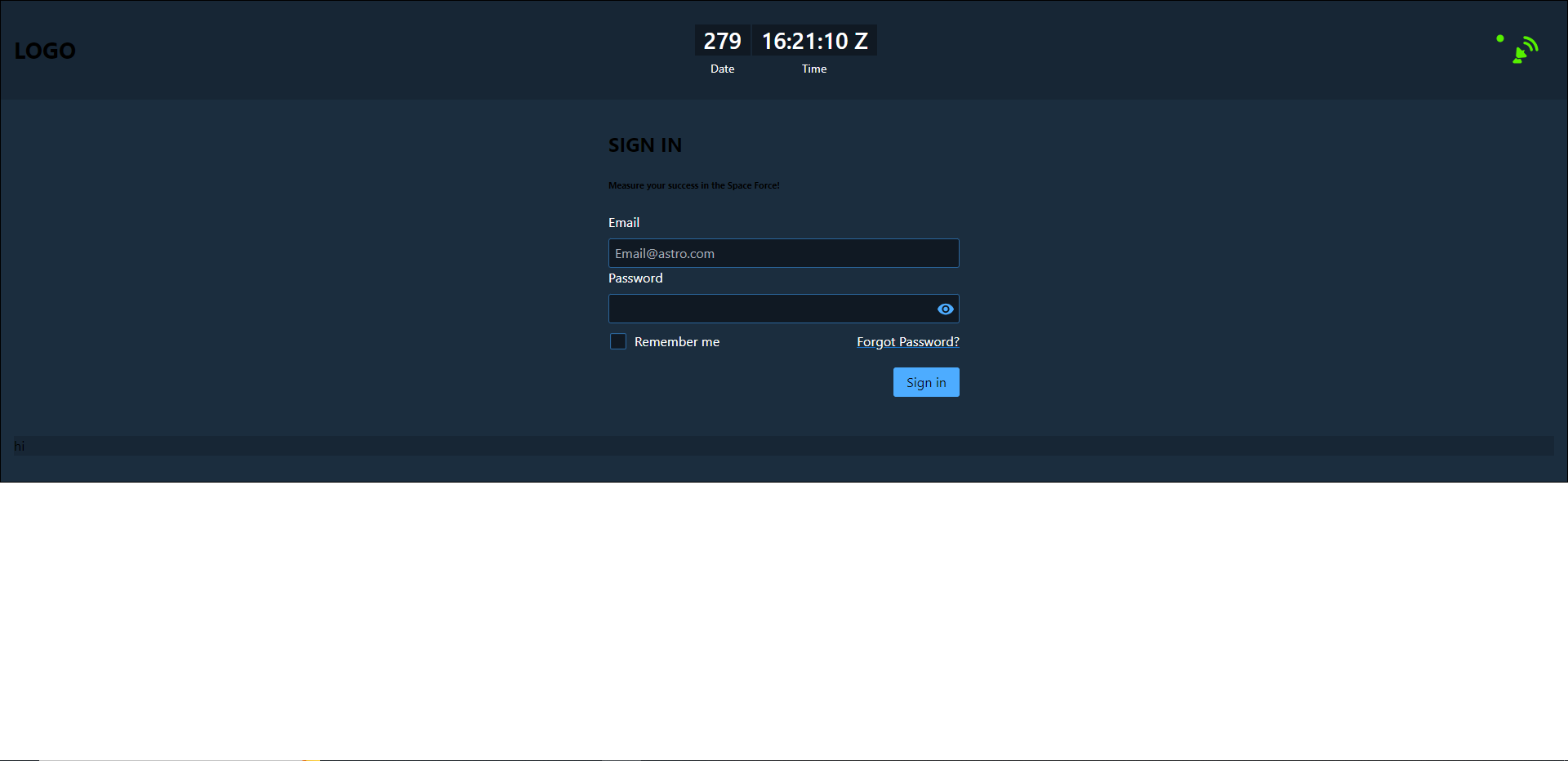
My current sign in page via Chrome (Notice the whitespace):
My current frontend code:
const SignIn = () => {
  return (
    <RuxContainer className="container">
      <div slot="header" className="header-container">
        <h3 className="first-header-item">LOGO</h3>
        <RuxClock timezone="Z"></RuxClock>
        <RuxMonitoringIcon status="normal"></RuxMonitoringIcon>
      </div>
      <div className="body-container">
        <form className="rux-form">
          <h2 className="body-sign-in">SIGN IN</h2>
          <h6>Measure your success in the Space Force!</h6>
          <div className="sign-in-inputs">
            <rux-input
              id="email"
              placeholder="[email protected]"
              label="Email"
              type="email"
              ruxblur="{handleValidation()}"
            ></rux-input>
            <rux-input id="pw" label="Password" type="password"></rux-input>
          </div>
          <div className="sign-in-helper-functions">
            <rux-checkbox class="checkbox">Remember me</rux-checkbox>
            <p className="forgot-password">Forgot Password?</p>
          </div>
          <div className="sign-in-container">
            <rux-button className="sign-in-btn" type="submit">
              Sign in
            </rux-button>
          </div>
        </form>
      </div>
      <div slot="footer" className="footer">
        <p>hi</p>
      </div>
    </RuxContainer>
  );
};

export default SignIn;
And, finally, here is my CSS code that uses flexbox:
body {
  margin: 0;
}

.header-container {
  display: flex;
  justify-content: space-between;
  align-items: center;
}

.body-container {
  display: flex;
  flex-direction: column;
  align-items: center;
}

.rux-form {
  width: 30%;
  max-width: 430px;
}

.sign-in-helper-functions {
  display: flex;
  justify-content: space-between;
  margin-top: 10px;
}

.forgot-password {
  margin: 0;
  color: white;
  text-decoration: underline;
  text-decoration-color: #1976d2;
}

.sign-in-container {
  display: flex;
  justify-content: end;
  width: 100%;
  margin-top: 20px;
}

.footer {
  background-color: #172635;
}
I have tried messing with the main html and body tags but nothing seems to work.
2
Answers
now this will fill up 100% of the computer screen’s height, while maintaining responsiveness. You can adjust the flex-grow value on the body-container to change the ratio of the header, body and footer in the container.
Maybe making the
.containeroccupies at least the full height and width of the viewport would work:if it didn’t maybe try to set the
.containerdisplay to flex, and make the.body-containertakes the remaining vertical space: