skip to Main Content

I am new to CSS, and I need help. My problem here is that no matter what I do, the Home button doesn’t come to the middle of the screen. Can you please help me with that? Here is my code. By the way, I am working with Bootstrap 5 classes but as much as I tried to fix it with those classes I think I need to fix it with CSS. Thank you for your help.

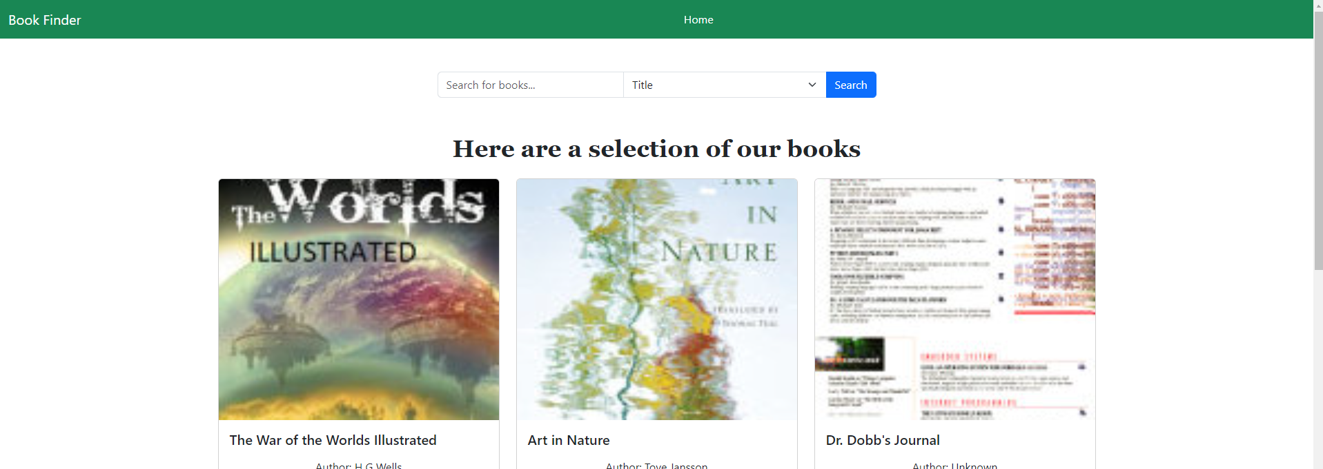
I tried checking some posts on this site but none of the solutions worked. I also tried fixing it with ChatGPT, but it didn’t work. This is how it looks like

<link href="https://cdn.jsdelivr.net/npm/[email protected]/dist/css/bootstrap.min.css" rel="stylesheet"/>
<nav class="navbar navbar-expand-sm navbar-dark bg-success" aria- 
label="Third navbar example">
<div class="container-fluid">
<a class="navbar-brand" href="#">Book Finder</a>
<button class="navbar-toggler" type="button" data-bs- 
toggle="collapse" data-bs-target="#navbarsExample03" aria- 
controls="navbarsExample03" aria-expanded="false" aria-label="Toggle 
navigation">
    <span class="navbar-toggler-icon"></span>
  </button>
  <div class="collapse navbar-collapse justify-content-center">
    <ul class="navbar-nav mb-2 mb-sm-0 ">
      <li class="nav-item">
        <a class="nav-link active" aria-current="page" [routerLink]="['/homepage']">Home</a>
      </li>
    </ul>
  </div>
</div>

2

Answers


  1. How I would approach this is to make logo (in this case Book Finder) to have an position of absolute, then position it accordingly relative to the parent (navbar). Then for the navbar-nav, you can apply display: flex together with justify-content: center.

    <link href="https://cdn.jsdelivr.net/npm/[email protected]/dist/css/bootstrap.min.css" rel="stylesheet"/>
    <nav class="navbar navbar-expand-sm navbar-dark bg-success" aria- 
    label="Third navbar example">
    <div class="container-fluid">
    <a class="navbar-brand position-absolute" href="#">Book Finder</a>
    <button class="navbar-toggler" type="button" data-bs- 
    toggle="collapse" data-bs-target="#navbarsExample03" aria- 
    controls="navbarsExample03" aria-expanded="false" aria-label="Toggle 
    navigation">
        <span class="navbar-toggler-icon"></span>
      </button>
      <div class="collapse navbar-collapse justify-content-center">
        <ul class="navbar-nav mb-2 mb-sm-0 ">
          <li class="nav-item">
            <a class="nav-link active" aria-current="page" [routerLink]="['/homepage']">Home</a>
          </li>
        </ul>
      </div>
    </div>
    Login or Signup to reply.
  2. enter image description here

    This is updated code and in this code, I set position of container-fluid to relative and set position of Home to absolute. So The home button is posited at the middle center of the sceen without effect of "Book Finder" at the left corner.

    <nav class="navbar navbar-expand-sm navbar-dark bg-success" aria-="" label="Third navbar example">
    /*Update here*/
    <div class="container-fluid" style="position: relative;">
    <a class="navbar-brand" href="#">Book Finder</a>
    <button class="navbar-toggler" type="button" data-bs-="" toggle="collapse" data-bs-target="#navbarsExample03" aria-="" controls="navbarsExample03" aria-expanded="false" aria-label="Toggle 
    navigation">
        <span class="navbar-toggler-icon"></span>
      </button>
      /*Update here*/
      <div class="collapse navbar-collapse justify-content-center" style="
        position: absolute;
        left: 50%;
        transform: translateX(-50%);
        width: 100%;
      ">
        <ul class="navbar-nav mb-2 mb-sm-0 ">
          <li class="nav-item">
            <a class="nav-link active" aria-current="page" [routerlink]="['/homepage']">Home</a>
          </li>
        </ul>
      </div>
    </div></nav>
    
    Login or Signup to reply.
Please signup or login to give your own answer.
Back To Top
Search