skip to Main Content

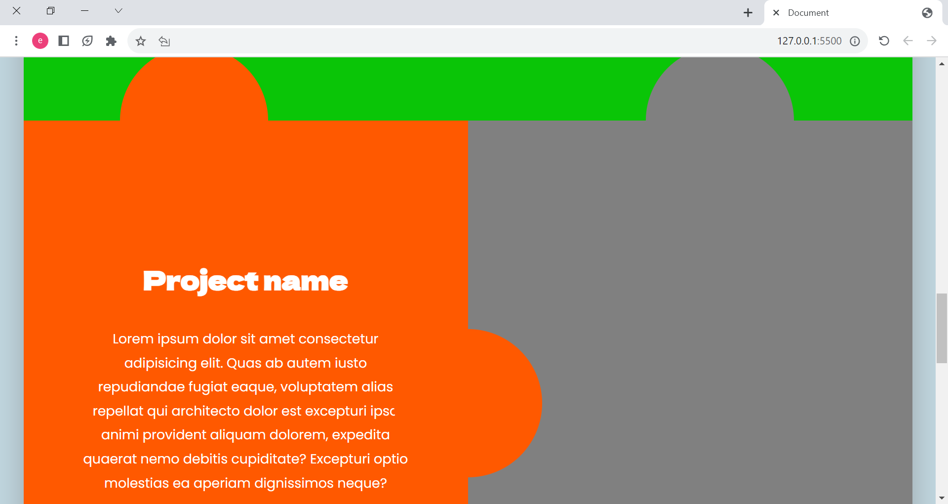
I am creating the page layout to be like puzzle pieces, I want the image to take the shape of one of the pieces, is there any way -or maybe property like background-clip: text but for images- to do this? Here is a picture of the layout, I want the image to fit the whole of the grey part. I’ve tried to make the image background-image but couldn’t manage to make it works.

enter image description here

here is the related code :
HTML :

<section class="project-details-section">
        <div class="project-info">
          <h2 class="project-name">Project name</h2>
          <div class="circle-general circle--left-top"></div>
          <div class="circle-general circle--centre-left"></div>
          <p class="project-paragraph">
            Lorem ipsum dolor sit amet consectetur adipisicing elit. Quas ab autem iusto repudiandae fugiat eaque, voluptatem alias repellat qui architecto dolor est excepturi ipsa animi provident aliquam dolorem, expedita quaerat nemo debitis cupiditate? Excepturi optio molestias ea aperiam dignissimos neque?
          </p>
        </div>
        <div class="project-photo">
          <div class="circle-general circle--right-top"></div>
          </div>
        </div>
      
      </section>

CSS:

.projects-section {
  background-color: #0ac507;
  position: relative;
  z-index: 95;
}

.project-details-section {
  color: white;
  position: relative;
  z-index: 96;
  display: grid;
  grid-template-columns: 50% 50%;
}

.project-info {
  display: flex;
  flex-direction: column;
  align-items: center;
  justify-content: center;
  text-align: center;

  position: relative;
  z-index: 99;
  background-color: #ff5900;
  
}

.project-name {
  font-size: 3.5rem;
}

.project-paragraph {
  text-align: center;
  padding: 0 8rem;
  margin-top: 4rem;
}

.project-photo {
  background-color: grey;
}

.circle--left-top {
  top: 0;
  left: 5%;
  transform: translate(50%, -50%);
}

.circle--right-top {
  top: 0;
  right: 5%;
  transform: translate(-50%, -50%);
}

.circle--centre-left {
  top: 55%;
  left: 100%;
  transform: translate(-50%, -50%);
}

2

Answers


  1. You can use clip-path to achieve this, you’ll need to create a better clip path, here is a tool: https://bennettfeely.com/clippy/

    .puzzle {
    width:200px;
    height:200px;
    clip-path: polygon(0% 26%, 26% 25%, 28% 18%, 31% 16%, 40% 13%, 46% 13%, 48% 15%, 53% 20%, 53% 23%, 53% 24%, 54% 27%, 87% 26%, 89% 53%, 93% 55%, 96% 56%, 98% 59%, 98% 61%, 97% 66%, 94% 70%, 92% 73%, 90% 73%, 88% 76%, 88% 100%, 1% 100%);
    background-image: url('https://picsum.photos/200')
    
    }
    <div class="puzzle">
    </div>
    Login or Signup to reply.
  2. The easiest way is to create an svg shape and apply it as a clip-path to your block. Something like this:

    .wrapp{
      display: inline-flex;
      align-items: flex-end;
      background: blue;
    }
    .svg {
      position: absolute;
      width: 0;
      height: 0;
    }
    .clipped {
      width: 200px;
      height: 200px;
      background: turquoise url(https://source.unsplash.com/600x600?summer);
      background-size: cover;
      clip-path: url(#my-clip-path);
      margin-right: -48px;
      margin-top: -8px;
    }
    
    .sibling{
      background: yellow;
      width: 141px;
      height: 141px;
      border-top-left-radius: 8px;
    }
    <div class="wrapp">
      <div class="clipped"></div>
      <div class="sibling"></div>
    </div>
    <svg class="svg">
      <clipPath id="my-clip-path" clipPathUnits="objectBoundingBox"><path d="M0.866,0.518 c-0.025,0,-0.049,0.008,-0.069,0.021 c-0.008,0.005,-0.017,0.005,-0.025,0 s-0.013,-0.014,-0.013,-0.023 V0.343 c0,-0.027,-0.021,-0.048,-0.045,-0.048 h-0.196 c-0.009,0,-0.017,-0.005,-0.021,-0.013 c-0.004,-0.008,-0.005,-0.018,0,-0.026 c0.011,-0.021,0.017,-0.045,0.017,-0.07 c0,-0.08,-0.06,-0.145,-0.134,-0.145 c-0.074,0,-0.134,0.065,-0.134,0.145 c0,0.025,0.006,0.049,0.017,0.07 c0.004,0.008,0.004,0.018,0,0.026 c-0.004,0.008,-0.012,0.013,-0.021,0.013 H0.045 c-0.025,0,-0.045,0.021,-0.045,0.048 v0.169 c0,0.009,0.005,0.018,0.012,0.023 c0.007,0.005,0.017,0.005,0.024,0.001 c0.019,-0.011,0.041,-0.017,0.064,-0.017 c0.074,0,0.134,0.065,0.134,0.145 c0,0.08,-0.06,0.145,-0.134,0.145 c-0.023,0,-0.045,-0.006,-0.064,-0.017 c-0.008,-0.004,-0.017,-0.004,-0.024,0.001 C0.005,0.796,0,0.805,0,0.814 v0.179 c0,0.027,0.02,0.048,0.045,0.048 h0.669 c0.025,0,0.045,-0.022,0.045,-0.048 v-0.183 c0,-0.01,0.005,-0.018,0.013,-0.023 c0.008,-0.005,0.017,-0.005,0.025,0 c0.02,0.013,0.044,0.021,0.069,0.021 c0.074,0,0.134,-0.065,0.134,-0.145 C1,0.583,0.94,0.518,0.866,0.518"></path></clipPath>
    </svg>

    Resources for this answer:
    https://www.svgrepo.com/svg/36896/puzzle-piece
    https://yoksel.github.io/relative-clip-path/

    Login or Signup to reply.
Please signup or login to give your own answer.
Back To Top
Search