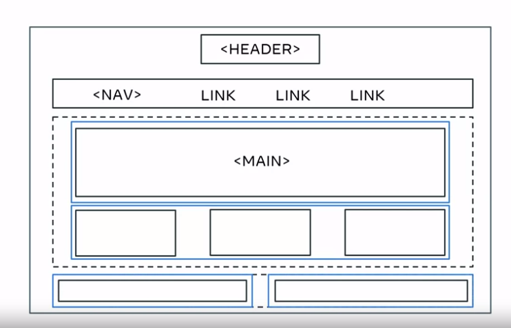
I am trying to come up with the format in the image using flexbox, but currently my navbar is in a column not row. Am unsure of how to fix this or if I should be using grid/another way to come up with the format. I managed to do it by setting the display individually(setting display to inline-block on nav bar, footer etc) but am wondering if there is a more efficient way to do so/or my current idea of doing it is wrong. I tried grid using a 4×3 making it "header header header header" "nav nav nav nav" and so on but i did not know how to make the main fill up the row it was taking with only 3 sections.
body {
  background-color: white;
  font-family: 'Markazi Text', 'serif';
  text-align: center;
  display: flex;
  flex-flow: column wrap;
  justify-content: stretch;
}

header>img {
  width: 25%;
}

nav>ul {
  list-style: none;
  background-color: grey;
  flex-flow: row wrap;
}

nav>li {
  padding: 5px;
  flex-basis: auto;
}

main article {}

.foot {}
<!DOCTYPE html>
<html lang="en">
<head>
<title>Little Lemon</title>
<link href="styles.css" rel="stylesheet">
</head>
<body>
<header>
<img src="Images/Asset [email protected]" alt="Little Lemon Logo">
</header>
<nav>
<ul class name="uList">
<li class name="list"><a href="index.html">Home</a></li>
<li class name="list"><a href="menu.html">Menu</a></li>
<li class name="list"><a href="book.html">Book</a></li>
<li class name="list"><a href="about.html">About</a></li>
</ul>
</nav>
<main>
<h1>Main</h1>
<section class="article">section1</section>
<section class="article">section2</section>
<section class="article">section3</section>
</main>
<footer>
<h1 class="foot">footer1</h1>
<h1 class="foot">footer2</h1>
</footer>
</body>
</html>


2
Answers
You can refer to this code and let me know it it works. I guess I made it correct and will be useful to you. Thank you.
First of all let me suggest some good resources that should help you with the
Flexboxconcept:Now, let me showcase a simple attempt to accomplish your desired design which you can build upon and tinker with it.
And as I said, this is just an attempt that you will hopefully find useful and that’ll allow you to build upon and have your own ides.
And finally, I recommend looking at the different
CSSlibraries and frameworks out there, such asbootstrap,tailwind…, and check how they implement and use their ownflexboxutilities as I think this will help you to have a better idea on howflexboxwork.