skip to Main Content

I have a basic website where there should be a background image that displays underneath all elements, but when I display it, it never displays underneath the Navigation bar. This even occurs when I set it to a background image, but instead of not displaying it displays a seccond copy of the image in the nav bar background.

Here is what it looks like when the image is just put it: Image of navbar not working

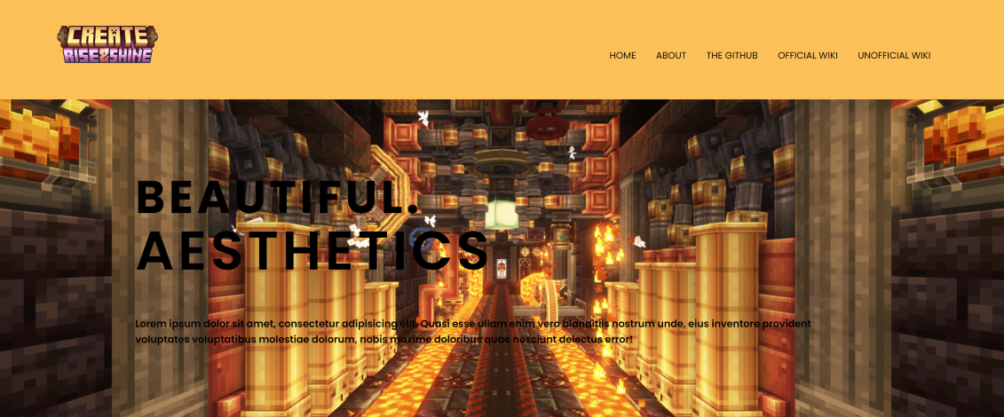
And here is what it looks like when I set it to be a background image and a normal image: Image of navbar showing repeat when set to background image

As well as what it looks like when you only set it as a background image and remove the normal image tag: Image of double repeat background

Here is my code:

<!DOCTYPE html>
<html class="gallery-html">
    <head>
        <meta charset="UTF-8" />
        <meta http-equiv="X-UA-Compatible" content="IE=edge" />
        <meta name="viewport" content="width=device-width, initial-scale=1.0" />
        <title>The Create Mod - Gallery</title>
        <link rel="stylesheet" href="style.css" />
        <script src="https://kit.fontawesome.com/8d3778546a.js" crossorigin="anonymous"></script>
        <link href="https://fonts.googleapis.com/css2?family=Poppins:wght@100;200;300;400;600;700&display=swap" rel="stylesheet" />
        <script defer src="app.js"></script>
    </head>
    <body>
        <div class="container home">
            <section class="home">
                <nav class="nav-2">
                    <a href="boxmodel.html"><img class="nottobescaled" src="images/logo.png" alt="The Create 'Rise and Shine' Logo" class="image-1" /></a>
                    <div class="nav-links-2" id="navLinks-2">
                        <i class="fa-solid fa-xmark" style="color: #fffcdd" onclick="hideMenu()"></i>
                        <ul>
                            <li><a href="boxmodel.html">HOME</a></li>
                            <li><a href="about.html">ABOUT</a></li>
                            <li><a href="https://github.com/Creators-of-Create/Create">THE GITHUB</a></li>
                            <li><a href="https://github.com/Creators-of-Create/Create/wiki">OFFICIAL WIKI</a></li>
                            <li><a href="https://create.fandom.com/wiki/Create_Mod_Wiki">UNOFFICIAL WIKI</a></li>
                        </ul>
                    </div>
                    <i class="fa-solid fa-bars" style="color: #fffcdd" onclick="showMenu()"></i>
                </nav>
            </section>
            <script>
                var navLinks = document.getElementById("navLinks");

                function showMenu() {
                    navLinks.style.right = "0";
                }

                function hideMenu() {
                    navLinks.style.right = "-200px";
                }
            </script>
            <section class="home onlytexthome image-slide-parent">
                <img class="image-slide" src="images/gallery-1.png" />
                <!-- <div class="image-blank-div"></div> -->
                <div class="content">
                    <h1>
                        Beautiful.
                        <br />
                        <span class="styled-text">Aesthetics</span>
                    </h1>
                    <p>Lorem ipsum dolor sit amet, consectetur adipisicing elit. Quasi esse ullam enim vero blanditiis nostrum unde, eius inventore provident voluptates voluptatibus molestiae dolorum, nobis maxime doloribus quae nesciunt delectus error!</p>
                </div>
            </section>
        </div>
    </body>
</html>
.nav-2 img {
    transition: transform 0.5s ease-in-out;
    width: 150px;
}
.nav-2 img:hover {
    transform: scale(1.2);
}
.nav-2 i {
    display: none;
}
.nav-2 {
    display: flex;
    padding: 2% 6%;
    justify-content: space-between;
    align-items: center;
}
.nav-links-2 {
    flex: 1;
    text-align: right;
}
.nav-links-2 ul li {
    list-style: none;
    display: inline-block;
    padding: 8px 12px;
    position: relative;
}
.nav-links-2 ul li a {
    color: white;
    text-decoration: none;
    font-size: 13px;
}
.nav-links-2 ul li::after {
    content: "";
    width: 0%;
    height: 2px;
    background: var(--orange-wheel-hex);
    display: block;
    margin: auto;
    transition: 0.5s;
}
.nav-links-2 ul li:hover::after {
    width: 100%;
    border-radius: 50px;
}
.onlytexthome {
    padding: 100px 200px;
}
.gallery-html {
    position: relative;
    display: block;
    width: 100%;
}
.gallery-html ul li a {
    color: black;
}
.home {
    position: relative;
    display: flex;
    justify-content: center;
    flex-direction: column;
    background: var(--xanthous-hex);
    z-index: 10;
    background-image: url(images/);
}
.home .image-slide-parent img {
    z-index: 0;
    position: absolute;
    top: 0;
    left: 0;
    width: 100%;
    height: 100%;
    object-fit: cover;
    background-size: cover;
}
.onlytexthome p {
    padding-left: 0;
    color: black;
    font-weight: 600;
}
.onlytexthome h1 {
    font-size: 4em;
    font-weight: 900;
    text-transform: uppercase;
    letter-spacing: 5px;
    line-height: 75px;
    margin-bottom: 40px;
}
.content {
    z-index: 1;
}
.container .home {
    z-index: 1;
}

I tried to change it to a background image but it just duplicated it, showing it twice, once in the nav bar and once again in the body. I am expecting the image to cover the entire screen. I have also tried the z-index, but that does not seem to work.

2

Answers


  1. One thing that I noticed is that you applied the class "home" on your two sections.

    You can add the "home" class on the container class so that it will call once.

    Sample:

    <!DOCTYPE html>
    <html class="gallery-html">
        <head>
            <meta charset="UTF-8" />
            <meta http-equiv="X-UA-Compatible" content="IE=edge" />
            <meta name="viewport" content="width=device-width, initial-scale=1.0" />
            <title>The Create Mod - Gallery</title>
            <link rel="stylesheet" href="style.css" />
            <script src="https://kit.fontawesome.com/8d3778546a.js" crossorigin="anonymous"></script>
            <link href="https://fonts.googleapis.com/css2?family=Poppins:wght@100;200;300;400;600;700&display=swap" rel="stylesheet" />
            <script defer src="app.js"></script>
        </head>
        <body>
    
            <style>
    
    
    .nav-2 img {
        transition: transform 0.5s ease-in-out;
        width: 150px;
    }
    .nav-2 img:hover {
        transform: scale(1.2);
    }
    .nav-2 i {
        display: none;
    }
    .nav-2 {
        display: flex;
        padding: 2% 6%;
        justify-content: space-between;
        align-items: center;
    }
    .nav-links-2 {
        flex: 1;
        text-align: right;
    }
    .nav-links-2 ul li {
        list-style: none;
        display: inline-block;
        padding: 8px 12px;
        position: relative;
    }
    .nav-links-2 ul li a {
        color: white;
        text-decoration: none;
        font-size: 13px;
    }
    .nav-links-2 ul li::after {
        content: "";
        width: 0%;
        height: 2px;
        background: var(--orange-wheel-hex);
        display: block;
        margin: auto;
        transition: 0.5s;
    }
    .nav-links-2 ul li:hover::after {
        width: 100%;
        border-radius: 50px;
    }
    .onlytexthome {
        padding: 100px 200px;
    }
    .gallery-html {
        position: relative;
        display: block;
        width: 100%;
    }
    .gallery-html ul li a {
        color: black;
    }
    .home {
        position: relative;
        display: flex;
        justify-content: center;
        flex-direction: column;
        /* background: var(--xanthous-hex); */
        z-index: 10;
        background-image: url(https://png.pngtree.com/thumb_back/fh260/background/20200714/pngtree-modern-double-color-futuristic-neon-background-image_351866.jpg);
    }
    .home .image-slide-parent img {
        z-index: 0;
        position: absolute;
        top: 0;
        left: 0;
        width: 100%;
        height: 100%;
        object-fit: cover;
        background-size: cover;
    }
    .onlytexthome p {
        padding-left: 0;
        color: black;
        font-weight: 600;
    }
    .onlytexthome h1 {
        font-size: 4em;
        font-weight: 900;
        text-transform: uppercase;
        letter-spacing: 5px;
        line-height: 75px;
        margin-bottom: 40px;
    }
    .content {
        z-index: 1;
    }


            </style>
            <div class="container home">
                <section class="">
                    <nav class="nav-2">
                        <a href="boxmodel.html"><img class="nottobescaled" src="https://img.freepik.com/free-vector/bird-colorful-gradient-design-vector_343694-2506.jpg" alt="The Create 'Rise and Shine' Logo" class="image-1" /></a>
                        <div class="nav-links-2" id="navLinks-2">
                            <i class="fa-solid fa-xmark" style="color: #fffcdd" onclick="hideMenu()"></i>
                            <ul>
                                <li><a href="boxmodel.html">HOME</a></li>
                                <li><a href="about.html">ABOUT</a></li>
                                <li><a href="https://github.com/Creators-of-Create/Create">THE GITHUB</a></li>
                                <li><a href="https://github.com/Creators-of-Create/Create/wiki">OFFICIAL WIKI</a></li>
                                <li><a href="https://create.fandom.com/wiki/Create_Mod_Wiki">UNOFFICIAL WIKI</a></li>
                            </ul>
                        </div>
                        <i class="fa-solid fa-bars" style="color: #fffcdd" onclick="showMenu()"></i>
                    </nav>
                </section>
                <script>
                    var navLinks = document.getElementById("navLinks");
    
                    function showMenu() {
                        navLinks.style.right = "0";
                    }
    
                    function hideMenu() {
                        navLinks.style.right = "-200px";
                    }
                </script>
                <section class=" onlytexthome image-slide-parent">
                    <img class="image-slide" src="images/gallery-1.png" />
                    <!-- <div class="image-blank-div"></div> -->
                    <div class="content">
                        <h1>
                            Beautiful.
                            <br />
                            <span class="styled-text">Aesthetics</span>
                        </h1>
                        <p>Lorem ipsum dolor sit amet, consectetur adipisicing elit. Quasi esse ullam enim vero blanditiis nostrum unde, eius inventore provident voluptates voluptatibus molestiae dolorum, nobis maxime doloribus quae nesciunt delectus error!</p>
                    </div>
                </section>
            </div>
        </body>
    </html>

    Hope it helps.

    Login or Signup to reply.
  2. If you want the background image to cover the entire screen, I suggest applying the styles on the body tag or the topmost parent that you have if you don’t want to use the body tag.

    background-size: cover property will make the image stretch over the entire container.

    As per MDN docs, the cover property is defined as

    Scales the image (while preserving its ratio) to the smallest possible size to fill the container (that is: both its height and width completely cover the container), leaving no empty space. If the proportions of the background differ from the element, the image is cropped either vertically or horizontally.

    body {
        background-image: url(https://png.pngtree.com/thumb_back/fh260/background/20200714/pngtree-modern-double-color-futuristic-neon-background-image_351866.jpg);
        background-repeat: no-repeat;
        background-size: cover;
        height: 100vh;
        margin: 0;
    }
    
    .nav-2 img {
        transition: transform 0.5s ease-in-out;
        width: 150px;
    }
    
    .nav-2 img:hover {
        transform: scale(1.2);
    }
    
    .nav-2 i {
        display: none;
    }
    
    .nav-2 {
        display: flex;
        padding: 2% 6%;
        justify-content: space-between;
        align-items: center;
    }
    
    .nav-links-2 {
        flex: 1;
        text-align: right;
    }
    
    .nav-links-2 ul li {
        list-style: none;
        display: inline-block;
        padding: 8px 12px;
        position: relative;
    }
    
    .nav-links-2 ul li a {
        color: white;
        text-decoration: none;
        font-size: 13px;
    }
    
    .nav-links-2 ul li::after {
        content: "";
        width: 0%;
        height: 2px;
        background: var(--orange-wheel-hex);
        display: block;
        margin: auto;
        transition: 0.5s;
    }
    
    .nav-links-2 ul li:hover::after {
        width: 100%;
        border-radius: 50px;
    }
    
    .onlytexthome {
        padding: 100px 200px;
    }
    
    .gallery-html {
        position: relative;
        display: block;
        width: 100%;
    }
    
    .gallery-html ul li a {
        color: black;
    }
    
    .home {
        position: relative;
        display: flex;
        justify-content: center;
        flex-direction: column;
        background: var(--xanthous-hex);
        z-index: 10;
    }
    
    .home .image-slide-parent img {
        z-index: 0;
        position: absolute;
        top: 0;
        left: 0;
        width: 100%;
        height: 100%;
        object-fit: cover;
        background-size: cover;
    }
    
    .onlytexthome p {
        padding-left: 0;
        color: black;
        font-weight: 600;
    }
    
    .onlytexthome h1 {
        font-size: 4em;
        font-weight: 900;
        text-transform: uppercase;
        letter-spacing: 5px;
        line-height: 75px;
        margin-bottom: 40px;
    }
    
    .content {
        z-index: 1;
    }
    
    .container .home {
        z-index: 1;
    }
    
    Login or Signup to reply.
Please signup or login to give your own answer.
Back To Top
Search