I’m pretty sure I’m just missing something basic, but for the life of me I get figure it out.
Background: I’m using bootstrap 3 (please don’t judge 🙂 ), html, and css.
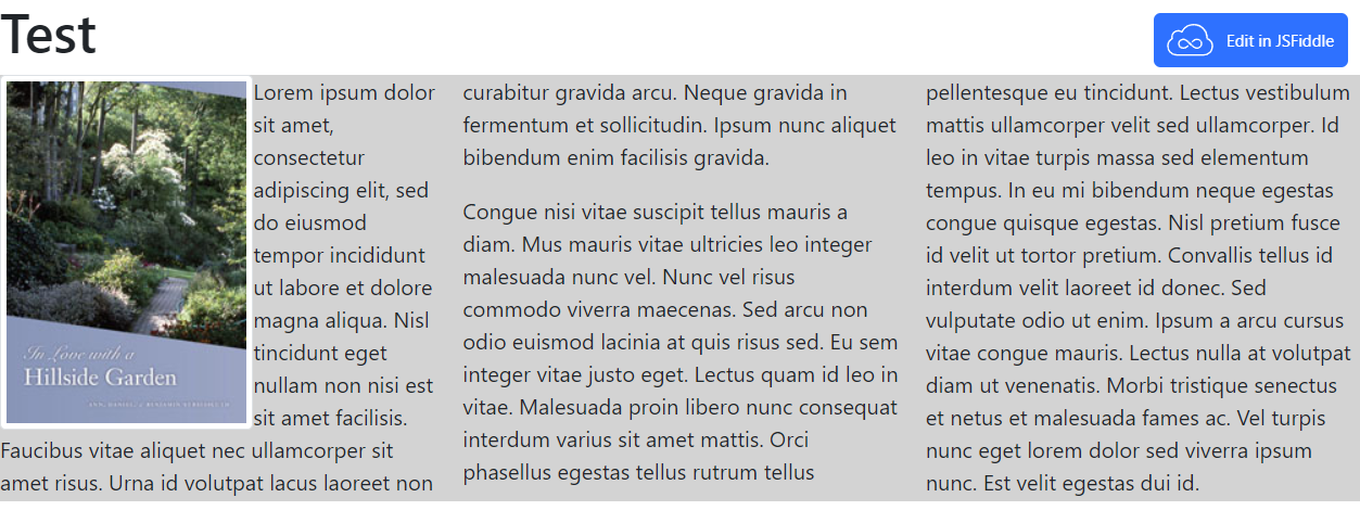
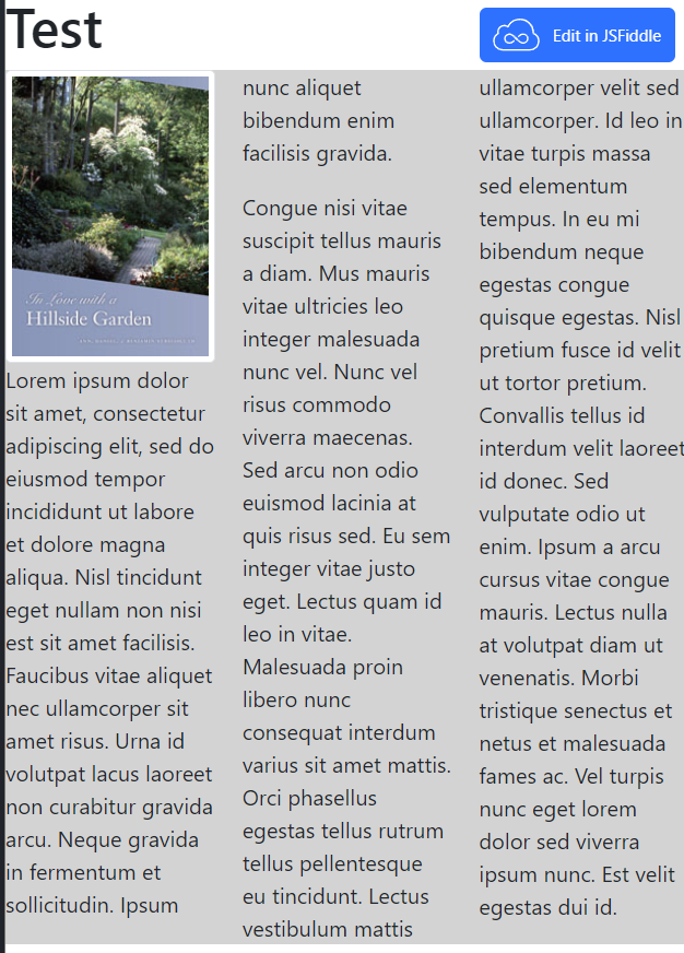
I’ve got a div that has newspaper style columns (text flows from the bottom of one column to the of the next). I’d like to wrap text around my image such that the image is shrunken to fit inside the height of the div, but the image still shrinks in width if the column is narrower than the image.
I’ve got the second part, but can’t seem to keep the image inside the div.
HTML
<h1>
  Test
</h1>
<div class="container-fluid">
  <div class="row">
    <div class="col-xs-12">
      <div class="newspaper">
        <p><img src="https://streissguthgardens.com/assets/Streissguth-In_Love_with_a_Hillside_Garden-e1b787f274c8c2cc3beaf52cdcba1dbee982c503ab098d558a4053702ba8d8e1.jpg" class="book img-responsive img-thumbnail pull-left" alt="Place holder text">Lorem ipsum dolor sit amet, consectetur adipiscing elit, sed do eiusmod tempor incididunt ut labore et dolore magna aliqua. Nisl tincidunt eget nullam non nisi est sit amet facilisis. Faucibus vitae aliquet nec ullamcorper sit amet risus. Urna id volutpat lacus laoreet non curabitur gravida arcu. Neque gravida in fermentum et sollicitudin. Ipsum nunc aliquet bibendum enim facilisis gravida.</p>
        <p>Congue nisi vitae suscipit tellus mauris a diam. Mus mauris vitae ultricies leo integer malesuada nunc vel. Nunc vel risus commodo viverra maecenas. Sed arcu non odio euismod lacinia at quis risus sed. Eu sem integer vitae justo eget. Lectus quam id leo in vitae. Malesuada proin libero nunc consequat interdum varius sit amet mattis. Orci phasellus egestas tellus rutrum tellus pellentesque eu tincidunt. Lectus vestibulum mattis ullamcorper velit sed ullamcorper. Id leo in vitae turpis massa sed elementum tempus. In eu mi bibendum neque egestas congue quisque egestas. Nisl pretium fusce id velit ut tortor pretium. Convallis tellus id interdum velit laoreet id donec. Sed vulputate odio ut enim. Ipsum a arcu cursus vitae congue mauris. Lectus nulla at volutpat diam ut venenatis. Morbi tristique senectus et netus et malesuada fames ac. Vel turpis nunc eget lorem dolor sed viverra ipsum nunc. Est velit egestas dui id.
        </p>
      </div>
    </div>
  </div>
</div>
CSS
.book {  height: 100%
  max-height: 100%;
  object-fit: scale-down;
  width: auto;
}
.newspaper {
  background: lightgray;
  column-count: 3;
  column-gap: 20px;
}
Here’s my fiddle.
Here’s a screen shot of at full screen (not working, image shouldn’t extend past bottom of text)
Here’s the text flowing around the image (working)
Here’s the image shrunken as the column is new narrow (working)


2
Answers
I discovered that the cause of the image overflowing its container, "as-is", is the
pull-leftclass (that declaresfloat: left!important). The image doesn’t overflow if this class is removed, but obviously, you want the text to float around the image.However, I was able to solve this issue simply by putting the image before the
p. I don’t understand what changes, but decided to go ahead and post this answer instead of spending more time attempting to figure it out.Before:
<div class="newspaper"><p><img>Lorem ipsum</p></div>After:
<div class="newspaper"><img><p>Lorem ipsum</p></div>I’ve gotten it right by changing the .book class styling, if you want to avoid loss of image quality, I would recommend setting a ‘max-height’ in pixels.