


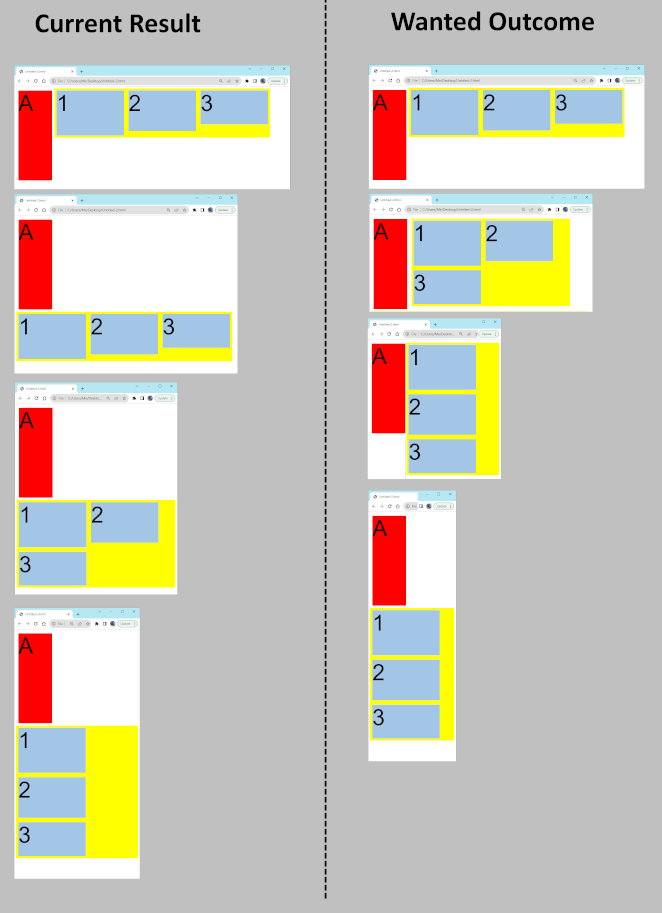
In the example below, I have defined Flexbox instead another Flexbox. For box 1, 2, and 3, I want them to stay on the right of box A (e.g. in desktop browser), and only shows them below box A if there is not enough space to show on the right of box A (e.g. in a smartphone browser). What trick do I need to achieve it?
I am open for solutions using Bootstrap 4 or 5.
<html lang="en-us">
  <style>
    body, div {font-family: sans-serif; font-size:100px}
  </style>
  <body>
    <div style="display:flex; flex-flow:row wrap; justify-content:flex-start; align-items:flex-start; ">
      <div id="letter" style="background-color:red; min-width:150px; min-height:400px; margin:10px;">A</div>
      <div id="numbers"
           style="display:flex; flex-flow:row wrap;
                  justify-content:flex-start; align-items:flex-start;
                  background-color:yellow">
        <div style="background-color:lightblue; min-width:300px; min-height:200px; margin:10px">1</div>
        <div style="background-color:lightblue; min-width:300px; min-height:180px; margin:10px">2</div>
        <div style="background-color:lightblue; min-width:300px; min-height:150px; margin:10px">3</div>
      </div>
  </body>
</html>
2
Answers
it’s possible, all you have to do is to give the both A[div] and numbers[div] a
float:left;then every thing will be just like you want it. but be sure divs have a display of block otherwise the float won’t work.If flex items are allowed to wrap, the items will wrap before their width is reduced.
The only way to control the behavior of nested flexboxes is to change the wrap declarations using a media query.
I gave a similar answer to a similar question a couple of days ago.