


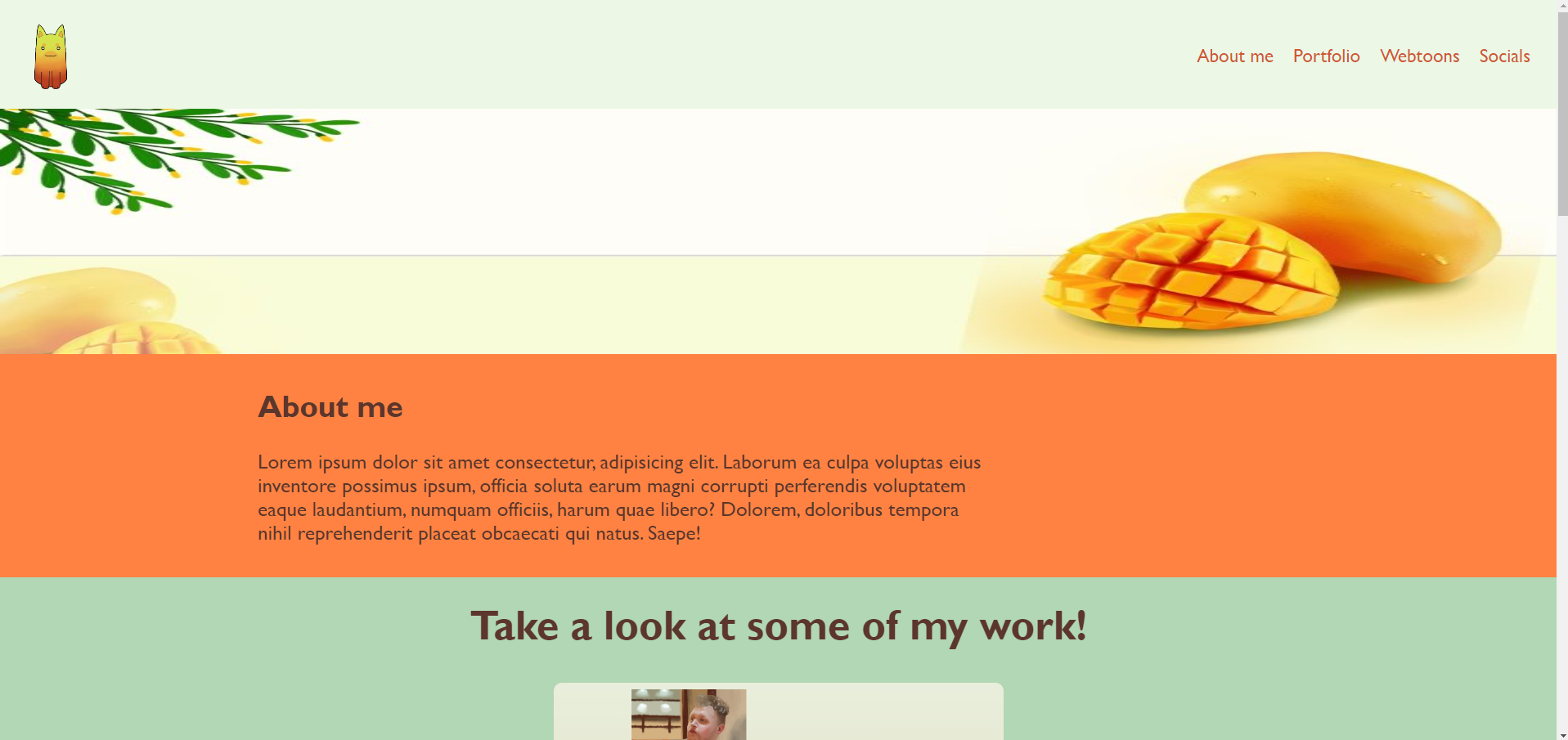
I am coding this website for a friend, and she wants the background colour of the textbox to go all the way to the edge, whilst the actual text stays slightly away from the left edge. This I have coded, and it looks like this: the website as it is now
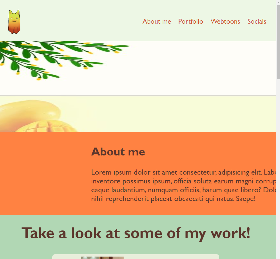
But I want this website to also work for mobile screens, and the way I have coded it, the text gets cut off like shown in this next image: the website in a smaller screen size How do I fix this? I want to keep the text away from the edge, without centering it, but so it also works for a mobile screen. Here is my code:
.main {
  text-align: center;
}

#about-me {
  text-align: left;
  background-color: #FF8242;
  font-size: 25px;
  padding: 15px;
  margin: -8px;
  font-family: 'Gill Sans', 'Gill Sans MT', Calibri, 'Trebuchet MS', sans-serif;
  color: #5c362c;
}

#about-me p {
  margin-left: 300px;
  width: 900px;
}

#about-me h2 {
  margin-left: 300px;
}
<div id="about-me">
<h2>
About me
</h2>
<p>
Lorem ipsum dolor sit amet consectetur, adipisicing elit. Laborum ea culpa voluptas eius inventore
possimus ipsum, officia soluta earum magni corrupti perferendis voluptatem eaque laudantium, numquam
officiis, harum quae libero? Dolorem, doloribus tempora nihil reprehenderit placeat obcaecati qui
natus. Saepe!
</p>
</div>As you can see, I simply used margin, and honestly idk what else to do for it to work the same, I am a beginner coder and have only learnt HTML coding and CSS. I have used Java script before, but I never learned it, so I didn’t understand much of it.
2
Answers
Never use fixed widths for content elements like this. You can use
max-width: 900px;instead ofwidth: 900px;, which will prevent the text to go outside the window.And you could use a percentage value for the margin-left instead of a fixed pixel value. Or you use a media-query (see https://developer.mozilla.org/en-US/docs/Web/CSS/CSS_media_queries/Using_media_queries) with different settings for different screen widths.
The code explicitly sets a width:
If the screen is narrower than 900 pixels, this width will be wider than the screen. (Well, technically 1200 pixels, since there’s also
margin-left: 300px;.)You could change that to
max-widthinstead. Additionally, I’d also recommend removing themarginwhen the screen is narrow. Something like this: