


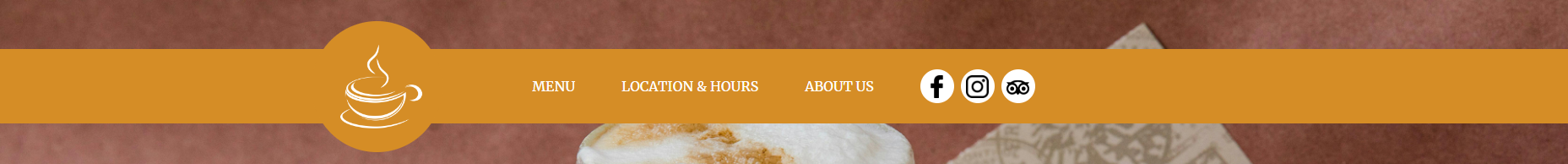
I’m trying to add a circle with an image inside to a navbar. The circle has to be bigger than the navbar such as this image:
I am using "position: absolute" so the circle remains at that position, problem is that on smaller screens it looks like this:
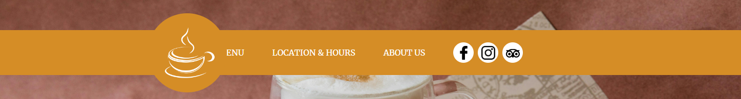
Covering the navbar items, how can I keep the circle as it is but make it’s position relative to the rest of the navbar items?
I have tried removing the "position: absolute" attribute from the circle but that makes the navbar increase it’s height to match the circle’s height & align vertically the navbar items with the circle, as such:
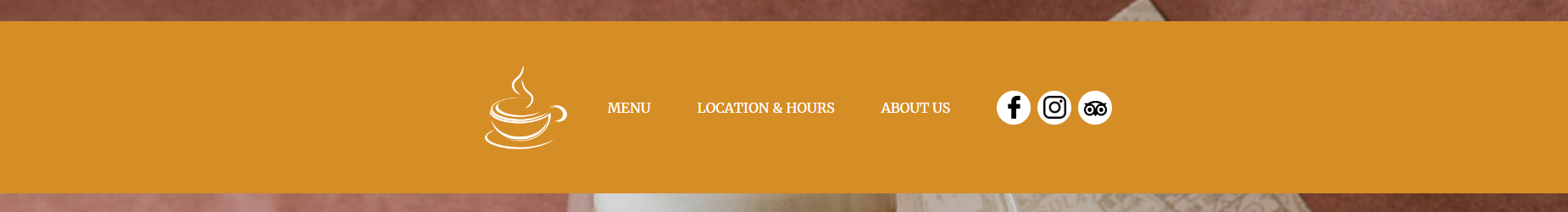
Making the navbar too thick. If there’s something I could do to maintain the navbar height and items alignment with it while leaving the circle centered horizontally with the rest of the items, that would be perfect.
HTML:
  <nav class="navbar p-4 z-2 justify-content-center">
    <div class="circle me-4">
      <img src="images/logo.png" alt="Logo" class="img-fluid">
    </div>
    <a class="nav-item text-white text-decoration-none" href="#">MENU</a>
    <a class="nav-item text-white text-decoration-none" href="#">LOCATION & HOURS</a>
    <a class="nav-item text-white text-decoration-none" href="#">ABOUT US</a>
    <div id="socials" class="d-flex">
      <div class="sm-circle me-2">
        <a href="#" class="text-decoration-none">
          <img src="images/facebook_logo.png" alt="Facebook Logo" class="img-fluid">
        </a>
      </div>
      <div class="sm-circle me-2">
        <a href="#">
          <img src="images/instagram_logo.png" alt="Instagram Logo" class="img-fluid">
        </a>
      </div>
      <div class="sm-circle">
        <a href="#">
          <img src="images/tripadvisor_logo.png" alt="TripAdvisor Logo" class="img-fluid">
        </a>
      </div>
    </div>
  </nav>
CSS:
nav {
    position: absolute !important;
    top: 60px;
    left: 0;
    width: 100%;
    background-color: #d58d26;
}

nav a {
    color: white;
}

nav a.nav-item:not(:last-child) {
    margin-right: 55px;
}

.circle {
    width: 155px;
    height: auto;
    background-color: #d58d26;
    border-radius: 50%;
}

.sm-circle {
    width: 40px;
    height: 40px;
    display: flex;
    justify-content: center;
    align-items: center;
    background-color: white;
    border-radius: 50%;
}

.sm-circle img {
    width: 27px;
    height: auto;
}
2
Answers
The image may need to be outside the nav container in order for that to work. Have you tried wrapping the image with a , with the enclosed in that tag. Then setting a margin right styling in css to push the image to the right position?
You can use
display: grid, andgrid-template-columnsandgrid-template-rowsto solve that problem.In the grid, you have three items: the background, the logo, and the navigation.
The
1frunits in the row section ensure, that the remaining space the logo uses is distributed equally at the top and bottom, and theautois just there so that the navigation bar can take as much space as it needs.