 Question posted in


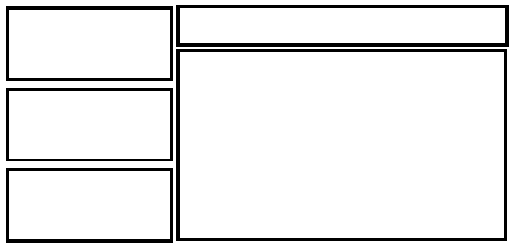
This is my desired layout:
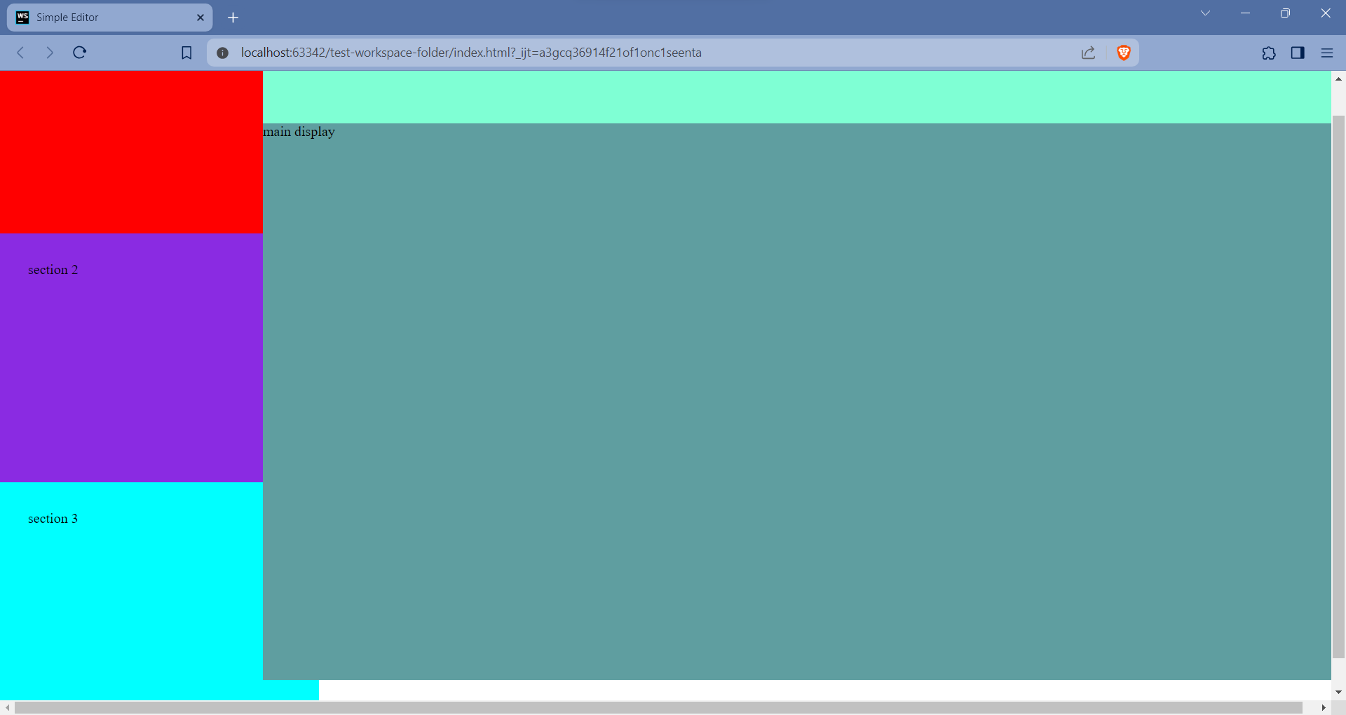
And this is my rendered layout
These are my CSS and HTML:
body {
  margin: 0;
  box-sizing: border-box;
}

article {
  display: flex;
  flex-direction: row;
  width: 100vw;
  height: 100vh;
}

aside {
  display: flex;
  flex-direction: column;
  justify-content: space-around;
  width: 300px;
  height: 100vh;
}

main {
  display: flex;
  flex-direction: column;
  flex-grow: 1;
  height: 100vh;
}

#code-html,
#code-css,
#code-js {
  padding: 2rem;
  width: 100%;
  flex-grow: 1;
}

#code-html {
  width: 100%;
  height: 300px;
  min-height: 30%;
  background-color: red;
}

#code-css {
  width: 100%;
  height: 300px;
  min-height: 30%;
  background-color: blueviolet;
}

#code-js {
  width: 100%;
  height: 300px;
  min-height: 30%;
  background-color: aqua;
}

#main-run {
  height: 100px;
  background-color: aquamarine;
}

#main-display {
  flex-grow: 1;
  background-color: cadetblue;
}
<body>
<article>
<aside>
<section id="code-html">section 1</section>
<section id="code-css">section 2</section>
<section id="code-js">section 3</section>
</aside>
<main>
<section id="main-run">sub-head</section>
<section id="main-display">main display</section>
</main>
</article>
</body>https://stackoverflow.com/questions/ask#Why is there an overlap at the bottom of the screen. I want the main element to take all the available width. Also, the height of aside element is more than 100vh. All the contents should fit into the screen without a scroll bar.
Thank you!
2
Answers
changed min-height to max-height and removed padding added some styles.
The
box-sizingproperty isn’t inherited, so you can add:or at least add
box-sizing: border-boxto the sections that have padding on them. Without it, the browser ignores the padding when sizing them, so the additional padding causes them to overflow.