skip to Main Content

I have the following html and css file. What I want to achieve is a standard layout with header and footer and menubar with css grid. This seems to work great.

Now I want to layout the content area and there also define a css grid but it has two problems.

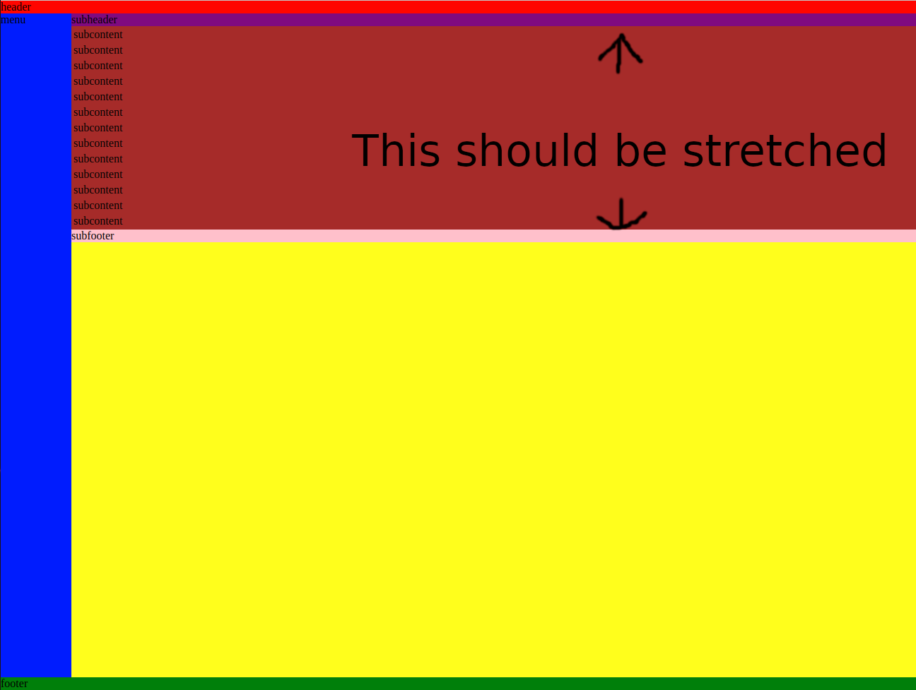
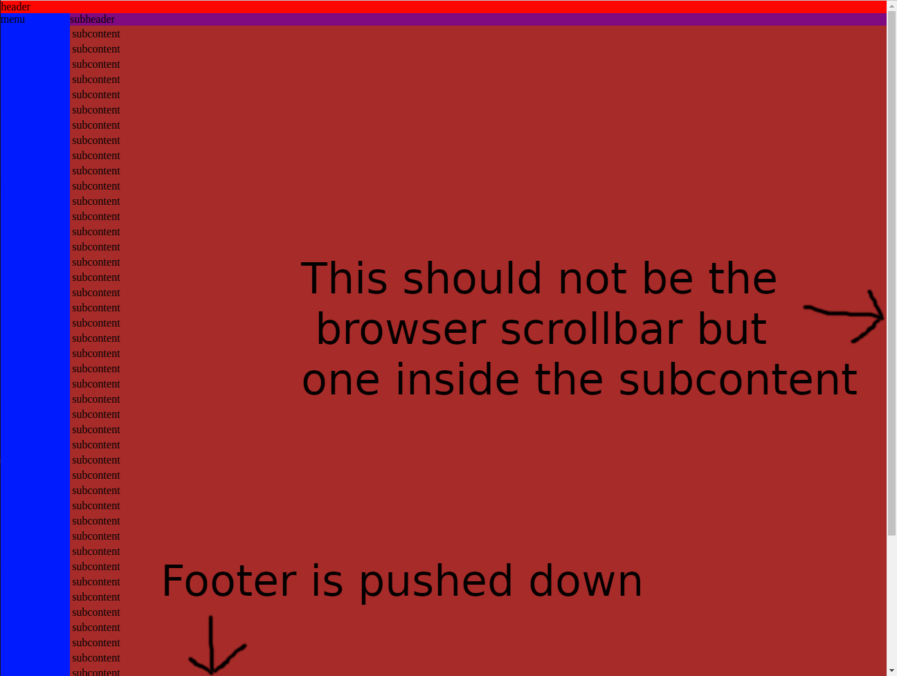
If the subcontent (the table) only has few entries then it does not stretch over the rest of the available space. And if it has too many entries and would overflow it does not show the scrollbar.

I thougt all I would need is a

align-self: stretch;
overflow-y: auto;

but they don’t seem to have any effect.

<!DOCTYPE html>
<html>
  <head>
    <link rel="stylesheet" href="style.css">
  </head>
  <body>
  
    <div class="container">
    
      <div class="menu">
        menu
      </div>
    
      <div class="header">
        header
      </div>
      
      <div class="content">

        <div class="subcontainer">
        
          <div class="subheader">
            subheader
          </div>
          
          <div class="subcontent">
            <table>
              <tr><td>subcontent</td></tr>
              <tr><td>subcontent</td></tr>
              <tr><td>subcontent</td></tr>
              <tr><td>subcontent</td></tr>
              <tr><td>subcontent</td></tr>
              <tr><td>subcontent</td></tr>
              <tr><td>subcontent</td></tr>
              <tr><td>subcontent</td></tr>
              <tr><td>subcontent</td></tr>
              <tr><td>subcontent</td></tr>
              <tr><td>subcontent</td></tr>
              <tr><td>subcontent</td></tr>
              <tr><td>subcontent</td></tr>
            </table>
          </div>
          
          <div class="subfooter">
            subfooter
          </div>
          
        </div>  
        
      </div>
      
      <div class="footer">
        footer
      </div>
      
    </div>
    
  </body>
</html>

and the css

body {
  margin: 0;
}

.container {
  height: 100vh;
  background-color: lightblue;
  display: grid;
  grid-template:
    [row1-start] "header header" min-content [row1-end]
    [row2-start] "menu content" 1fr [row2-end]
    [row3-start] "footer footer" min-content [row3-end]
    / 100px auto;
}

.menu {
  background-color: blue;
  grid-area: menu;
}

.header {
  background-color: red;
  grid-area: header;
}

.content {
  background-color: yellow;
  grid-area: content;
}

.footer {
  background-color: green;
  grid-area: footer;
}


.subcontainer {
  background-color: lightblue;
  display: grid;
  grid-template:
    [row1-start] "subheader" min-content [row1-end]
    [row2-start] "subcontent" 1fr [row2-end]
    [row3-start] "subfooter" min-content [row3-end]
    / auto;
}

.subheader {
  background-color: purple;
  grid-area: subheader;
}

.subcontent {
  background-color: brown;
  grid-area: subcontent;
  align-self: stretch;
  overflow-y: auto;
}

.subfooter {
  background-color: pink;
  grid-area: subfooter;
}

This illustrates the first problem, that the subcontent does not get stretched.

enter image description here

And this is with a long table which should stay inside its bounds and display a scrollbar instead

enter image description here

And this is how it should look ideally in the overflow case. The scrollbar is only inside the subcontent area.

enter image description here

2

Answers


  1. <!DOCTYPE html>
    <html>
      <head>
        <style>
          body {
            margin: 0;
          }
    
          .container {
            height: 100vh;
            background-color: lightblue;
            display: flex;
            flex-direction: column;
          }
    
          .menu {
            background-color: blue;
            height: 100%;
          }
          .bodycontainer {
            display: flex;
            width: 100%;
            height: 100%;
          }
          .header {
            background-color: red;
            grid-area: header;
          }
    
          .content {
            background-color: yellow;
          }
    
          .footer {
            background-color: green;
            grid-area: footer;
          }
    
          .subcontainer {
            background-color: lightblue;
            display: flex;
            flex-direction: column;
            width: 100%;
          }
    
          .subheader {
            background-color: purple;
            grid-area: subheader;
            height: 10%;
          }
    
          .subcontent {
            background-color: brown;
            overflow-y: auto;
          }
    
          .subfooter {
            background-color: pink;
            grid-area: subfooter;
            height: 10%;
          }
        </style>
      </head>
      <body>
        <div class="container">
          <div class="header">header</div>
          <div class="bodycontainer">
            <div class="menu">menu</div>
    
            <div class="subcontainer">
              <div class="subheader">subheader</div>
    
              <div class="subcontent">
                <table>
                  <tr>
                    <td>subcontent</td>
                  </tr>
                  <tr>
                    <td>subcontent</td>
                  </tr>
                  <tr>
                    <td>subcontent</td>
                  </tr>
                  <tr>
                    <td>subcontent</td>
                  </tr>
                  <tr>
                    <td>subcontent</td>
                  </tr>
                  <tr>
                    <td>subcontent</td>
                  </tr>
                  <tr>
                    <td>subcontent</td>
                  </tr>
                  <tr>
                    <td>subcontent</td>
                  </tr>
                  <tr>
                    <td>subcontent</td>
                  </tr>
                  <tr>
                    <td>subcontent</td>
                  </tr>
                  <tr>
                    <td>subcontent</td>
                  </tr>
                  <tr>
                    <td>subcontent</td>
                  </tr>
                  <tr>
                    <td>subcontent</td>
                  </tr>
                  <tr>
                    <td>subcontent</td>
                  </tr>
                  <tr>
                    <td>subcontent</td>
                  </tr>
                  <tr>
                    <td>subcontent</td>
                  </tr>
                  <tr>
                    <td>subcontent</td>
                  </tr>
                  <tr>
                    <td>subcontent</td>
                  </tr>
                  <tr>
                    <td>subcontent</td>
                  </tr>
                  <tr>
                    <td>subcontent</td>
                  </tr>
                  <tr>
                    <td>subcontent</td>
                  </tr>
                  <tr>
                    <td>subcontent</td>
                  </tr>
                  <tr>
                    <td>subcontent</td>
                  </tr>
                  <tr>
                    <td>subcontent</td>
                  </tr>
                </table>
              </div>
    
              <div class="subfooter">subfooter</div>
            </div>
          </div>
          <div class="footer">footer</div>
        </div>
      </body>
    </html>

    I just run your code and I did not see the first problem you mentioned
    The second problem is solved in the above code provided

    To make the scroll bar appear inside the .subcontent div when there are more table entries, you can set a specific height for the .subcontent div and then use the overflow-y: auto; CSS property to enable vertical scrolling. This will create a scrollable area inside the .subcontent div when its content exceeds the specified height. Adjust the height value to fit your design requirements.

    Login or Signup to reply.
  2. Free server available for 24-hour testing whats +8619907977871

    Login or Signup to reply.
Please signup or login to give your own answer.
Back To Top
Search