skip to Main Content

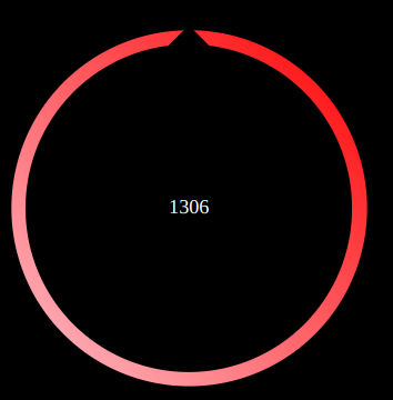
I’m trying do an arrow to point a direction, chosen by a gamepad. I stylised my arrow like this :
A screen of my arrow, as an image is better than 1000 words

When an angle is given by the joystick, all the stuff is rotating with this angle (rotateapplyed to cercle class). Thus the tip of the black triangle is pointing a direction. Pretty, isn’t it ? 😀

But ! you can see a number, in the middle. It’s an important information (a PWM setting I’m sending over TCP, but not the subject here) And I want it to be in the center of the circle for… style ?

My issue is : I centered this number with a flexbox, then, when all the circle is rotating, the number is rotating too ! It’s ugly ! How can I avoid this ? 🙁

Please find the CSS and the HTML bellow :

                <div class="cercle" id="fleche">
                    <div class="middle">
                        <p id="vitesse">1306</p>
                    </div>
                    <div class="triangle">
    
                    </div>
                </div>
            .cercle {
                order:0;
                border-radius: 50%;
                height: 80%;
                aspect-ratio: 1/1;
                background: linear-gradient(45deg, pink, red);
                display: flex;
                rotate: 0deg;
                transition: 350ms;

                .middle{
                    border-radius: 50%;
                    height: 92%;
                    width: 92%;
                    background-color: black;
                    align-self: center;
                    margin: auto;
                    display: flex;
                    flex-direction: column;
                    align-items: center;
                    justify-content: center;

                }   

                .triangle {
                    width: 0px;
                    border-style: solid;
                    border-width: 20px;
                    border-color: rgba(0, 0, 0, 0) rgba(0, 0, 0, 0) black rgba(0, 0, 0, 0) ;
                    margin-left: 44.4%;
                    margin-top: -7.2%;
                    background: rgba(0, 0, 0, 0);
                    position: absolute;
                }

                #vitesse{
                    /*...*/
                }
            }

You probably guessed it, there is no critical issue, just aesthetic. I tried to apply an opposed rotation to this number, but the result is not satisfying (seems like "clipping".) I think the best option is to forbid the rotation of the number… by getting it out of the circles ? But I’ve to keep it inside, if I want the number to dynamically stay in the center of the circle.

Thanks for your help !

3

Answers


  1. You can do one of two things:

    1. An easy fix would just to rotate the text by the negative amount of whatever your circle is rotated. So if the input from the joystick is 80deg, you rotate #vitesse by -80deg.
    2. The first method will work fine but its better to set your hierarchy to be more indicative of whats going on. I would separate the rotating element from the non rotating elements so that it would not be a parent of them, so when it rotates it will not rotate anything else
    Login or Signup to reply.
  2. you can essay this

    `.cercle {
      order: 0;
      border-radius: 50%;
      height: 80%;
      aspect-ratio: 1/1;
      background: linear-gradient(45deg, pink, red);
      display: flex;
      transform: rotate(30deg); /* Rotate the .cercle element */
      transition: 350ms;
    }
    
    .middle {
      border-radius: 50%;
      height: 92%;
      width: 92%;
      background-color: black;
      align-self: center;
      margin: auto;
      display: flex;
      flex-direction: column;
      align-items: center;
      justify-content: center;
    }
    
    .triangle {
      width: 0px;
      border-style: solid;
      border-width: 20px;
      border-color: rgba(0, 0, 0, 0) rgba(0, 0, 0, 0) black rgba(0, 0, 0, 0);
      margin-left: 44.4%;
      margin-top: -7.2%;
      background: rgba(0, 0, 0, 0);
    }
    
    #vitesse {
      /* Counter-rotate the paragraph to cancel out the parent's rotation */
      transform: rotate(-30deg); /* Counter-rotate by the same amount as .cercle's rotation */
      color: #fff;
    }
    ` 
    
    Login or Signup to reply.
  3. Here is a simple idea without too much code:

    .box {
      --s: 15px; /* control the triangle size */
    
      width: 250px;
      aspect-ratio: 1;
      display: grid;
      place-content: center;
      color: #fff;
      padding: var(--s); 
      border-radius: 50%;
      background:
        linear-gradient(#000 0 0) content-box,
        linear-gradient(45deg,#fff,red); /* the gradient coloration */
      position: relative;
      z-index: 0;
    }
    .box:before {
      content:"";
      position: absolute;
      z-index: -1;
      inset: 0 calc(50% - var(--s)) 50%;
      clip-path: polygon(0 var(--s),50% 0,100% var(--s),100% 100%, 0 100%);
      background: #000;
      transform-origin: bottom;
      rotate: 20deg; /* control the rotation here */
    }
    
    
    body {
      background: #000;
    }
    <div class="box">1350</div>
    Login or Signup to reply.
Please signup or login to give your own answer.
Back To Top
Search