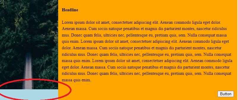
I’m trying to get the image on the left to take up the entire height no matter how much content is on the right (see screenshot).
You’ll have to make the viewport around 850px or less to see what I’m talking about.
.flex-container {
  display: flex;
  flex-wrap: wrap;
  background-color: purple;
  width: 100%;
  line-height: 1.5;
  font-size: 0.9rem;
}

.item-1 {
  max-height: 100%;
  width: auto;
  flex-basis: 25%;
  flex-grow: 0;
  max-width: 25%;
  background-color: lightblue;
}

.item-1-direct-child {
  min-height: 100%;
}

img {
  max-height: 100%;
  display: block;
  background-size: cover;
  background-repeat: no-repeat;
  background-position: center;
  width: 100%;
  object-fit: cover;
  min-height: 187px;
}

.item-2 {
  flex-basis: 75%;
  flex-grow: 0;
  max-width: 75%;
  background-color: orange;
}

.item-2-direct-child {
  padding-left: 12px;
  padding-right: 12px;
  padding-bottom: 12px;
  padding-top: 24px;
}

h4 {
  margin: 0px;
  margin-bottom: 20px;
}

.button-container {
  display: flex;
  justify-content: flex-end;
}

.button-container>a {
  text-decoration: none;
}

button {
  margin-top: 25px;
}
<div class="flex-container">
<div class="item-1">
<div class="item-1-direct-child">
<img src="https://picsum.photos/200/300" />
</div>
</div>
<div class="item-2">
<div class="item-2-direct-child">
<h4>Headline</h4>
<span>
Lorem ipsum dolor sit amet, consectetuer adipiscing elit. Aenean commodo ligula eget dolor. Aenean massa. Cum sociis natoque penatibus et magnis dis parturient montes, nascetur ridiculus mus. Donec quam felis, ultricies nec, pellentesque eu, pretium quis, sem. Nulla consequat massa quis enim. Lorem ipsum dolor sit amet, consectetuer adipiscing elit. Aenean commodo ligula eget dolor. Aenean massa. Cum sociis natoque penatibus et magnis dis parturient montes, nascetur ridiculus mus. Donec quam felis, ultricies nec, pellentesque eu, pretium quis, sem. Nulla consequat massa quis enim. Lorem ipsum dolor sit amet, consectetuer adipiscing elit. Aenean commodo ligula eget dolor. Aenean massa. Cum sociis natoque penatibus et magnis dis parturient montes, nascetur ridiculus mus. Donec quam felis, ultricies nec, pellentesque eu, pretium quis, sem. Nulla consequat massa quis enim.
</span>
<div class="button-container">
<a>
  <button>
  Button
  </button>
</a>
</div>
</div>
</div>
</div>


4
Answers
You have the correct CSS, but you are applying it wrong.
Images can either be set as an
<img>tag or as a CSSbackground-image. Your CSS is trying to set a background image for an image element, which makes no sense.Instead, remove the
<img>tag and the CSS for it. Just use this CSSAnd add that class to the sidebar element.
As a side note, you have this code:
Which is a button inside of a link. This is invalid HTML, and it makes no sense. An interactive element cannot be inside of another interactive element. An
<a>is for linking to another document, and a<button>is for either doing some action or submitting a form. You need to pick which one needs to happen here.height: 100%from the item..item-1-direct-child { min-height: 100%; }toheight: 100%img { max-height: 100%; }toheight: 100%https://jsfiddle.net/dgrogan/sqfet3zj/
You have a lot of unnecessary percentage lengths and other code.
Also, it’s not clear what you’re aiming for with all those
max-widthandmax-heightrules.So, to keep it simple, I’ve just simplified the code and provided a solution the problem.
You may need to make modifications to achieve your overall goal.
jsFiddle
I made some changes to the CSS:
changed
.item-1to create a container to contain the image and in the.item-1-direct-child,height: 100%;and added flex to stretch its children vertically.