skip to Main Content

i want to have 4 columns in my navbar like shown in the picture:

enter image description here

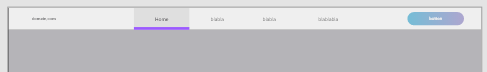
And the text inside the boxes should be centered, like in the middle of the box. Its importent that thy’re boxes so that i can apply "border-bottom" to it. Can somebody pls help, i cant figure it out myself. Heres what i got so far:

header {
    display: flex;
    justify-content: space-between;
    align-items: center;
    width: 100%;
    height: 70px;
    padding: 0px 10%;
    background-color: #EFEFEF;
}

.logo {
    cursor: pointer;
    text-decoration: none;
    color: #707070;
    font-family: 'Segoe UI', Tahoma, Geneva, Verdana, sans-serif;
}

.nav__links a,
.cta,
.overlay__content a {
    font-family: "Montserrat", sans-serif;
    font-weight: 500;
    color: #707070;
    text-decoration: none;
}

.nav__links {
    list-style: none;
    display: flex;
}

.nav__links li a {
    border: 1px solid black;
    width: 225px;
    height: 70px;
    float: left;
}

#active {
    border-bottom: 8px green solid;
}

.cta {
    padding: 9px 25px;
    background-color: rgba(0, 136, 169, 1);
    border: none;
    border-radius: 50px;
    cursor: pointer;
    transition: background-color 0.3s ease 0s;
}
<body>
    <header>
        <a class="logo" href="/">filmfestwilsdruff.de</a>
        <nav>
            <ul class="nav__links">
                <li><a href="#" id="active">Home</a></li>
                <li><a href="#">blabla</a></li>
                <li><a href="#">blabla</a></li>
                <li><a href="#">blablabla</a></li>
            </ul>
        </nav>
        <a class="cta" href="#">Contact</a>
    </header>
</body>

2

Answers


  1. You can center horizontally et verticaly using 2 lines of CSS :

        text-align: center; /* center the link */
        line-height: 70px; /* match the height to align in the middle */
    

    Here’s the snippet:

    header {
        display: flex;
        justify-content: space-between;
        align-items: center;
        width: 100%;
        height: 70px;
        padding: 0px 10%;
        background-color: #EFEFEF;
    }
    
    .logo {
        cursor: pointer;
        text-decoration: none;
        color: #707070;
        font-family: 'Segoe UI', Tahoma, Geneva, Verdana, sans-serif;
    }
    
    .nav__links a,
    .cta,
    .overlay__content a {
        font-family: "Montserrat", sans-serif;
        font-weight: 500;
        color: #707070;
        text-decoration: none;
    }
    
    .nav__links {
        list-style: none;
        display: flex;
    }
    
    .nav__links li a {
        border: 1px solid black;
        width: 225px;
        height: 70px;
        float: left;
        text-align: center; /* center the link */
        line-height: 70px; /* match the height to align in the middle */
    }
    
    #active {
        border-bottom: 8px green solid;
    }
    
    .cta {
        padding: 9px 25px;
        background-color: rgba(0, 136, 169, 1);
        border: none;
        border-radius: 50px;
        cursor: pointer;
        transition: background-color 0.3s ease 0s;
    }
    <body>
        <header>
            <a class="logo" href="/">filmfestwilsdruff.de</a>
            <nav>
                <ul class="nav__links">
                    <li><a href="#" id="active">Home</a></li>
                    <li><a href="#">blabla</a></li>
                    <li><a href="#">blabla</a></li>
                    <li><a href="#">blablabla</a></li>
                </ul>
            </nav>
            <a class="cta" href="#">Contact</a>
        </header>
    </body>
    Login or Signup to reply.
  2. 1) To Align Content

    Flexbox is great to align content vertically and horizontally.

    • Add display: flex to the parent element of the items to be centered
    • justify-content will align content on the x-axis (horizontal)
    • align-items will align content on the cross-axis (vertical)

    Append the following CSS styles to .nav__links li a

    .nav__links li a {
        display: flex;
        justify-content: center;
        align-items: center;
    }
    

    2) To Align #active Bottom Border

    Using a box-shadow to replicate the bottom border with a value of inset so it’s inside the content element.

    #active {
        box-shadow: inset 0 -8px 0 green;
    }
    
    header {
        display: flex;
        justify-content: space-between;
        align-items: center;
        width: 100%;
        height: 70px;
        padding: 0px 10%;
        background-color: #efefef;
    }
    
    .logo {
        cursor: pointer;
        text-decoration: none;
        color: #707070;
        font-family: "Segoe UI", Tahoma, Geneva, Verdana, sans-serif;
    }
    
    .nav__links a,
    .cta,
    .overlay__content a {
        font-family: "Montserrat", sans-serif;
        font-weight: 500;
        color: #707070;
        text-decoration: none;
    }
    
    .nav__links {
        list-style: none;
        display: flex;
    }
    
    .nav__links li a {
        display: flex;
        align-items: center;
        justify-content: center;
        
        border: 1px solid black;
        width: 225px;
        height: 70px;
        float: left;
    }
    
    #active {
        box-shadow: inset 0 -8px 0 green;
    }
    
    .cta {
        padding: 9px 25px;
        background-color: rgba(0, 136, 169, 1);
        border: none;
        border-radius: 50px;
        cursor: pointer;
        transition: background-color 0.3s ease 0s;
    }
    <body>
        <header>
            <a class="logo" href="/">filmfestwilsdruff.de</a>
            <nav>
                <ul class="nav__links">
                    <li id="active"><a href="#">Home</a></li>
                    <li><a href="#">blabla</a></li>
                    <li><a href="#">blabla</a></li>
                    <li><a href="#">blablabla</a></li>
                </ul>
            </nav>
            <a class="cta" href="#">Contact</a>
        </header>
    </body>
    Login or Signup to reply.
Please signup or login to give your own answer.
Back To Top
Search