skip to Main Content

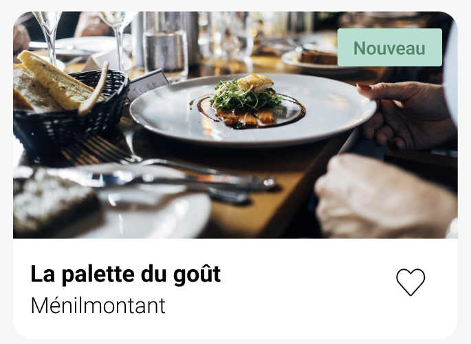
I’m trying to make this card, with "Nouveau" on the top right side.

Card I’m trying to reproduce (Figma)

I tried with position: absolute but the text isn’t consistently on the top right. With smaller screens it overflows and leaves the card, and with bigger screens the text moves towards the centre of the image.

<section class="home-restaurants">
            <div class="home-restaurants_card">
                <img src="assets/images/restaurants/jay-wennington-N_Y88TWmGwA-unsplash.jpg">
                <p class="nouveau">Nouveau</p>
                <div class="home-restaurants_card-content">
                    <h3>La palette du goût</h3>
                    <p>Ménilmontant</p>
                </div>
            </div>
        </section>
.home-restaurants
    background-color: #F6F6F6
    &_card
        margin: 18px
        position: relative
        img
            display: flex
            background-color: white
            border-radius: 15px 15px 0 0
            width: 100%
            height: 231px
            object-fit: cover
        &-content
            line-height: 5px
            padding: 5px 0 5px 15px
            background-color: white
            border-radius: 0 0 15px 15px

.nouveau
    display: flex
    justify-content: center
    align-content: center
    border-radius: 5px
    color: #008766
    background-color: #99E2D0
    padding: 7px
    width: 80px

3

Answers


  1. Chosen as BEST ANSWER

    This is what ended up working for me. Some containers were all I needed.

    <div class="home-restaurants_card">
                <div class="home-restaurants_card-container">
                    <img src="assets/images/restaurants/jay-wennington-N_Y88TWmGwA-unsplash.jpg">
                    <div class="home-restaurants_card-container_nouveau">
                        <p>Nouveau</p>
                    </div>
                </div>
                <div class="home-restaurants_card-content">
                    <h3>La palette du goût</h3>
                    <p>Ménilmontant</p>
                </div>
            </div>
    
    .home-restaurants_card-container_nouveau {
      position: absolute;
      bottom: 80%;
      right: 1em;
    }
    .home-restaurants_card-container_nouveau p {
      display: flex;
      justify-content: center;
      align-content: center;
      border-radius: 5px;
      color: #008766;
      background-color: #99E2D0;
      padding: 7px;
      width: 80px;
    }
    

  2. You may try to use the image you’re going to display on card as a background-image. Then you can put a card container div that is going to hold the card on top left using flexbox.

    I’ve tried to re-create a version of what I’m trying to suggest using a snippet with some explanations is CSS styling comments(Unfortunately I couldn’t add the image to snippet but it does work with an image.):

    body {
      width: 100vw;
      height: 100vh;
      margin: 0;
      padding: 0;
      display: flex;
      justify-content: center;
      align-items: center;
    }
    
    .container {
      width: 60%;
      height: 80%;
      /* Added an image and created a column flexbox(Unfortunately I don't) know how to add an image in code snippet. :/ */
      background-image: url(faq-img-bg.jpg);
      display: flex;
      flex-direction: column;
      align-items: center;
    }
    
    .card-container {
    /* A full-width container that contains the card "Nouveau". Justify-content set to end so that it sticks to the rightmost of the container. */
      width: 100%;
      display: flex;
      justify-content: end;
      align-items: center;
    }
    
    /* card and paragraph styling, nothing associated with answer. */
    .card {
      padding: 0.5em;
      margin: 1em 1em;
      background-color: hsla(0, 0%, 0%, 0.5);
      background-size: auto;
      display: flex;
      justify-content: center;
      align-items: center;
    }
    
    p {
      margin: 5em;
    }
    <body>
        <div class="container">
          <div class="card-container"><div class="card">Nouveau</div></div>
          <p>Lorem ipsum dolor sit amet consectetur adipisicing elit.</p>
        </div>
      </body>
    Login or Signup to reply.
  3. try this code

            .home-restaurants {
                max-width: 450px;
                background-color: #F6F6F6
            }
    
            .home-restaurants_card {
                position: relative;
            }
    
            .home-restaurants_card img {
                display: flex;
                background-color: white;
                border-radius: 15px 15px 0 0;
                width: 100%;
                height: 231px;
                object-fit: cover;
            }
    
            .home-restaurants_card-content {
                padding: 10px;
            }
    
            .nouveau {
                position: absolute;
                top: 10px;
                right: 10px;
                display: flex;
                justify-content: center;
                align-content: center;
                border-radius: 5px color: #008766;
                background-color: #99E2D0;
                padding: 7px;
                width: 80px;
                margin: 0px
            }
     <section class="home-restaurants">
            <div class="home-restaurants_card">
                <img
                    src="https://encrypted-tbn0.gstatic.com/images?q=tbn:ANd9GcTkMx9VHbZSmeBrWPo8LecnX2A3Sr6CpeGwe8jBWKHKONOJXl07pJ4jHEURkrBn_K-e7Og&usqp=CAU">
                <p class="nouveau">Nouveau</p>
            </div>
            <div class="home-restaurants_card-content">
                <h3>La palette du goût</h3>
                <p>Ménilmontant</p>
            </div>
        </section>
    Login or Signup to reply.
Please signup or login to give your own answer.
Back To Top
Search