skip to Main Content

I want to make something like this enter image description here

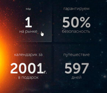
as you see, the adjacent borders in the center are slightly darker than other parts. How to make it with css?
Thanks in advance

2

Answers


  1. Can use linear-gradient() or radial-gradient.

    To set a gradient background, you can use the background parameter. For a gradient border, you can use border-image-source.

    Your request wasn’t very clear, but I assume you want to direct the endpoints of the four elements towards the center of the grid. In that case, I had to individually set the gradient for both the background and the border at each of the four elements to radiate in the desired direction.

    .grid {
      display: grid;
      grid-template-columns: repeat(2, 1fr);
      grid-gap: 20px;
      padding: 20px;
      box-sizing: border-box;
      width: 500px;
      height: 300px;
      background-image: url(https://i.stack.imgur.com/QYZq3.png);
      background-size: cover;
      background-repeat: no-repeat;
      background-position: center;
    }
    
    .grid div {
      background-color: rgba(255, 255, 255, 0.1); /* if linear-gradient() not working on browser */
      border-width: 1px;
      border-style: solid;
      border-image-slice: 1;
      height: 100%;
      width: 100%;
    }
    
    .grid div:nth-child(1) {
      background: linear-gradient(to bottom right, rgba(255, 255, 255, 0.0) 50%, rgba(255, 255, 255, 0.4) 100%);
      border-top-width: 0;
      border-left-width: 0;
      border-image-source: linear-gradient(to bottom right, rgba(255, 255, 255, 0.0) 50%, rgba(255, 255, 255, 0.8) 100%);
    }
    .grid div:nth-child(2) {
      background: linear-gradient(to bottom left, rgba(255, 255, 255, 0.0) 50%, rgba(255, 255, 255, 0.4) 100%);
      border-top-width: 0;
      border-right-width: 0;
      border-image-source: linear-gradient(to bottom left, rgba(255, 255, 255, 0.0) 50%, rgba(255, 255, 255, 0.8) 100%);
    }
    .grid div:nth-child(3) {
      background: linear-gradient(to top right, rgba(255, 255, 255, 0.0) 50%, rgba(255, 255, 255, 0.4) 100%);
      border-bottom-width: 0;
      border-left-width: 0;
      border-image-source: linear-gradient(to top right, rgba(255, 255, 255, 0.0) 50%, rgba(255, 255, 255, 0.8) 100%);
    }
    .grid div:nth-child(4) {
      background: linear-gradient(to top left, rgba(255, 255, 255, 0.0) 50%, rgba(255, 255, 255, 0.4) 100%);
      border-bottom-width: 0;
      border-right-width: 0;
      border-image-source: linear-gradient(to top left, rgba(255, 255, 255, 0.0) 50%, rgba(255, 255, 255, 0.8) 100%);
    }
    <div class="grid">
      <div></div>
      <div></div>
      <div></div>
      <div></div>
    </div>
    Login or Signup to reply.
  2. You’ll have to play with the settings a bit to get exactly what you want, but here’s an example using image mask. I used mask because it can also cover a border on the component. I couldn’t get it to account for a box shadow however, and the transparency would also effect any content in the card. To avoid that you’d need to layer two elements.

    An alternative is to use the transparent gradient for the card background and forget about mask altogether, but then it wouldn’t fade the border. I only saw a border on the first box and not the others, so not entirely sure what you wanted. Exactly as the image shows? You’d probably need to adjust each of the 4 boxes individually and likely need to wrap multiple elements together to get the exact appearance.

    body{
      background: -webkit-linear-gradient(to right, #4BC0C8, #C779D0, #FEAC5E); 
      background: linear-gradient(to right, #4BC0C8, #C779D0, #FEAC5E); 
    }
    
    .card{
      
      width:200px;height:200px;
      background: linear-gradient(135deg, rgba(53,56,57,1) 0%, rgba(53,56,57,1) 100%);
      border:2px solid #888;
      
      -webkit-mask-image: linear-gradient(90deg, transparent, rgba(0, 0, 0, 1));
    
    
    -webkit-box-shadow: 0px 0px 24px 3px rgba(0,0,0,0.65);
    -moz-box-shadow: 0px 0px 24px 3px rgba(0,0,0,0.65);
    box-shadow: 0px 0px 24px 3px rgba(0,0,0,0.65);
    
        
    }
    <div class="card">
    
    </div>
    Login or Signup to reply.
Please signup or login to give your own answer.
Back To Top
Search