


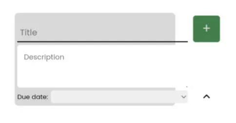
The layout becomes broken when viewed in phones. Here is the link to my codepen Expanded Task Input. I used flexbox to layout this.
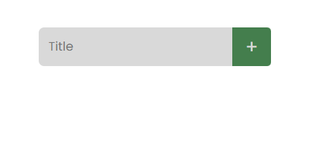
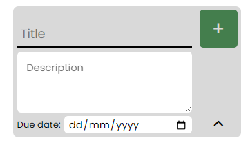
Preview in Desktop:
Desktop Collapsed |
Desktop Expanded
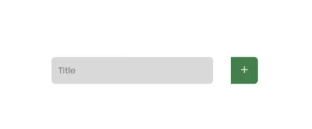
Preview in Mobile
Mobile Collapsed |
Mobile Expanded
Here is the HTML part:
<div class="container">
  <div>
    <div class="input-frame">
      <div class="inputs">
        <input class="title-input" type="text" name="title" placeholder="Title">
        <textarea class="description-input" name="description" rows="3" placeholder="Description"></textarea>
        <div class="date-input-container">
          Due date:
          <input id="date-input" name="date" type="date">
        </div>
      </div>
      <div class="buttons">
        <div class="add-button">+</div>
        <div class="caret-up"><i class="caret-up-icon fa-solid fa-angle-up"></i></div>
      </div>
    </div>
  </div>
</div>
Here is the CSS part:
* {
  margin: 0;
  padding: 0;
  box-sizing: border-box;
  font-family: "Poppins", sans-serif;
}

.container {
  display: flex;
  justify-content: center;
  min-height: 100vh;
  align-items: center;
}

.container > div {
  height: 300px;
  width: 500px;
  padding: 25px;
}

.input-frame {
  display: flex;
  justify-content: space-between;
  width: 300px;
  min-height: 50px;
  margin: auto;
  background-color: #d9d9d9;
  border-radius: 7px;
  transition: 500ms;
}

.buttons {
  display: flex;
  flex-direction: column;
  justify-content: space-between;
  align-items: center;
}

.caret-up {
  display: none;
  width: fit-content;
}

.caret-up-icon {
  transition: 100ms;
}

.caret-up-icon:hover {
  transform: scale(1.5);
}

.add-button {
  background-color: #447e4d;
  min-width: 50px;
  height: 50px;
  font-size: 1.5em;
  color: #d9d9d9;
  right: 0;
  text-align: center;
  vertical-align: middle;
  line-height: 50px;
  border-radius: 0 7px 7px 0;
  transition: 200ms;
}

.add-button:hover {
  cursor: pointer;
}

.inputs {
  display: flex;
  flex-direction: column;
}

.title-input {
  height: 50px;
  border: none;
  background-color: transparent;
  border: 7px 0 0 7px;
  padding: 0 12.5px;
  font-size: 1em;
}

.title-input:focus {
  /*   outline: 3px solid #447E4D; */
  outline: none;
}

.description-input {
  display: none;
  border: none;
  border-radius: 5px;
  padding: 12.5px;
  resize: vertical;
}

.date-input-container {
  display: none;
  align-items: center;
  font-size: 0.75em;
  transition: 200ms;
}

#date-input {
  flex: 1;
  margin-left: 5px;
  border: none;
  border-radius: 5px;
  padding: 2px 5px 0 5px;
}

@keyframes descriptionEntry {
  from {
    opacity: 0;
    height: 0;
  }
  to {
    opacity: 1;
    height: 80px;
  }
}
Here is the JAVASCRIPT part:
const titleInput = document.querySelector(".title-input");
const inputFrame = document.querySelector(".input-frame");
const addButton = document.querySelector(".add-button");
const inputs = document.querySelector(".inputs");
const descriptionInput = document.querySelector(".description-input");
const dateInputContainer = document.querySelector(".date-input-container");
const dateInput = document.querySelector("#date-input");
const caretUp = document.querySelector(".caret-up");

titleInput.addEventListener("focus", () => {
  inputFrame.style.cssText = `
    padding: 5px;
    column-gap: 10px`;

  inputs.style.cssText = `
    flex: 1;
    row-gap: 5px`;

  descriptionInput.style.cssText = `
    display: block;
    animation: 500ms descriptionEntry forwards;`;

  addButton.style.borderRadius = "5px";

  titleInput.style.cssText = `
    padding: 15px 5px 0 5px;
    border-radius: 0;
    border-bottom: 2px solid black`;

  dateInputContainer.style.cssText = `
    display: flex;`;

  caretUp.style.display = "block";
});

caretUp.addEventListener("click", () => {
  inputFrame.style.cssText = `
    padding: 0px;
    column-gap: 0px`;

  descriptionInput.style.cssText = `
    display: none;`;

  addButton.style.borderRadius = "0 5px 5px 0";

  titleInput.style.cssText = `
    border: none;
    padding: 0 12.5px;
    border: 7px 0 0 7px;`;

  dateInputContainer.style.cssText = `
    display: none;`;

  caretUp.style.display = "none";
});
I’ve tried testing it on a different phone and on a different browser on a mobile phone as well as on a different desktop and on a different browser on a desktop but still it only works well on desktops.
I’ve thought that maybe it is a codepen limitation but I’ve tried putting it on github pages and the problem is the same when viewed on phones so maybe it has something to do with my code and with the code compatibility on browsers
2
Answers
Changing the width in the .input-frame class to fit-content solves it
it now looks the same as the desktop | Demo
Don't know why is it like this and is different between desktop and mobile but if there is an expert here about how browsers renders it both in mobile and desktop feel free to share it tnx.
Please check here :
Demo
you are missing width:
I have checked your code and found that you are using display:flex; that was creating gap between input box and button. If you will inspect your codepan then you will see.
I just added width:100% to remove that gap and wholia you are good to go. I will check article for more details (pin point) then i will update the answer for future use. Let me know if this is what you want.