


I am actually following a tutorial and my code mimics the exact code of this instructor. On the instructors website, his images are aligned perfectly and mine are not. What’s happening here?
CSS
html {
  box-sizing: border-box;
  scroll-behavior: smooth;
}

body {
  margin: 0;
  color: var(--on-background);
  font-family: Arvo, sans-serif;
  background-color: var(--background);
  background-image: url("data:image/svg+xml,%3Csvg xmlns='http://www.w3.org/2000/svg' viewBox='0 0 80 80' width='80' height='80'%3E%3Cpath fill='%2349bdc9' fill-opacity='0.3' d='M14 16H9v-2h5V9.87a4 4 0 1 1 2 0V14h5v2h-5v15.95A10 10 0 0 0 23.66 27l-3.46-2 8.2-2.2-2.9 5a12 12 0 0 1-21 0l-2.89-5 8.2 2.2-3.47 2A10 10 0 0 0 14 31.95V16zm40 40h-5v-2h5v-4.13a4 4 0 1 1 2 0V54h5v2h-5v15.95A10 10 0 0 0 63.66 67l-3.47-2 8.2-2.2-2.88 5a12 12 0 0 1-21.02 0l-2.88-5 8.2 2.2-3.47 2A10 10 0 0 0 54 71.95V56zm-39 6a2 2 0 1 1 0-4 2 2 0 0 1 0 4zm40-40a2 2 0 1 1 0-4 2 2 0 0 1 0 4zM15 8a2 2 0 1 0 0-4 2 2 0 0 0 0 4zm40 40a2 2 0 1 0 0-4 2 2 0 0 0 0 4z'%3E%3C/path%3E%3C/svg%3E");
}

section {
  min-height: 100vh;
  display: flex;
  justify-content: center;
  align-items: center;
  flex-direction: column;
}

h1 {
  font-family: Acme, sans-serif;
  font-size: 100px;
  margin-bottom: 0;
}

h2 {
  color: var(--on-background-alt);
  font-size: 32px;
  font-weight: normal;
  text-align: center;
}

/* Navigation */
nav {
  z-index: 10;
  position: fixed;
  font-family: Lato, sans-serif;
  font-size: 24px;
  letter-spacing: 3px;
  padding: 25px;
  width: 100vw;
  background: rgb(255 255 255 / 50%);
}

a {
  margin-right: 25px;
  color: var(--primary-color);
  text-decoration: none;
  border-bottom: 3px solid transparent;
  font-weight: bold;
}

a:hover,
a:focus {
  color: var(--on-background);
  border-bottom: 3px solid;
}

/* Home Section */
.title-group {
  text-align: center;
}

/* About Section */
.about-container {
  display: flex;
}

.image-container {
  border: 1px solid var(--secondary-color);
  border-radius: 10px;
  padding: 10px 20px;
  margin-right: 25px;
  width: auto;
  background: var(--background);
  box-shadow: var(--box-shadow);
}
HTML
<!DOCTYPE html>
<html lang="en">
<head>
    <meta charset="UTF-8">
    <meta name="viewport" content="width=device-width, initial-scale=1.0">
    <title>Light Dark Mode</title>
    <link rel="icon" type="image/png" href="favicon.png">
    <link rel="stylesheet" href="https://cdnjs.cloudflare.com/ajax/libs/font-awesome/5.10.2/css/all.min.css"/>
    <link rel="stylesheet" href="style.css">
</head>
<body>
    <!-- Navigation -->
    <nav id="nav">
        <a href="#home">HOME</a>
        <a href="#about">ABOUT</a>
        <a href="#projects">PROJECTS</a>
        <a href="#contact">CONTACT</a>
    </nav>
    <!-- Home Section -->
    <section id="home">
        <div class="group">
            <h1>Custom Title Here</h1>
            <h2>Welcome to the Website!</h2>
        </div>
    </section>
    <!-- About Section -->
    <section id="about">
        <h1>Undraw Illustrations</h1>
        <div class="about-container">
            <div class="image-container">
                <h2>Web Innovation</h2>
                <img src="img/undraw_proud_coder_light.svg" alt="Proud Coder" id="image1">
            </div>
        </div>
        <div class="about-container">
            <div class="image-container">
                <h2>Problem Solving</h2>
                <img src="img/undraw_feeling_proud_light.svg" alt="Proud" id="image2">
            </div>
        </div>
        <div class="about-container">
            <div class="image-container">
                <h2>High Concept</h2>
                <img src="img/undraw_conceptual_idea_light.svg" alt="Idea" id="image3">
            </div>
        </div>
    </section>
    <!-- Projects Section -->
    <section id="projects">
        <h1>Buttons</h1>
    </section>
    <!-- Contact Section -->
    <section id="contact">

    </section>
    <!-- Script -->
    <script src="script.js"></script>
</body>
</html>
Here is what my website looks like
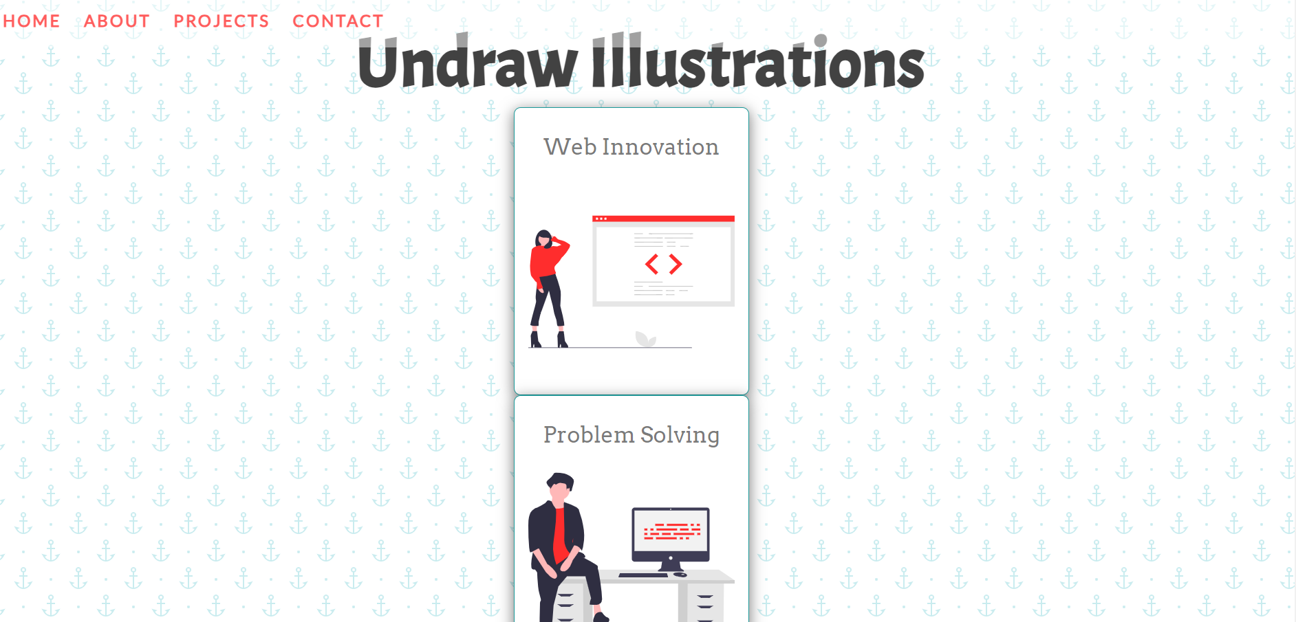
Here is what it SHOULD look like
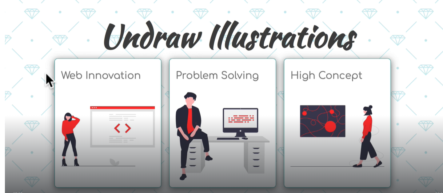
I tried this based on geeksforgeeks, yet still no luck. If I subbed the .content for my .about-container and .box for my .image container.
<style>
        header {
            font-size: 20px;
            align-items: center;
            justify-content: center;
            display: flex;
            height: 10vh;
            background-color: rgb(85, 123, 1);
            color: white;
        }

        .content {
            justify-content: space-around;
            align-items: center;
            display: flex;
            flex-direction: row;
        }

        .box {
            width: 73%;
            height: 25%;
            padding: 5px;
        }
    </style>
2
Answers
To align images in a row, need to create a container div for them. So, it should cover all of the image container divs except for the h1 element.
HTML:
CSS:
Here is the working solution for align the images in row using Flex Layout
And here is css
Hope this will help