skip to Main Content

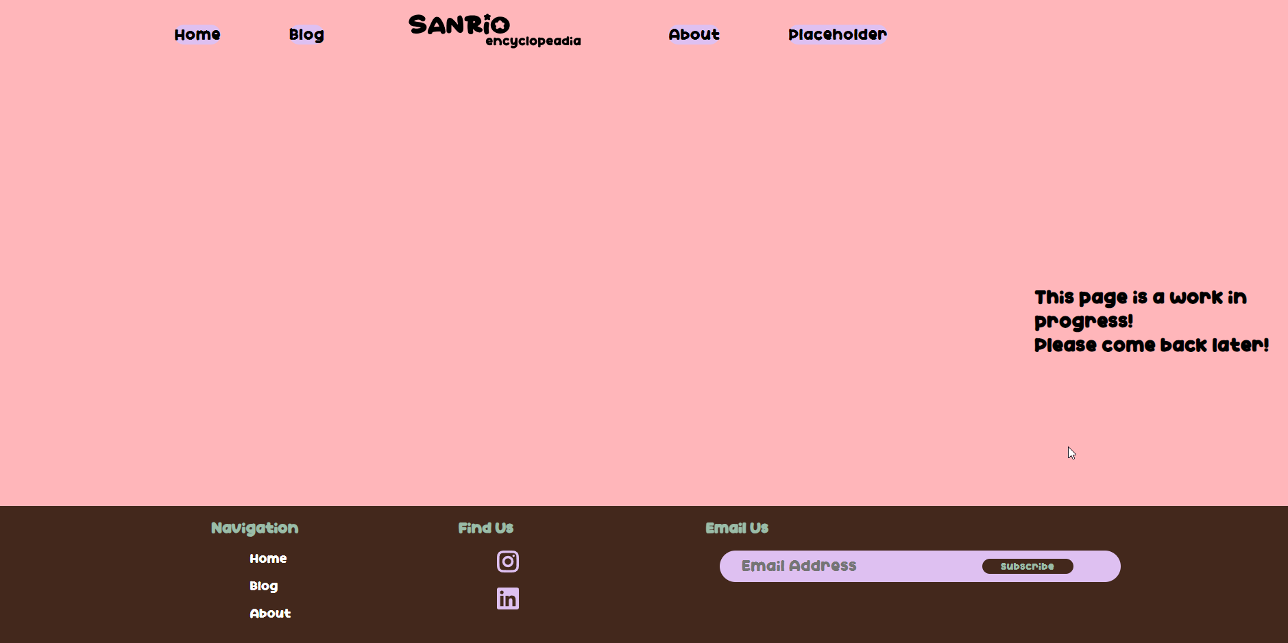
For some reason, my main content seems to be off to the left side while my header is to the right and my footer is where I want it to be
website in question

/* NAV BAR */

li {
  font-family: "talkComic", sans-serif;
}

header {
  display: flex;
  height: 100vh;
  width: 100%;
}

nav {
  display: flex;
  justify-content: space-evenly;
}

nav ul {
  display: flex;
  align-items: center;
  gap: 100px;
  list-style: none;
}

nav ul li a {
  text-decoration: none;
}

.navbtn {
  border-radius: 60px;
  background-color: var(--periwinkle);
  font-family: "talkComic", sans-serif;
  color: #000;
  text-align: center;
  font-size: 20px;
  font-style: normal;
  font-weight: 400;
  width: 250px;
  height: 62px;
}


/* WRAPPER */

.wrapper {
  max-width: 1262px;
  margin: 0 auto;
  position: relative;
}


/* WIP PAGE */

.wippage {
  justify-items: center;
}


/* FOOTER */

footer {
  background-color: var(--poopbrown);
  width: 100%;
  height: 200px;
  color: white;
  position: absolute;
  bottom: 0;
}

footer a {
  text-decoration: none;
  color: white;
}

footer ul {
  list-style: none;
}

footer h3 {
  font-family: "talkComic", sans-serif;
  color: var(--treegreen);
}

footer ul li {
  margin: 16px 16px;
}

footer .linkscontainer {
  display: grid;
  grid-template-columns: 2fr 2fr 3fr;
}

footer form {
  margin-left: 20px;
  margin-top: 16px;
  position: relative;
}

footer form input {
  font-family: "talkComic", sans-serif;
  font-size: 20px;
  border-radius: 45px;
  background: #dec0f1;
  color: #000;
  padding: 8px 32px;
  border: none;
  width: 100%;
}

footer form .submit {
  position: absolute;
  right: 5px;
  top: 25%;
  border-radius: 45px;
  background: #43281c;
  font-family: "talkComic", sans-serif;
  border: none;
  color: var(--treegreen);
  cursor: pointer;
  width: 133px;
  height: 22px;
}


/* character list */

.charcontainer {
  position: relative;
  margin: 0 auto;
}

.charcontainer ul {
  display: flex;
  align-items: center;
  gap: 100px;
  list-style: none;
}

.charcontainer ul li img {
  width: 303px;
  height: 470px;
  border-radius: 60px;
  background-color: var(--treegreen);
}
<html lang="en">

<head>
  <meta charset="UTF-8" />
  <meta name="viewport" content="width=device-width, initial-scale=1.0" />
  <title>WIP</title>
  <link rel="stylesheet" href="style.css" />
</head>

<body>
  <header>
    <div class="wrapper">
      <nav>
        <ul class="navbar">
          <li>
            <a href="#" class="navbtn">Home</a>
          </li>
          <li>
            <a href="placeholder.html" class="navbtn">Blog</a>
          </li>
          <li>
            <a href="index.html"><img class="logo" src="Images/sanriologo.png" alt="" /></a>
          </li>
          <li>
            <a href="#" class="navbtn">About</a>
          </li>
          <li>
            <a href="#" class="navbtn">Placeholder</a>
          </li>
        </ul>
      </nav>
    </div>
  </header>

  <div class="wrapper">
    <div class="wippage">
      <h2>
        This page is a work in progress! <br /> Please come back later!
      </h2>
    </div>
  </div>

  <footer>
    <div class="wrapper">
      <div class="linkscontainer">
        <div class="links">
          <h3>Navigation</h3>
          <ul>
            <li>
              <a href="#">Home</a>
            </li>

            <li>
              <a href="#">Blog</a>
            </li>

            <li>
              <a href="#">About</a>
            </li>
          </ul>
        </div>

        <div class="findUs">
          <h3>Find Us</h3>
          <ul>
            <li>
              <a href="#">
                <img src="Images/icons/instaicon.svg" alt="" />
              </a>
            </li>

            <li>
              <a href="#"><img src="Images/icons/linkedinicon.svg" alt="" /></a>
            </li>
          </ul>
        </div>

        <div class="emailUs">
          <h3>Email Us</h3>
          <form action="#">
            <input type="text" placeholder="Email Address" />
            <button class="submit">Subscribe</button>
          </form>
        </div>
      </div>
    </div>
  </footer>
</body>

</html>

I’ve tried removing the wrapper
changing the body’s padding and margin
I am a complete beginner here honestly and have no idea where I should be looking

EDIT:

I forgot to show what my body css looks like

body {
  background: var(--prettypink);
  margin: 0;
  padding: 0;
  height: 100vh;
  justify-content: center;
  align-items: center;
  display: flex;
}

2

Answers


  1. Try something like this

    HTML

    body {
      display: grid;
      grid-column: 1fr;
      grid-template-rows: 1fr 2fr 1fr;
      padding: 20px;
    }
    
    
    /* NAV BAR */
    
    li {
      font-family: "talkComic", sans-serif;
    }
    
    nav ul {
      display: flex;
      align-items: center;
      list-style: none;
      justify-content: space-between;
      margin: 0;
      padding: 0;
    }
    
    nav ul li a {
      text-decoration: none;
    }
    
    .navbtn {
      border-radius: 60px;
      background-color: var(--periwinkle);
      font-family: "talkComic", sans-serif;
      color: #000;
      text-align: center;
      font-size: 20px;
      font-style: normal;
      font-weight: 400;
      width: 250px;
      height: 62px;
    }
    
    
    /* WRAPPER */
    
    .wrapper {
      display: flex;
      align-items: center;
      width: 100%;
      justify-content: center;
    }
    
    
    /* FOOTER */
    
    footer a {
      text-decoration: none;
      color: white;
    }
    
    footer ul {
      list-style: none;
    }
    
    footer h3 {
      font-family: "talkComic", sans-serif;
      color: var(--treegreen);
    }
    
    footer ul li {
      margin: 16px 16px;
    }
    
    footer .linkscontainer {
      display: flex;
      width: 100%;
      justify-content: space-between;
    }
    
    footer form {
      display: flex;
      align-items: center;
      border-radius: 45px;
      background: #dec0f1;
    }
    
    footer form input {
      font-family: "talkComic", sans-serif;
      font-size: 20px;
      color: #000;
      padding: 8px 32px;
      border: none;
      width: 100%;
      background: transparent;
    }
    
    footer form .submit {
      border-radius: 45px;
      background: #43281c;
      font-family: "talkComic", sans-serif;
      border: none;
      color: rosybrown;
      cursor: pointer;
      width: 133px;
      height: 22px;
      margin-right: 15px;
    }
    
    
    /* character list */
    
    .charcontainer {
      position: relative;
      margin: 0 auto;
    }
    
    .charcontainer ul {
      display: flex;
      align-items: center;
      gap: 100px;
      list-style: none;
    }
    
    .charcontainer ul li img {
      width: 303px;
      height: 470px;
      border-radius: 60px;
      background-color: var(--treegreen);
    }
    <html lang="en">
    
    <head>
      <meta charset="UTF-8" />
      <meta name="viewport" content="width=device-width, initial-scale=1.0" />
      <title>WIP</title>
      <link rel="stylesheet" href="style.css" />
    
    </head>
    
    <body>
      <header>
        <nav>
          <ul class="navbar">
            <li>
              <a href="#" class="navbtn">Home</a>
            </li>
            <li>
              <a href="placeholder.html" class="navbtn">Blog</a>
            </li>
            <li>
              <a href="index.html"><img class="logo" src="Images/sanriologo.png" alt="" /></a>
            </li>
            <li>
              <a href="#" class="navbtn">About</a>
            </li>
            <li>
              <a href="#" class="navbtn">Placeholder</a>
            </li>
          </ul>
        </nav>
      </header>
    
      <div class="wrapper">
        <div class="wippage">
          <h2>
            This page is a work in progress! <br /> Please come back later!
          </h2>
        </div>
      </div>
    
      <footer>
        <div class="linkscontainer">
          <div class="links">
            <h3>Navigation</h3>
            <ul>
              <li>
                <a href="#">Home</a>
              </li>
    
              <li>
                <a href="#">Blog</a>
              </li>
    
              <li>
                <a href="#">About</a>
              </li>
            </ul>
          </div>
    
          <div class="findUs">
            <h3>Find Us</h3>
            <ul>
              <li>
                <a href="#">
                  <img src="Images/icons/instaicon.svg" alt="" />
                </a>
              </li>
    
              <li>
                <a href="#"><img src="Images/icons/linkedinicon.svg" alt="" /></a>
              </li>
            </ul>
          </div>
    
          <div class="emailUs">
            <h3>Email Us</h3>
            <form action="#">
              <input type="text" placeholder="Email Address" />
              <button class="submit">Subscribe</button>
            </form>
          </div>
        </div>
      </footer>
    </body>
    
    </html>
    Login or Signup to reply.
    • Lots of ugly borders just to show what is where.

    • Used grid to give the three containers a place to live.

    • Change the UL and LI to div and span – just my opinion that this is less hassle than fixing the style that those include etc.

    • put some colors on but they don’t match yours but you did not provide those so this is my 3 second guesswork

    • set a base 16px font on the body then used em for sizing – my brain works better with smaller numbers like say I want a size increase to 3.5X – so simple 3.5em now if I change my base it all sizes from that.

    • I admit I have a preference for classes kebob like page-container etc. I did not alter yours like navbtn to something like nav-button which to me is more descriptive.

    • note the header and footer are there and the main part takes up the rest due to the grid-template-rows: auto 1fr auto;

    • I "super-centered" those three with place-items: center; which is a shortcut you can look up.

    • I named the three main containers as "header", "main" and "footer" in the grid area template the put them in there.

    • I also leveraged the grid on your "form" in the footer in a similar way but put both the input and the button in the same grid cell – aligned the button center and put it on the right side (end) footer form .submit { grid-area: formthing; justify-self: end;

    • the visual style is subjective and up to you but this is about the layout – try re-sizing the page both directions and see it should flow properly. I did NOT try on mobile

    • Note there is no "position" in this anywhere to make it more modern

    :root {
      --treegreen: #8da582;
      --poopbrown: #7a5901;
      --periwinkle: #C3CDE6;
    }
    
    body {
      margin: 0;
      padding: 0;
      font-size: 16px;
      box-sizing: border-box;
    }
    
    .page-container {
      display: grid;
      grid-template-rows: auto 1fr auto;
      grid-template-columns: 1fr;
      grid-template-areas: "header" "main" "footer";
      place-items: center;
      height: 100vh;
      border: solid red 1px;
    }
    
    header {
      grid-area: header;
      display: grid;
      place-items: center;
      border: solid 1px #0000FF;
      width: 100%;
    }
    
    .content-container {
      grid-area: main;
      display: grid;
      place-items: center;
      border: solid 1px #00FF00;
    }
    
    footer {
      grid-area: footer;
      border: solid 1px #FFFF00;
      background-color: var(--poopbrown, #7a5901);
    }
    
    nav {
      border: solid pink 1px;
    }
    
    nav .navbar {
      display: flex;
      align-items: center;
      gap: 3em;
      justify-content: space-around;
      height: 3em;
    }
    
    nav .navbar .nav-item {
      font-family: "talkComic", sans-serif;
    }
    
    nav .navbar .nav-item .navbtn {
      text-decoration: none;
      border-radius: 3em;
      text-align: center;
      font-size: 1.25em;
      font-style: normal;
      font-weight: 400;
      padding: 0.25em;
      width: fit-content;
      block-size: fit-content;
      background-color: var(--periwinkle, #C3CDE6);
      font-family: "talkComic", sans-serif;
      color: #000;
    }
    
    nav .navbar .nav-item-logo {
      background-color: #88338820;
      block-size: fit-content;
      display: grid;
      place-items: center;
      height: 100%;
    }
    
    nav .navbar .nav-item-logo .navbtn .logo {
      height: 100px;
      object-fit: contain;
      aspect-ratio: 1 / 1;
      border: solid cyan 1px;
    }
    
    .footer-container {
      height: auto;
      width: 100%;
      display: grid;
      grid-template-columns: 1fr 1fr 2fr;
      align-items: start;
      justify-items: center;
    }
    
    footer .footer-block-container {
      border: solid pink 1px;
    }
    
    footer .footer-link {
      text-decoration: none;
      color: white;
    }
    
    footer h3 {
      font-family: "talkComic", sans-serif;
      color: var(--treegreen, #228B22);
    }
    
    footer .footer-block-container .footer-link-items {
      display: grid;
      grid-template-rows: repeat(1fr, 3);
      row-gap: 1em;
    }
    
    footer .footer-link-items .footer-link-item {
      border: solid #00ff00 1px;
    }
    
    footer .footer-block-container .footer-nav-container {
      display: grid;
      grid-template-rows: 1fr auto;
      grid-template-columns: 1fr;
    }
    
    .footer-link-items {
      display: flex;
    }
    
    footer form {
      display: grid;
      grid-template-columns: 1fr;
      grid-template-rows: 1fr;
      grid-template-areas: "formthing";
      margin-left: 1.25em;
      margin-top: 1em;
      border: solid 1px #FF00FF;
    }
    
    footer form input {
      grid-area: formthing;
      font-family: "talkComic", sans-serif;
      font-size: 1.25em;
      border-radius: 45px;
      background: #dec0f1;
      color: #000;
      padding: 0.5em 2em;
      border: none;
    }
    
    footer form .submit {
      grid-area: formthing;
      justify-self: end;
      margin-top: 1em;
      border-radius: 45px;
      background: #43281c;
      font-family: "talkComic", sans-serif;
      border: none;
      color: var(--treegreen, #228B22);
      cursor: pointer;
      width: 8.5em;
      height: 1.375em;
    }
    <div class="page-container">
      <header class="header-container">
        <nav>
          <div class="navbar">
            <span class="nav-item"><a href="#" class="navbtn">Home</a></span>
            <span class="nav-item"><a href="placeholder.html" class="navbtn">Blog</a></span>
            <span class="nav-item-logo"><a href="index.html" class="navbtn"><img class="logo" src="Images/sanriologo.png" alt="logo" /></a></span>
            <span class="nav-item"><a href="#" class="navbtn">About</a></span>
            <span class="nav-item"><a href="#" class="navbtn">Placeholder</a></span>
          </div>
        </nav>
      </header>
      <div class="content-container">
        <div class="content-block">
          <h2>
            This page is a work in progress! <br />Please come back later!
          </h2>
        </div>
      </div>
      <footer class="footer-container">
        <div class="footer-block-container">
          <h3>Navigation</h3>
          <div class="footer-link-items">
            <span class="footer-link-item"><a class="footer-link" href="#">Home</a></span>
            <span class="footer-link-item"><a class="footer-link" href="#">Blog</a></span>
            <span class="footer-link-item"><a class="footer-link" href="#">About</a></span>
          </div>
        </div>
        <div class="footer-block-container">
          <div class="findUs">
            <h3>Find Us</h3>
            <div class="footer-link-items">
              <span class="footer-link-item">
                  <a class="footer-link" href="#"><img src="Images/icons/instaicon.svg" alt="insta" /></a>
              </span>
              <span class="footer-link-item">
                  <a class="footer-link" href="#"><img src="Images/icons/linkedinicon.svg" alt="linkedin" /></a>
               </span>
            </div>
          </div>
        </div>
        <div class="footer-block-container">
          <div class="emailUs">
            <h3>Email Us</h3>
            <form action="#">
              <input type="text" placeholder="Email Address" />
              <button type="button" class="submit">Subscribe</button>
            </form>
          </div>
        </div>
      </footer>
    </div>
    Login or Signup to reply.
Please signup or login to give your own answer.
Back To Top
Search