skip to Main Content

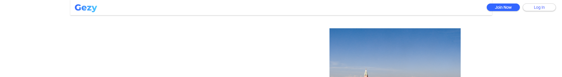
i just started to code html and css. I created a to make a navigation bar on top of my landing page but the problem is, the size of navbar doesnt fit into page when i zoom out, its getting smaller everytime i zoom out. How can i make it fit with keep everthing in body section centered?I zoomed out to %75 in the picture

Here is my code for HTML and CSS

* {
  box-sizing: border-box;
}

body, html {
  padding: 0px;
  max-width: 1920px;
  margin: auto;

}

.navigation-bar {
  height: 70px;
  box-shadow: 0 2px 4px 0 rgba(0, 0, 0, .2);
  display: flex;
  align-items: center;
}
<div class="navigation-bar"> 
    <div class="logo">Gezy</div>
    <div class="button-container">
        <div class="join-now"><button>Join Now</button></div>
        <div class="log-in"><button>Log In</button></div>
    </div> 
</div>

2

Answers


  1. The <body> element is constraining it, because you’ve set a maximum width:

    max-width: 1920px;
    

    Remove that and the constraint goes away.

    Login or Signup to reply.
  2. To make sure your navigation bar remains fixed in size even when zooming out and everything in the body is centered, you can use a combination of relative and absolute positioning. Here’s an updated version of your code:

    <!DOCTYPE html>
    <html lang="en">
    <head>
        <meta charset="UTF-8">
        <meta name="viewport" content="width=device-width, initial-scale=1.0">
        <style>
            * {
                box-sizing: border-box;
            }
    
            body, html {
                padding: 0;
                margin: 0;
                max-width: 1920px;
                height: 100%;
                display: flex;
                justify-content: center;
                align-items: center;
            }
    
            .navigation-bar {
                position: fixed;
                top: 0;
                left: 0;
                right: 0;
                height: 70px;
                box-shadow: 0 2px 4px 0 rgba(0, 0, 0, .2);
                display: flex;
                align-items: center;
                justify-content: space-between;
                padding: 0 20px;
                background-color: #fff; /* Add a background color to make it visible */
                width: 100%;
                z-index: 1000; /* Ensure the navigation bar is on top of other elements */
            }
    
            .logo {
                font-size: 1.5em;
                font-weight: bold;
            }
    
            .button-container {
                display: flex;
                gap: 10px;
            }
    
            .join-now button, .log-in button {
                padding: 8px 16px;
            }
        </style>
    </head>
    <body>
        <div class="navigation-bar"> 
            <div class="logo">Gezy</div>
            <div class="button-container">
                <div class="join-now"><button>Join Now</button></div>
                <div class="log-in"><button>Log In</button></div>
            </div> 
        </div>
    
        <!-- Your main content goes here -->
    
    </body>
    </html>
    • Use position: fixed; for the navigation bar to keep it fixed at the top.
    • Set top, left, right, and width to ensure it spans the full width.
      justify-content: space-between; in .navigation-bar to push the logo to the left and the buttons to the right.
    • Added some basic styles to the logo and buttons for better visibility.
    Login or Signup to reply.
Please signup or login to give your own answer.
Back To Top
Search