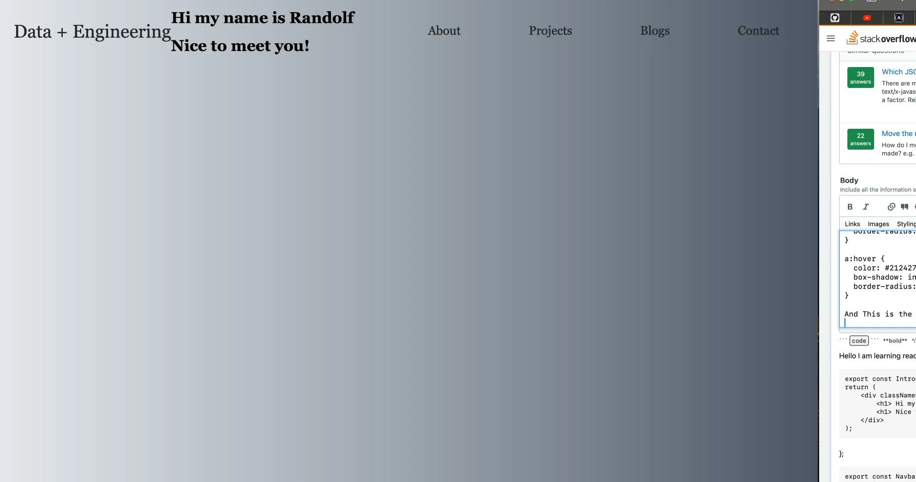
Hello I am learning react and I have made 2 components:
Navbar and Description
export const Introduction = () => {
return (
    <div className="Introduction">
        <h1> Hi my name is Randolf </h1>
        <h1> Nice to meet you!</h1>
    </div>
);};

export const Navbar = () => {
return (
    <div className="Navbar">
        <h1 className="NavTitle"> Data + Engineering </h1>
        <nav>
            <ul>
                <li><a href="App.js"> About</a></li>
                <li><a href="Projects.js"> Projects</a></li>
                <li><a href="Blogs.js"> Blogs</a></li>
                <li><a href="Contact.js"> Contact</a></li>
            </ul>
        </nav>
    </div>
);
};
I am trying to have the navigation bar and the navigation title in the place that they are currently, but the content from Introduction overlaps with them in place when they are within my function app that returns the html script.
function App() { return (
<div className='container'>
  <header>
    <Navbar/>
  </header>
  <Introduction/>
</div>);}
From here this is also my css:
.App {
  background-image: linear-gradient(to right, rgb(229, 231, 235), rgb(156, 163, 175), rgb(75, 85, 99));
  size: 100%;
}

.App-header {
  background-image: linear-gradient(to right, rgb(229, 231, 235), rgb(156, 163, 175), rgb(75, 85, 99));
  position: fixed;
  left: 0;
  right: 0;
  top: 0;
}

.App-link {
  color: #61dafb;
}

body {
  background-image: linear-gradient(to right, rgb(229, 231, 235), rgb(156, 163, 175), rgb(75, 85, 99));
  font-family: Georgia, 'Times New Roman', Times, serif;
}

/* Navigation bar components */

.NavTitle {
  color: #212427;
  float: left;
  padding-top: 10px 0;
  padding-left: 20px;
  font-weight: 500;
  font-size: 37.5px;
  font-weight: 200;
}

nav {
  float: right;
}

nav ul {
  margin: 0;
  padding: 0;
  list-style: none;
}

nav li {
  display: inline-block;
  margin-left: 70px;
  margin-right: 70px;
  padding-top: 30px;
}

nav a {
  box-shadow: inset 0 0 0 0 #212427;
  color: #212427;
  padding: 0 .75rem;
  margin: 0 -.75rem;
  font-size: 25px;
  font-weight: 500;
  font: bold;
  text-decoration: none;
  transition: color .5s ease-in-out, box-shadow .5s ease-in-out;
  border-radius: 7.5px;
}

a:hover {
  color: #212427;
  box-shadow: inset 200px 0 0 0 beige;
  border-radius: 7.5px;
}
And This is the output I received:
I would like to know how to have the "Hi my name is Randolf Nice to meet you! under the navigation bar and "Data + Engineering" as they are in the correct orientation. Thank you for following with me!


2
Answers
the problem you are facing is due to
floats, in 2023 you should avoid using floats to create layouts and use flexbox or grid insteadbut this was a very common problem when we used to design with floats and solution is called
clearfix, I will suggest you read about why float cause this issue and what is clearfix solutionbut in short you can use this
and add the class called
clearfixtoheadercomponent in HTMLIt seems like you want to arrange your components and elements in a specific layout with the introduction content displayed below the navigation bar. To achieve this, you can use CSS to control the positioning of your components. Here’s how you can modify your code to achieve the desired layout.
function App(){
return (
);
}
/* Add this CSS to your stylesheet */
/* Container for the entire app */
.container {
display: flex;
}
/* Content below the navigation bar */
.content {
margin-top: 20px;
}
With these changes, the Navbar and Introduction components will be displayed vertically with the introduction content below the navigation bar. You can adjust the margin-top value in the .content CSS rule to control the spacing between the navigation bar and the introduction content.
Remember to customize the styling and layout further according to your design preferences.