skip to Main Content

I have a div:

  • it has width, but it is not known ahead of time
  • it might or might not have height set
  • when height is not set, it should expand vertically to match content.

I want to overlay that div with an SVG:

  • SVG has a square view box
  • SVG should take up exactly the size of the div.

I know this could be done using position: relative/absolute. I am trying to use CSS grid layout to achieve this, though.

Here’s the code I have:

<div id="wrapper">
    <div id="d1" style="width: 20em;">
        <p>Some content here.</p>
        <p>Some content here.</p>
    </div>
    <svg id="overlay" viewBox="0 0 3 3" preserveAspectRatio="none">
        <rect width="100%" height="100%" fill="purple" opacity="0.5" />
    </svg>
</div>
#wrapper {
    display: grid;
    width: fit-content;
    height: fit-content;
}

#d1 {
    grid-area: 1 / 1;
    box-sizing: border-box;
    padding: 0;
    margin: 0;
    border: 5px solid black;
}

#overlay {
    grid-area: 1 / 1;
    width: 100%;
    height: 100%;
}

https://jsfiddle.net/w2mucxvL/

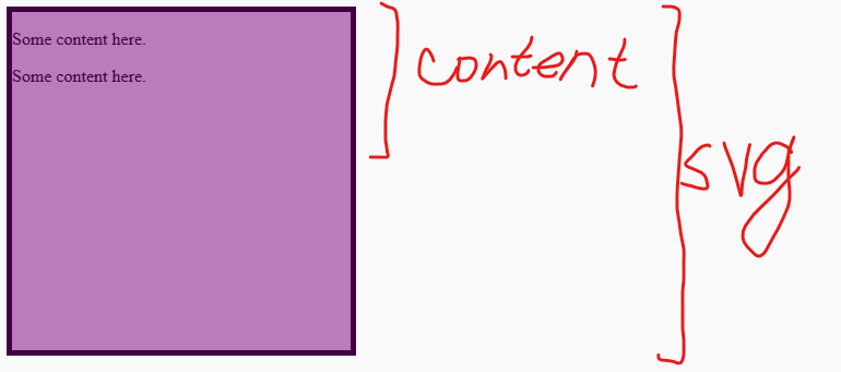
enter image description here

The problem is: browsers seems to be ignoring preserveAspectRatio="none", which causes SVG to be square (instead of the size of #d1, which is not square). What am I missing?

2

Answers


  1. Because with viewBox="0 0 3 3", the svg has its own default size of the aspect ratio of a square. So the grid is taking account of the dimensions of the SVG as well.

    For an overlay, you could make the SVG position: absolute so its dimensions will be ignored by its parent #wrapper.

    Together with setting position: relative to the #wrapper, the SVG will be covering only the size of #wrapper correctly.

    #wrapper {
        display: grid;
        width: fit-content;
        height: fit-content;
        /* added */
        position: relative;
    }
    
    #d1 {
        grid-area: 1 / 1;
        box-sizing: border-box;
        padding: 0;
        margin: 0;
        border: 5px solid black;
    }
    
    #overlay {
        grid-area: 1 / 1;
        width: 100%;
        height: 100%;
        /* added */
        position: absolute;
    }
    <div id="wrapper">
        <div id="d1" style="width: 20em;">
            <p>Some content here.</p>
            <p>Some content here.</p>
        </div>
        <svg id="overlay" viewBox="0 0 3 3" preserveAspectRatio="none">
            <rect width="100%" height="100%" fill="purple" opacity="0.5" />
        </svg>
    </div>
    Login or Signup to reply.
  2. You have to disable the size contribution of the SVG so that it doesn’t affect the size of the grid but rather consider the grid size to be sized:

    #wrapper {
      display: grid;
      width: fit-content;
    }
    
    #d1 {
      grid-area: 1 / 1;
      border: 5px solid black;
    }
    
    #overlay {
      grid-area: 1 / 1;
      width: 100%;
      height: 100%;
      contain: size; /* disable size contribution */
    }
    <div id="wrapper">
      <div id="d1" style="width: 20em;">
        <p>Some content here.</p>
        <p>Some content here.</p>
      </div>
      <svg id="overlay" viewBox="0 0 3 3" preserveAspectRatio="none">
            <rect width="100%" height="100%" fill="purple" opacity="0.5" />
        </svg>
    </div>

    Written differently:

    #wrapper {
      display: grid;
      width: fit-content;
    }
    
    #d1 {
      grid-area: 1 / 1;
      border: 5px solid black;
    }
    
    #overlay {
      grid-area: 1 / 1;
      width: 0;
      height: 0;
      min-width: 100%;
      min-height: 100%;
    }
    <div id="wrapper">
      <div id="d1" style="width: 20em;">
        <p>Some content here.</p>
        <p>Some content here.</p>
      </div>
      <svg id="overlay" viewBox="0 0 3 3" preserveAspectRatio="none">
            <rect width="100%" height="100%" fill="purple" opacity="0.5" />
        </svg>
    </div>
    Login or Signup to reply.
Please signup or login to give your own answer.
Back To Top
Search