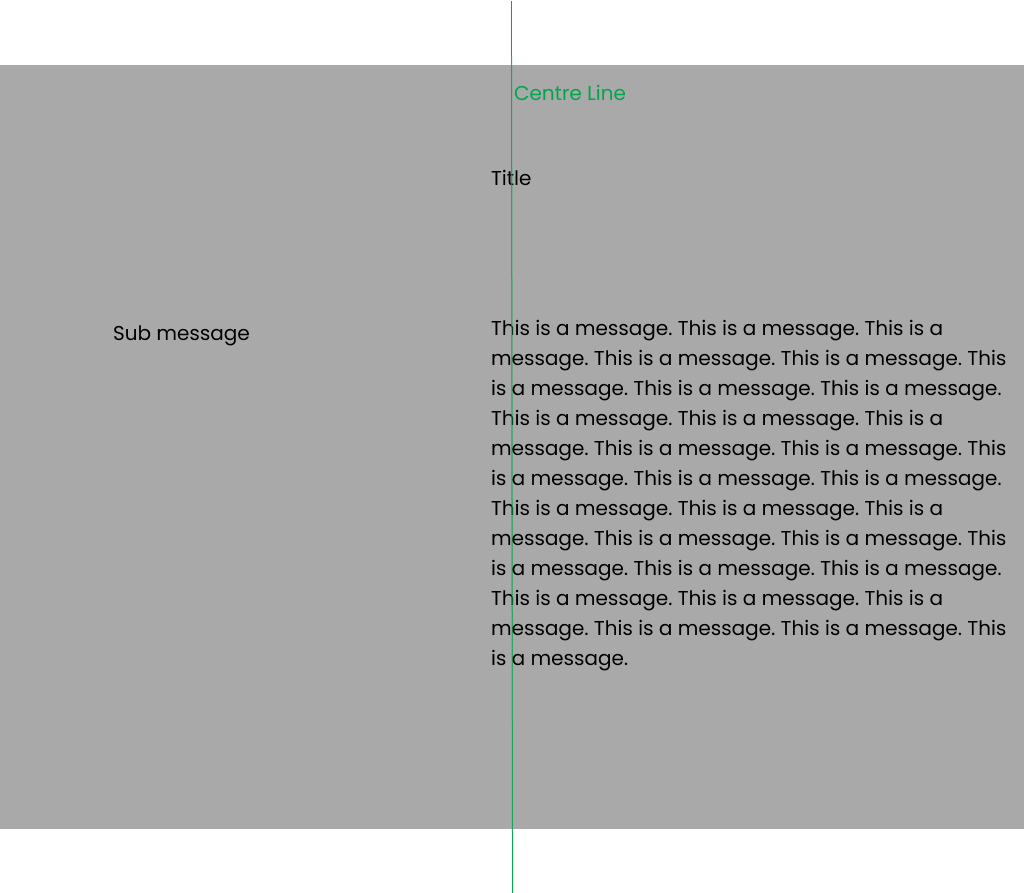
I’m trying to position a title in the centre and a message which will start from the same x axis point as the title, whilst positioning a sub message from the start on the left:
I’ve tried the following CSS, but the two messages just stay close together, and the second message does not align with the title
.container{
    display: flex;
    justify-content: center;
}

.divForSubMessageAndMessage{
    display: flex;
    justify-content: flex-start;
}

.message{
    justify-self: center;
    align-self: center;
}
<div className="container">
<h1>Title</h1>
<div className="divForSubMessageAndMessage">
<p className="subMessage">subMessage</p>
<p className="message">Message</p>
</div>
</div>


2
Answers
A grid is much better suited than a flexbox for managing the overall layout of this particular design.
This cannot be done only with css. In addition, when using javascript, it is important to take into account the nuances – such as, for example, the width of
.title. Here is an example for you as a starting point: