


I’m trying to recreate the scrolling-effect of the iOS 16 weather app with CSS. That is to say I need blocks with sticky headers that overlap each other at the top. position: sticky itself pushes the last header out once the next header is at the top. Is there a way to prevent this behavior and to have the blocks overlap? (preferably using only CSS)
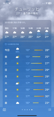
To make it clearer what I’m trying to achieve here’s the weather app I’m talking about. As you can see the next block overlaps the title of the previous block (while it fades away) instead of pushing it out.
The way I usually do stuff like this is by using position: sticky, which pushes the previous block out instead of overlapping it.
section {
  padding-bottom: 10px;
}

.content {
  height: 300px;
  width: 300px;
  background-color: lightblue;
}

.header {
  height: 40px;
  width: 300px;
  background-color: coral;
  position: sticky;
  top: 0;
}
<section>
<div class="header">
Title 1
</div>
<div class="content" />
</section>
<section>
<div class="header">
Title 2
</div>
<div class="content" />
</section>
<section>
<div class="header">
Title 3
</div>
<div class="content" />
</section>
2
Answers
One way would be to alter your structure a bit. Taking the
.headerelements outside thesectionelements would directly have the effect you want. Although it modifies how you can do the styling you want.You can add a negative bottom margin to the sticky header to give it more room to remain sticky and this will simulate the overlap you want. Don’t forget to also add the same amount of margin to the next section to rectify.