skip to Main Content

I have a parent div with some childs, when number of child is more than 5 I create another column and I put others childs, the problem is my div not fit content,this is my parent div with some childs:

enter image description here

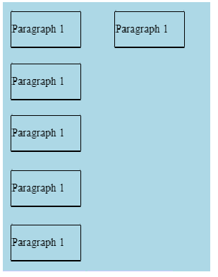
When I add another item it look like:

enter image description here

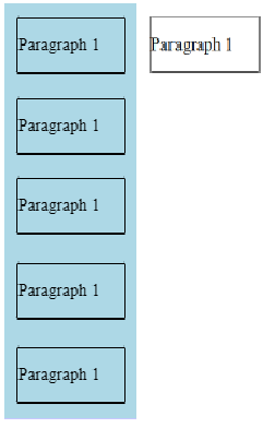
I’ve tried width: fit-content but not work’s, output:

enter image description here

EDIT: I want to have a fixed height of my parent,always 450px

This is my code :

.container {
  display: flex;
  flex-direction: column;
  flex-wrap: wrap;
  max-height: 450px;
  background: lightblue;
  width: fit-content;
  word-wrap: break-word;
}

.item {
  border: 1px solid black;
  border-radius: 2%;
  margin: 12px 10px;
  width: 100px;
}
<div class="container">
  <div class="item">
    <p>Paragraph 1</p>
  </div>
  <div class="item">
    <p>Paragraph 1</p>
  </div>
  <div class="item">
    <p>Paragraph 1</p>
  </div>
  <div class="item">
    <p>Paragraph 1</p>
  </div>
  <div class="item">
    <p>Paragraph 1</p>
  </div>
  <div class="item">
    <p>Paragraph 1</p>
  </div>
</div>

I want to get the background cover all children’s div

3

Answers


  1. Because you fixed your max-hight: 450px. You need to change that to auto or increase your pixel.

    .container {
      display: flex;
      flex-direction: column;
      flex-wrap: wrap;
      max-height: auto;
      background: lightblue;
      width: fit-content;
      word-wrap: break-word;
    }
    
    .item {
      border: 1px solid black;
      border-radius: 2%;
      margin: 12px 10px;
      width: 100px;
    }
    <div class="container">
      <div class="item">
        <p>Paragraph 1</p>
      </div>
      <div class="item">
        <p>Paragraph 1</p>
      </div>
      <div class="item">
        <p>Paragraph 1</p>
      </div>
      <div class="item">
        <p>Paragraph 1</p>
      </div>
      <div class="item">
        <p>Paragraph 1</p>
      </div>
      <div class="item">
        <p>Paragraph 1</p>
      </div>
    </div>
    Login or Signup to reply.
  2. .container {
      display: flex;
      flex-direction: column;
      flex-wrap: wrap;
      max-height: 450px;
      background: lightblue;
    }
    
    .item {
      border: 1px solid black;
      margin: 12px 10px;
      width: 100px;
    }
    <div class="container">
      <div class="item">
        <p>Paragraph 1</p>
      </div>
      <div class="item">
        <p>Paragraph 1</p>
      </div>
      <div class="item">
        <p>Paragraph 1</p>
      </div>
      <div class="item">
        <p>Paragraph 1</p>
      </div>
      <div class="item">
        <p>Paragraph 1</p>
      </div>
      <div class="item">
        <p>Paragraph 1</p>
      </div>
    </div>

    does it look like what you wanted? if so, great, if not, yes I know it doesn’t make your container grow when the number children increases but your request is a little problematic. try using a different layout (I know changing html is a horrible solution). but see here it’s like not possible (currently).

    here’s what I suggest:

    .container {
      display: inline-flex;
      flex-direction: row;
      max-height: 450px;
      background: lightblue;
    }
    
    .item {
      border: 1px solid black;
      margin: 12px 10px;
      width: 100px;
    }
    
    .column {
      display: flex;
      flex-direction: column;
    }
    <div class="container">
    
      <div class="column">
        <div class="item">
          <p>Paragraph 1</p>
        </div>
        <div class="item">
          <p>Paragraph 1</p>
        </div>
        <div class="item">
          <p>Paragraph 1</p>
        </div>
        <div class="item">
          <p>Paragraph 1</p>
        </div>
        <div class="item">
          <p>Paragraph 1</p>
        </div>
      </div>
    
      <div class="column">
        <div class="item">
          <p>Paragraph 1</p>
        </div>
      </div>
    
    </div>

    since you know you’re gonna break every 5th element, you can write it manually. sorry if my answer wasn’t enough.

    Login or Signup to reply.
  3. To achieve the desired layout where the background covers all children divs within a fixed height parent, you can modify the CSS of your container class as follows:

    .container {
      display: flex;
      flex-direction: column;
      flex-wrap: wrap;
      max-height: 450px;
      background: lightblue;
      width: fit-content;
      word-wrap: break-word;
      padding: 5px; /* Add padding to create some space between columns */
      box-sizing: border-box; /* Include padding in the width calculation */
    }
    
    .item {
      border: 1px solid black;
      border-radius: 2%;
      margin: 12px 10px;
      width: 100px;
    }
    
    /* Add a media query to force one column layout when the window width is smaller */
    @media (max-width: 1000px) {
      .container {
    flex-wrap: nowrap;
    overflow-y: auto; /* Enable vertical scrolling when there are many items */
      }
    }
    <div class="container">
      <div class="item">
        <p>Paragraph 1</p>
      </div>
      <div class="item">
        <p>Paragraph 1</p>
      </div>
      <div class="item">
        <p>Paragraph 1</p>
      </div>
      <div class="item">
        <p>Paragraph 1</p>
      </div>
      <div class="item">
        <p>Paragraph 1</p>
      </div>
      <div class="item">
        <p>Paragraph 1</p>
      </div>
    </div>

    With this updated CSS, the .container div will adjust its width according to the content. The max-height: 450px property will keep the parent div at a fixed height of 450px. If there are more child items than can fit within the fixed height, a vertical scrollbar will appear for the container.

    Remember to adjust the max-width value in the media query to your desired breakpoint for switching to a single-column layout.

    Keep in mind that using width: fit-content might not work as expected in some older browsers. It is supported in modern browsers, but if you need to support older browsers, you may need to use an alternative approach or consider using a CSS framework like Bootstrap.

    Login or Signup to reply.
Please signup or login to give your own answer.
Back To Top
Search