skip to Main Content

I’d like to create a speech bubble using pure CSS.

There’s a few requirements I have:

  • It must scale with either the content + some padding or a preffered size.
  • It’s background color should be semi-transparent.
  • You should be able to set a border, with it’s own level of transparency.
  • You should be able to set a border-radius, which both the border and background adheres to.

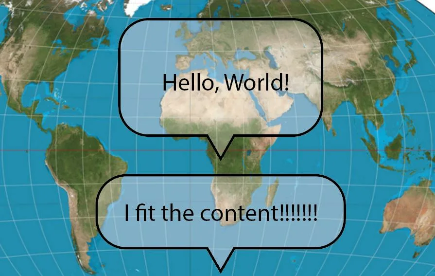
Here’s an example of what I would imagine two of such a speech bubble would look like, the first has a preffered with and height and centers the content, the second fits the height and width of the content with some padding. I think the crucial bit here is that in both cases, the little pointy triangle remains the same size and is centered.
enter image description here

I’ve tried looking for different speech bubble approaches, and attempted to adapt examples, such as #34 on the list here:

/* HTML: <div class="tooltip">This is a Tooltip with a border and a border radius. Border can have a solid or gradient coloration and the background is transparent</div> */
.tooltip {
    color: #fff;
    font-size: 18px;
    max-width: 28ch;
    text-align: center;
    background-color: #ff000055;
    border-radius: 25px;
}
.tooltip {
    /* triangle dimension */
    --a: 90deg; /* angle */
    --h: 1em; /* height */

    --p: 50%; /* triangle position (0%:left 100%:right) */
    --b: 7px; /* border width */
    --r: 1.2em; /* the radius */

    padding: 1em;
    color: #415462;
    position: relative;
    z-index: 0;
}
.tooltip:before,
.tooltip:after {
    content: '';
    position: absolute;
    z-index: -1;
    inset: 0;
    background: conic-gradient(#4ecdc4 33%, #fa2a00 0 66%, #cf9d38 0); /* your coloration */
    --_p: clamp(
        var(--h) * tan(var(--a) / 2) + var(--b),
        var(--p),
        100% - var(--h) * tan(var(--a) / 2) - var(--b)
    );
}
.tooltip:before {
    padding: var(--b);
    border-radius: var(--r) var(--r) min(var(--r), 100% - var(--p) - var(--h) * tan(var(--a) / 2))
        min(var(--r), var(--p) - var(--h) * tan(var(--a) / 2)) / var(--r);
    background-size: 100% calc(100% + var(--h));
    clip-path: polygon(
        0 100%,
        0 0,
        100% 0,
        100% 100%,
        calc(var(--_p) + var(--h) * tan(var(--a) / 2) - var(--b) * tan(45deg - var(--a) / 4)) 100%,
        calc(var(--_p) + var(--h) * tan(var(--a) / 2) - var(--b) * tan(45deg - var(--a) / 4))
            calc(100% - var(--b)),
        calc(var(--_p) - var(--h) * tan(var(--a) / 2) + var(--b) * tan(45deg - var(--a) / 4))
            calc(100% - var(--b)),
        calc(var(--_p) - var(--h) * tan(var(--a) / 2) + var(--b) * tan(45deg - var(--a) / 4)) 100%
    );
    -webkit-mask:
        linear-gradient(#000 0 0) content-box,
        linear-gradient(#000 0 0);
    -webkit-mask-composite: xor;
    mask-composite: exclude;
}
.tooltip:after {
    bottom: calc(-1 * var(--h));
    clip-path: polygon(
        calc(var(--_p) + var(--h) * tan(var(--a) / 2)) calc(100% - var(--h)),
        var(--_p) 100%,
        calc(var(--_p) - var(--h) * tan(var(--a) / 2)) calc(100% - var(--h)),
        calc(var(--_p) - var(--h) * tan(var(--a) / 2) + var(--b) * tan(45deg - var(--a) / 4))
            calc(100% - var(--h) - var(--b)),
        var(--_p) calc(100% - var(--b) / sin(var(--a) / 2)),
        calc(var(--_p) + var(--h) * tan(var(--a) / 2) - var(--b) * tan(45deg - var(--a) / 4))
            calc(100% - var(--h) - var(--b))
    );
}

But setting a semi-transparent background color (and a border-radius to hide the overflow behind the border) doesn’t fill in the little triangle at the bottom. Nor could I find a way to do so.

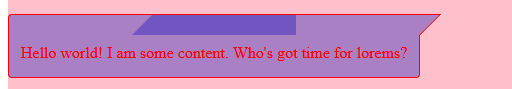
I also found a related question here which suggests an approach which I adapted to the code below

<div class="background">
  <div class="bubble">
  <p>
    Hello world! I am some content. Who's got time for lorems?
  </p>
</div>
</div>
.background {
  background: pink;
  display: flex;
  width: 100%;
  height: 100vh;
}

.bubble {
  height: fit-content;
  color: red;
  max-width: 75%;
  min-width: 200px;
  padding: 8px 12px 0 12px;
  position: relative;
  border-radius: 0 0 4px 4px;
  margin-top:40px;
  border: 1px solid red;
  border-top:0;
  margin-right: 16px;
  background: #0000bb55;
}

.bubble::before,
.bubble::after{
  
  content: '';
  position: absolute;
  width: 70%;
  height: 20px;
  top: -21px;
  border:1px solid;
  background: #0000bb55;
}
.bubble::before {
  right:-1px;
  border:1px solid;
  border-width:1px 1px 0 0;
  transform-origin:bottom;
  transform:skew(-45deg);
}
.bubble::after{
  left:-1px;
  border-width:1px 0 0 1px;
  border-radius:4px 0 0 0;
}

p {
 margin-top:0;
}

But as soon as you start introducing semi-transparent colors, those skewed transforms start overlapping and introducing color discrepancies.

enter image description here

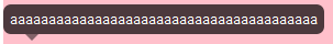
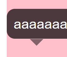
Finally, the answers in this post also seems to have different opacity levels for the triangle and the background:

<div class="wrapper">
  <p class="infoBubble">aaaaaaaaaaaaaaaaaaaaaaaaaaaaaaaaaaaaaaaa</p>
</div>
.wrapper {
  background: pink;
  height: 500px;
  width: 100vw;
}

.infoBubble {
    font-family:arial;
    font-size:12px;
    color:#FFFFFF;
    display: inline-block;
    position: absolute;
    padding:6px;
    background-color: rgba(0, 0, 0, 0.7);
    -webkit-border-radius:7px;
    -moz-border-radius:7px;
    border-radius:7px;
 }

.infoBubble:after {
    content:"";
    position:absolute;
    bottom:-6px;
    left:20px; 
    opacity:0.7;
    border-width:6px 6px 0; 
    border-style:solid;
    border-color: rgba(0, 0, 0, 0.7) transparent;
    display:block; 
    width:0;
}

enter image description here

So, I am wondering.. what is the right approach here?

2

Answers


  1. It seems my collection doesn’t contain that case but we can achieve it by combining #37 with #21 https://css-generators.com/tooltip-speech-bubble/

    First you copy the code of #37, then you add an extra span that will contain the code of #21 (not all its code but only the pseudo element part)

    .tooltip {
      /* triangle dimension */
      --a: 90deg; /* angle */
      --h: 1em; /* height */
    
      --p: 50%; /* triangle position (0%:left 100%:right) */
      --b: 7px; /* border width */
      --r: 1.2em; /* the radius */
      --c1: #0009; /* semi-transparent background*/
      --c2: red; /* border color*/
    
      padding: 1em;
      color: #fff;
      position: relative;
      z-index: 0;
    }
    .tooltip:before,
    .tooltip:after {
      content: "";
      position: absolute;
      z-index: -1;
      inset: 0;
      background: conic-gradient(var(--c2) 0 0);
      --_p:clamp(var(--h)*tan(var(--a)/2) + var(--b),var(--p),100% - var(--h)*tan(var(--a)/2) - var(--b));
    }
    .tooltip:before {
      padding: var(--b);
      border-radius: var(--r) var(--r) min(var(--r),100% - var(--p) - var(--h)*tan(var(--a)/2)) min(var(--r),var(--p) - var(--h)*tan(var(--a)/2))/var(--r);
      background-size: 100% calc(100% + var(--h));
      clip-path: polygon(0 100%,0 0,100% 0,100% 100%,
        calc(var(--_p) + var(--h)*tan(var(--a)/2) - var(--b)*tan(45deg - var(--a)/4)) 100%,
        calc(var(--_p) + var(--h)*tan(var(--a)/2) - var(--b)*tan(45deg - var(--a)/4)) calc(100% - var(--b)),
        calc(var(--_p) - var(--h)*tan(var(--a)/2) + var(--b)*tan(45deg - var(--a)/4)) calc(100% - var(--b)),
        calc(var(--_p) - var(--h)*tan(var(--a)/2) + var(--b)*tan(45deg - var(--a)/4)) 100%
      );
      -webkit-mask: linear-gradient(#000 0 0) content-box,linear-gradient(#000 0 0);
      -webkit-mask-composite: xor;
              mask-composite: exclude;
    }
    .tooltip:after {
      bottom: calc(-1*var(--h));
      clip-path: polygon(
        calc(var(--_p) + var(--h)*tan(var(--a)/2)) calc(100% - var(--h)),
        var(--_p) 100%,
        calc(var(--_p) - var(--h)*tan(var(--a)/2)) calc(100% - var(--h)),
        calc(var(--_p) - var(--h)*tan(var(--a)/2) + var(--b)*tan(45deg - var(--a)/4)) calc(100% - var(--h) - var(--b)),
        var(--_p) calc(100% - var(--b)/sin(var(--a)/2)),
        calc(var(--_p) + var(--h)*tan(var(--a)/2) - var(--b)*tan(45deg - var(--a)/4)) calc(100% - var(--h) - var(--b)));
    }
    .tooltip span {
      position: absolute;
      z-index: -1;
      inset: 0;
      padding: var(--b);
      border-radius: var(--r);
      clip-path: polygon(0 100%, 0 0, 100% 0, 100% 100%, min(100% - var(--b), var(--p) + var(--h)* tan(var(--a) / 2) - var(--b)* tan(45deg - var(--a) / 4)) calc(100% - var(--b)), var(--p) calc(100% + var(--h) - var(--b) / sin(var(--a) / 2)), max(var(--b), var(--p) - var(--h)* tan(var(--a) / 2) + var(--b)* tan(45deg - var(--a) / 4)) calc(100% - var(--b)));
      background: var(--c1) content-box;
      border-image: conic-gradient(var(--c1) 0 0) fill 0 / calc(100% - var(--h) - var(--b)) max(var(--b), 100% - var(--p) - var(--h)* tan(var(--a) / 2)) 0 max(var(--b), var(--p) - var(--h)* tan(var(--a) / 2)) / 0 0 var(--h) 0;
    }
    
    body {
      background: url(https://picsum.photos/id/107/800/600) center/cover
    }
    
    .tooltip {
      font-size: 18px;
      max-width: 28ch;
      text-align: center;
    }
    <div class="tooltip">
    <span></span>
    This is a Tooltip with a border and a border radius. Border can have a solid or gradient coloration and the background is transparent</div>
    Login or Signup to reply.
  2. It is possible. My code snippet is not done but I will explain what I did and then you might be able to finish what I started.

    The main properties that I used to achieve this effect are mask, mask-clip, mask-composite and clip-path.

    The bubble element itself has the background and it’s pseudo :before-element streches 100% in width and height of the bubble element plus it extends outside another "border-width". Let’s say the border is 5px so the pseudo element then has a size of 100% + 10px and starts at -5px -5px of the top left corner.

    The mask, mask-clip and mask-composite handle that the set background-color only appears as a border and is outside of the actual bubble element.

    The clip-path is used to ‘cut out’ the segment at the bottom where the arrow will sit.
    Clip-path is also used to cut the span:before element to a rectangle. This rectangle is built the same way as the bubble box.

    Hope this helps and maybe you can finish the code yourself 🙂 Calculating the span:before clip-path coordinates should fix it.

    body {padding:0;margin:0;display:grid;min-height:100vh;place-items:center;background:linear-gradient(to bottom right,lightblue,pink);}
    
    .bubble {
      --border: 3px;
      --border-color: rgba(255, 50, 50, .5);
      --background: rgba(0, 0, 0, .5);
      --radius: 1rem;
      --arrow-size: 50px;
      --color: #fff;
      
      position: relative;
      background-color: var(--background);
      max-width: 300px;
      color: var(--color);
      border-radius: calc(var(--radius) - var(--border));
      padding: 1rem;
    }
      
    .bubble > span {
      position: absolute;
      bottom: 0;
      left: 50%;
      translate: -50% 50%;
      width: var(--arrow-size);
      aspect-ratio: 1 / 1;
      rotate: 135deg;
      background: var(--background);
      clip-path: polygon(
        var(--border) calc(var(--border) * -1),
        calc(100% + var(--border)) calc(var(--border) * -1),
        calc(100% + var(--border)) calc(100% - var(--border)),
        100% 100%,
        0 0
      );
    }
        
    .bubble > span:before {
      content: '';
      position: absolute;
      inset: calc(var(--border) * -1);
      border: var(--border) solid transparent;
      mask:
        linear-gradient(transparent, transparent),
        linear-gradient(white, white);
      mask-clip: padding-box, border-box;
      mask-composite: intersect;
      background-color: var(--border-color);
    }
      
    .bubble:before {
      content: '';
      position: absolute;
      inset: calc(var(--border) * -1);
      border-radius: var(--radius);
      border: var(--border) solid transparent;
      mask:
        linear-gradient(transparent, transparent),
        linear-gradient(white, white);
      mask-clip: padding-box, border-box;
      mask-composite: intersect;
      clip-path: polygon(
        0% 0%, 
        100% 0%, 
        100% 100%, 
        calc(50% + (var(--arrow-size) / 2) + var(--border)) 100%, 
        calc(50% + (var(--arrow-size) / 2) + var(--border)) calc(100% - var(--border)),
        calc(50% - (var(--arrow-size) / 2) - var(--border)) calc(100% - var(--border)),
        calc(50% - (var(--arrow-size) / 2) - var(--border)) 100%,
        0% 100%
      );
      background-color: var(--border-color);
    }
    <div class="bubble">
      <span></span>
      Lorem ipsum dolor, sit amet consectetur adipisicing elit. Eaque fuga totam repellendus nisi in ea sit quaerat cupiditate, nam, eos aliquam perferendis eligendi, reprehenderit impedit ullam deleniti? Sed, sequi accusamus.
    </div>
    Login or Signup to reply.
Please signup or login to give your own answer.
Back To Top
Search