skip to Main Content

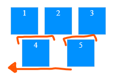
The last container/s should be to the left side. but it’ll puts all into the center! I want to: move the last container/s into the left but others above into the center of wrapper.
enter image description here

 .wrapper {
            display: flex;
            flex-wrap: wrap;
            gap: 10px 10px;
            flex-direction: row;
            align-items: stretch;
            justify-content: space-evenly;
            width: 200px;
            height: 100px;
            resize: horizontal;
        }

        .container {
            display: flex;
            flex-direction: column;
            flex-wrap: nowrap;
            align-items: stretch;
            justify-content: space-between;
            align-content: space-between;
            flex: none;
            width: 50px;
            height: 50px;
            text-align: center;
            max-width: 100%;
            padding: 2px;
            border: 1px solid rgb(95 170 227 / 78%);
            background: rgb(0, 145, 255);
            color: white;
        }
<div class="wrapper">
        <div class="container">
            1
        </div>
        <div class="container">
            2
        </div>
        <div class="container">
            3
        </div>
        <div class="container">
            4
        </div>
        <div class="container">
            5
        </div>
    </div>

Note: if my container/s has a single one, also put that one or two into the left side. and I don’t want to remove (align-items: stretch;) because if I do that added extra space!

3

Answers


  1. Remove justify-content: space-evenly;

    .wrapper {
      display: flex;
      flex-wrap: wrap;
      gap: 10px 10px;
      flex-direction: row;
      align-items: stretch;
      width: 200px;
      height: 100px;
      resize: horizontal;
    }
    
    .container {
      display: flex;
      flex-direction: column;
      flex-wrap: nowrap;
      align-items: stretch;
      justify-content: space-between;
      align-content: space-between;
      flex: none;
      width: 50px;
      height: 50px;
      text-align: center;
      max-width: 100%;
      padding: 2px;
      border: 1px solid rgb(95 170 227 / 78%);
      background: rgb(0, 145, 255);
      color: white;
    }
    <div class="wrapper">
      <div class="container">
        1
      </div>
      <div class="container">
        2
      </div>
      <div class="container">
        3
      </div>
      <div class="container">
        4
      </div>
      <div class="container">
        5
      </div>
    </div>
    Login or Signup to reply.
  2. justify-content: start; on .wrapper

    Login or Signup to reply.
  3. In order to reach what you’re saying, keeping the align of the first row centered and spaced and the second row all on the left,you can simply add this to your css:

    .container:nth-child(5){
        margin-right: auto;
    }
    

    It’s pretty basic and un-elegant but does the trick.
    Still, don’t know what you need to have on your page, but i really think Sai Manoj answer is the most good looking answer

    Login or Signup to reply.
Please signup or login to give your own answer.
Back To Top
Search