


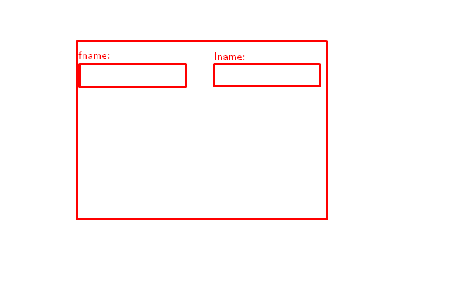
I’ve been trying for days but I couldn’t make this work, how do I achieve this? I can’t figure it out, how do I put two labels (fname lname) on the same line and under them the corresponding inputs?here’s a sketch of what i wanna do
I know it’s an easy task for you all but I’m stuck on it, I can do it but they end up on separate lines or I only get the first one done but the label on the second one disappears
2
Answers
Here you go, no need for flex/grid:
As the commenter noted, CSS Grid is going to be your preferred approach for this type of setup. Here is a working example.
Here is your HTML
Then the CSS to setup your grid:
So what is this doing? There are different types of
displayvalues within CSS. Many HTML elements have default values, such as adivhas a display ofblockwhereas ourinputelements have aninline-block. This tells the browser how to do layout of that element.So in our case, we’re first going to set it to leverage a relatively new layout paradigm called
grid. CSS Grid is powerful because it allows you to define layouts in two dimensions. CSS Grid items are its direct descendants which is why I added seemingly pointlessdivs as container elements for each item.So let’s dig into what each line is doing.
display: grid– This tells the browser to use Grid when laying out that elementgrid-template-columns: 1fr 1fr;– This is defining how many columns we want our grid to have and how to size them. We’re going to use the flexible length unit (fr) in order to size both columns.grid-template-rows: 1fr 1fr;– Like rows, this is defining how many columns we want our grid to have and how to size them.grid-auto-rows: 1fr;– Grid is powerful, and even though we’ve defined that we’ll have a 2×2 grid there are scenarios where new content may be inserted that the CSS author wasn’t aware of. If there isn’t a cell that the un-accounted for item can be placed into then CSS Grid will create a new row to insert the content into, these are known as implicit rows and columns. Here we’re defining how large we want those rows to be if there ends up being more than two rows of content.CSS Grid is very powerful and I highly recommend Rachel Andrew’s "Grid by Example" and just clicking from the first one until the end and you’ll have a rather strong grasp on how to use CSS Grid.
Have fun!