I have a <div> container that is displayed as flex with the following CSS properties:
.icon-container {
    padding: 3px;
    padding-top: 15px;
    padding-bottom: 15px;
    display: flex;
    flex-direction: column;
    align-content: center;
    align-items: center;
    border-radius: 25px;
    border: solid 2px white;
    width: 50px;
    background-color: #FFFFFF44;
}
The html looks like:
<div class="icon-container">
    <img alt="icon 1" src="/images/icon1.png"><br>
    <img alt="icon 2" src="/images/icon2.png"><br>
    <img alt="icon 3" src="/images/icon3.png"><br>
    <img alt="icon 4" src="/images/icon4.png"><br>
    <img alt="icon 5" src="/images/icon5.png">
</div>
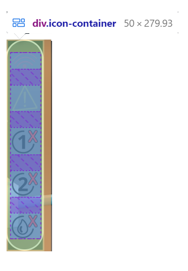
The resulting layout when I look at it under dev tools looks like:
I am trying to reduce the purple gaps by about half, but nothing seems to change them.


2
Answers
Add
flex-grow: 0.8and vary the value (0.8 in my example) up or down gradually until you find a solution that suits you.Remove
<br>and userow-gap: