How to reproduce that kind of border with CSS ? Only on the right side of the button. Searched everywhere without luck.
2
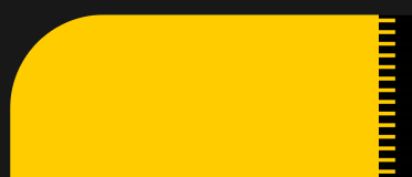
You could add an after pseudo element which has a repeating background linear-gradient rather than make it a true border.
This snippet puts it over the actual button, but you could put it immediately afterwards, changing the coloring.
<style>
  body {
    background-color: black;
  }

  button {
    width: 200px;
    height: 100px;
    background: gold;
    position: relative;
    border-color: gold;
    border-radius: 25% 0 0 0;
    border-width: 0;
  }

  button::after {
    width: 10%;
    height: 100%;
    background-image: linear-gradient(black 0 5px, transparent 5px 10px);
    background-position: 0 0;
    background-size: 10% 10px;
    position: absolute;
    content: '';
    top: 0;
    transform: translateX(-100%);
    left: 100%;
  }
</style>
<button>button</button>
One conic-gradient can do the job
conic-gradient
.box {
  width: 300px;
  height: 200px;
  border-top-left-radius: 50%;
  background:
    conic-gradient(at calc(100% - 25px),#0000 25%,gold 0)
    0 0/100% 20px;
 /* 25px control the horizontal size and 20px the vertical one */
}


body {
  background: #000;
}
<div class="box"></div>
Click here to cancel reply.


2
Answers
You could add an after pseudo element which has a repeating background linear-gradient rather than make it a true border.
This snippet puts it over the actual button, but you could put it immediately afterwards, changing the coloring.
One
conic-gradientcan do the job