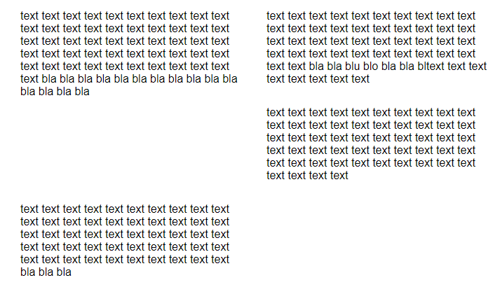
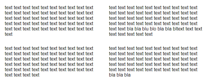
On desktop there are 4 columns next to eachother, on tablets only 2 columns next to eachother.
Somehow the 2 columns won’t get aligned how they should be.
I’m using 12 columns in total. col-x is for desktop, col-s-x is used for tablets.
Desktop design works as intended:
Only when I remove some text of the first column, the second row’s columns are placed next to eachother:
*
{
    box-sizing: border-box;
}

[class*="col-"]
{
    float: left;
    padding: 15px;
    /*border: 1px solid red;*/
}

.row::after
{
    content: "";
    clear: both;
    display: table;
}

/* For mobile phones: */
[class*="col-"]
{
    width: 100%;
}

@media only screen and (min-width: 600px)
{
    /* For tablets: */
    .col-s-1 {width: 8.33%;}
    .col-s-2 {width: 16.66%;}
    .col-s-3 {width: 25%;}
    .col-s-4 {width: 33.33%;}
    .col-s-5 {width: 41.66%;}
    .col-s-6 {width: 50%;}
    .col-s-7 {width: 58.33%;}
    .col-s-8 {width: 66.66%;}
    .col-s-9 {width: 75%;}
    .col-s-10 {width: 83.33%;}
    .col-s-11 {width: 91.66%;}
    .col-s-12 {width: 100%;}
}

@media only screen and (min-width: 768px)
{
    /* For desktop: */
    .col-1 {width: 8.33%;}
    .col-2 {width: 16.66%;}
    .col-3 {width: 25%;}
    .col-4 {width: 33.33%;}
    .col-5 {width: 41.66%;}
    .col-6 {width: 50%;}
    .col-7 {width: 58.33%;}
    .col-8 {width: 66.66%;}
    .col-9 {width: 75%;}
    .col-10 {width: 83.33%;}
    .col-11 {width: 91.66%;}
    .col-12 {width: 100%;}
}
<div class="row">
<div class="col-3 col-s-6">text text text text text text text text text text text text text text text text text text text text text text text text text text text text text text text text text text text text text text text text text text text text text text text text text text text
</div>
<div class="col-3 col-s-6">text text text text text text text text text text text text text text text text text text text text text text text text text text text text bla bla blu blo bla bla bltext text text text text text text text
</div>
<div class="col-3 col-s-6">text text text text text text text text text text text text text text text text text text text text text text text text text text text text text text text text text text text text text text text text text text text text text text text text text text text text text text</div>
<div class="col-3 col-s-6">text text text text text text text text text text text text text text text text text text text text text text text text text text text text text text text text text text text text text text text text text text text text text text text text text text bla bla bla</div>
</div>I’ve searched for a while, but I don’t know how to call this type of behaviour to research more specifically.
When there is a second row div, it will get aligned perfectly on tablets, but it crashes the desktop version.
Thanks for your help!


2
Answers
i just copy pasted your entire code along with CSS inside a React App and it’s working absolutely fine.
If it’s not working for your case, I can suggest you to use a grid layout.
That automatically handles such reponsive issues out of the box, you just have to mention the numer of colums that you want.
Here is an example of how you can do that:
And then you can use the CSS as follows:
In case you want to use different number of columns for different screen sizes,
then you can use media queries and change the number inside the repeat(<change_this_number>, minmax(min-width-of-column-you-want, 1fr)) property.
The simplicity and beauty of pure CSS.